Solar energy capacity has been growing amazingly quickly the last few years. Part of the reason for this is the starting point was so low, making it easy to have large gains.
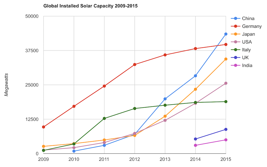
Chart by Curious Cat Economics Blog using data from the International Energy Agency (IEA) and the US Department of Energy. Chart may be used with attribution as specified here.
The 2014 and 2015 data on this chart is from IAE report for total installed photovoltaic (PV) solar capacity. See previous post on chart of Solar Energy Capacity by Country from 2009 to 2013. Different data sources for different year (and/or countries in the same year) is not ideal but for the purposes of this data in this post is sufficient.
Installed PV capacity is even more questionable that much other economic data. Economic data are always approximations of reality but with PV you have additional questions. The same plant located outside London or Rome have different capability to produce (and there are many factors that contribute not just the most obvious such as how much sun shines in a particular geography). Installed PV data is based on the capability of the equipment regardless of the solar potential of the location.
So even with the same investment it is likely Italy gets more production than Germany. The IAE report attempted to determine what was the likely ability of the solar PV capacity to produce for each country as a percentage of total electricity needs. They estimate Italy has the largest percentage of electricity needs capable of being produced by installed PV systems at 8%, with Greece at 7.4% and Germany at 7.1%. Japan is ranked 5th at just under 4%, UK is 12th at 2.5%, China is 22nd at 1%, India 24th and the USA 25th at close to .9%. They estimate the total global percentage at 1.3%.
These figures also show the huge power needs of China and the USA. Even with huge investments in Solar they us so much electricity that it is slow to make large gains in the percentage of total power generated by solar.
In the USA in 2013 solar energy capacity was under 1% USA total electrical capacity. In 2013 hydropower was 6.8%, wind was 5.3% and biomass was 1.3%. The increase in solar capacity should continue to grow rapidly and is making significant contributions to the macroeconomic energy picture (even if it doesn’t appear dramatic).
Related: Chart of Global Wind Energy Capacity by Country from 2005 to 2015 – Leasing or Purchasing a Solar Energy System For Your House – Nuclear Power Generation by Country from 1985-2010 – Manufacturing Output by Country 1999-2011: China, USA, Japan, Germany
Even if some lobbyists and their friends in Washington DC try to distract from the long term failure of the USA health care system the data continues to pour in about how bad it is.
U.S. Health-Care System Ranks as One of the Least-Efficient
None of these rankings are perfect and neither is this one. But it is clear beyond any doubt that the USA healthcare system is extremely costly for no better health results than other rich countries (and even more expensive with again no better results than most poor countries). It is a huge drain on the economy that we continue to allow lobbyists and special interests to take advantage of the rest of us via the Democrats and Republican parties actions over the last few decades.
We have to improve. The costs imposed on everyone to support those benefiting from this decades old transfer of economic wealth to health care special interests should no longer be accepted.
The top 5 countries are: Hong Kong, Singapore, Spain, South Korea and Japan. The first four have costs about 25% of the USA. Japan costs about 40% of the USA per person cost.
Mylan’s despicable actions with Epi-pen and the direct participation of both political parties in increasing the costs foisted on the health care system by Mylan is just one in hundreds of the individual actions that continue to saddle the rest of USA economy with huge costs.
Related: Out of Pocket “Maximum”, Understanding USA Health Care Costs – Decades Later The USA Health Care System is Still a Deadly Disease for Our Economy – 2015 Health Care Price Report, Costs in the USA and Elsewhere – USA Health Care Spending 2013: $2.9 trillion $9,255 per person and 17.4% of GDP – USA Spends $7,960 Compared to Around $3,800 for Other Rich Countries on Health Care with No Better Health Results (2009 data)
The International Federation of Health Plans has published the 2015 Comparative Price Report, Variation in Medical and Hospital Prices by Country. Once again this illustrates the excessive cost of health care in the USA. See related posts for some of our previous posts on this topic.
The damage to the USA economy due to inflated health care costs is huge. A significant portion of the excessive costs are due to policies the government enacts (which only make sense if you believe the cash given to politicians by those seeking to retain the excessive costs structure in the USA the last few decades buy the votes of the political parties and the individual politicians).
In 2015, Humira (a drug from Abbvie to treat rheumatoid arthritis that is either the highest grossing drug in the world, or close to it) costs $2,669 on average in the USA; $822 in Switzerland; $1,362 in the United Kingdom. This is the cost of a 28 day supply.
All the prices shown here are for the prices reported are the average allowed costs, which include both member cost sharing and health plan payment. So it only includes costs for those covered by health plans (it doesn’t include even much larger price tags given those without insurance in the USA).
Harvoni (a drug from Gilead to treat hepatitis C is also near the top of drugs with the largest revenue worldwide). This is also a drug that has been used as a lightning rod for the whole area of overpriced drugs. One interesting thing is this is actually one that is not nearly as inflated in the USA over other countries nearly as much as most are. Again, for a 28 day supply the costs are $16,861 in Switzerland; $22,554 in the United Kingdom and $32,114 in the USA. Obviously quite a lot but “only” double the cost in the USA instead of over triple for Humira (from Switzerland to the USA).
Tecfidera is prescribed to treat relapsing multiple sclerosis. The cost for a 30 day supply vary from $663 in the United Kingdom to $5,089 in the USA ($1,855 Switzerland).
There are actually some drugs that are more expensive outside the USA (though it is rare). OxyContin is prescribed to treat severe ongoing pain and is also abused a great deal. The prices vary from $95 in Switzerland to $590 in the United Kingdom ($265 in United States).
The report also includes the cost of medical procedures. For both the drugs and the procedures they include not only average but measures to show how variable the pricing is. As you would expect (if you pay attention to the massive pricing variation in the USA system) the variation in the cost of medical procedures is wide. For an appendectomy in the USA the 25th percentile of cost was $9,322 and for the 95th was $33,250; the average USA cost was $15,930. The average cost in Switzerland was $6,040 and in the United Kingdom was $8,009.
As has been obvious for decades the USA needs to stop allowing those benefiting from the massively large excessive health care costs in the USA from buying the Democrats and Republicans support to keep prices so high. But there has been very little good movement on this front in decades.
Related: USA Heath Care System Needs Reform – USA Health Care Spending 2013: $2.9 trillion $9,255 per person and 17.4% of GDP – Decades Later The USA Health Care System is Still a Deadly Disease for Our Economy – USA Spends $7,960 per person Compared to Around $3,800 for Other Rich Countries on Health Care with No Better Health Results (2009) – Drug Prices in the USA (2005)
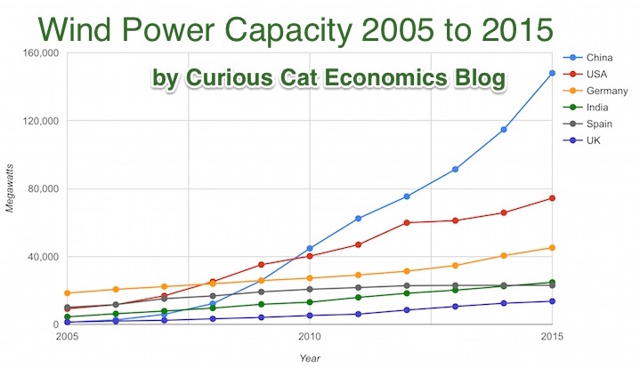
Chart by Curious Cat Economics Blog using data from the Wind Energy Association, data for 2014 and 2015. Chart may be used with attribution as specified here.
After a slowing of additional capacity added in 2013, both 2014 and 2015 saw a bit of a rebound in additions to global wind energy capacity. In 2013 capacity increased only 13% while in both 2014 and 2015 it increased 17%. Still 17% is less than any year in the last 10, except 2013.
At the end of 2013 China had 29% of global capacity (after being responsible for adding 62% of all the capacity added in 2013). In 2005 China had 2% of global wind energy capacity.
At the end of 2015 China accounted for 34% of global capacity, the only country in the top 8 increasing their share of global capacity. The USA now has 17% of capacity. Germany has 10%.
Europe moved first in adding large scale wind energy capacity but has added capacity very slowly in the last 5 years. Germany had 31% of global capacity in 2005. Spain had 17% in 2005 and now has just 5% (during that time Spain has more than doubled their wind energy capacity).
The 6 countries shown on the chart account for 76% of total wind energy capacity globally. From 2005 to 2015 those 8 countries have accounted for between 74 and 77% of total capacity – which is amazingly consistent.
Wind power now accounts for approximately 4 to 5% of total electricity used.
Related: Chart of Global Wind Energy Capacity by Country 2005 to 2013 – Solar Energy Capacity by Country (2005 to 2013) – Nuclear Power Generation by Country from 1985-2010 – Chart of Largest Petroleum Consuming Countries from 1980 to 2010
The report, The Dwindling Taxable Share Of U.S. Corporate Stock, from the Brookings Institution Tax Policy Center includes some amazing data.

In 1965 foreign ownership of USA stocks totaled about 2%, in 1990 it had risen to 10% and by 2015 to 26%. That the foreign ownership is so high surprised me. Holdings in retirement accounts (defined benefit accounts, IRAs etc.) was under 10% in 1965, rose to over 30% in 1990 and to about 40% in 2015. The holdings in retirement accounts doesn’t really surprise me.
The combination of these factors (and a few others) has decreased the holding of USA stocks that are taxable in the USA from 84% in 1965 to 24% in 2015. From the report
As with much economic data it isn’t an easy matter to determine what values to use in order to get figures such as “foreign ownership.” Still this is very interesting data, and as the report suggests further research in this area would be useful.
Related: There is No Such Thing as “True Unemployment Rate” – The 20 Most Valuable Companies in the World – February 2016 (top 10 all based in the USA) – Why China’s Economic Data is Questionable – Data provides an imperfect proxy for reality (we often forget the proxy nature of data)
The 20 publicly traded companies with the largest market capitalizations. Since my October 2015 list of the 20 most valuable stocks many of the market caps have declined significantly.
| Company | Country | Market Capitalization | |
|---|---|---|---|
| 1 | Apple | USA | $541 billion |
| 2 | Alphabet (GOOGL) | USA | $496 billion |
| 3 | Microsoft | USA | $412 billion |
| 4 | Exxon Mobil | USA | $341 billion |
| 5 | Berkshire Hathaway | USA | $329 billion |
| 6 | USA | $311 billion | |
| 7 | GE | USA | $300 billion |
| 8 | Johnson & Johnson | USA | $296 billion |
| 9 | Amazon | USA | $262 billion |
| 10 | Wells Fargo | USA | $245 billion |
Apple lost $131 billion in market cap since my October post. Alphabet (Google) lost just $1 billion in market cap, and for a short time moved past Apple into the top stop. Facebook achieved a rare increase during this period, gaining $16 billion and moving up 1 spot on the list. All the top 10 most valuable companies are based in the USA once again.
The next ten most valuable companies:
| Company | Country | Market Capitalization | |
|---|---|---|---|
| 11 | Nestle | Switzerland | $226 billion |
| 12 | Roche | Switzerland | $226 billion |
| 13 | China Mobile | China | $219 billion |
| 14 | Walmart | USA | $216 billion |
| 15 | JPMorgan Chase | USA | $214 billion |
| 16 | Procter & Gamble | USA | $211 billion |
| 17 | Verizon | USA | $209 billion |
| 18 | Industrial & Commercial Bank of China | China | $206 billion* |
| 19 | Novartis | Switzerland | $195 billion |
| 20 | Petro China | China | $191 billion |
Market capitalization shown are of the close of business February 26th, as shown on Google Finance.
The 11th to 20th most valuable companies includes 4 USA companies, 3 Chinese companies and 3 Swiss companies. Toyota fell from 20th to 25th and was replaced in the top 20 by Verizon, which resulted in the USA gaining 1 company and costing Japan their only company in the top 20. Pfizer also dropped out and was replaced by Walmart.
The total value of the top 20 decreased by $189 billion since my October post: from $6.054 trillion to $5.865 trillion. Since my October 2014 post of the 20 most valuable companies in the world the total value of the top 20 companies has risen from $5.722 trillion to $5.865 trillion, an increase of $143 billion. The companies making up the top 20 has changed in each period.
Related: Global Stock Market Capitalization from 2000 to 2012 – Stock Market Capitalization by Country from 1990 to 2010 – Historical Stock Returns
A few other companies of interest (based on their market capitalization):
Read more
Credit scores are far from a great measure of whether a person is a great credit risk for a specific loan, in my opinion. However, they are very widely used and therefor, very important. They also are somewhat useful. And lenders don’t base judgement solely on credit scores, they consider many other factors, if they have any sense at all.
Credit scores range from 300 to 850. They are calculated by various credit reporting organizations, including FICO. They factor in payment history, percent of outstanding credit available that is used, credit report checks, length of outstanding credit accounts, etc..
Metlife report on consumers and credit scores provides some interesting data.
| Credit score range | Default rate* |
|---|---|
| 740-850 | .4% |
| 680-739 | 2.8% |
| 620-679 | 7.5% |
| 550-619 | 17% |
| 300-459 | 33.8% |
* Default rate in this case means, 90 days past due. MetLife got this data from the Consumer Financial Health Study dataset**.
Peer to peer lending platform, Lending Club, limits loans to those with a minimum credit score of 660 (remember there are multiple organizations that provide credit scores, this minimum is based on Lending Club’s score). In general I see scores above 700 in A and B loans, scores from 650-700 in C and D loans. Remember the credit score is not the only factor setting the rate (you will see scores above 700 in the C loans sometimes, etc.). Credit scores provide some insight but are just 1 factor in approving loans or setting rates (an important one but not a completely dominant one).
About 38% of people have credit scores from 750-850. Another 37% from 600-749 and about 25% from 350-599.
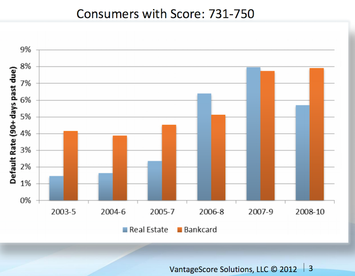
Vantage Score decided to make their score range go up to 1000, not the standard 850. Maybe a 750 score for them is comparable to 680? They say super-prime is 900+ (750-850 on more common scale), prime is 701-900 (680-739), near-prime 641-700 (620-679), subprime 501-640 (550-619). Anyway that chart shows the changing default rates from 2003 to 2010 by type of loan.
This Federal Reserve report on meeting between Federal Reserve Board staff and Fair Isaac Corporation (FICO) 20 June 2013 has some interesting material.
For guidance, the following table generally matches a borrower’s odds-of-default with the corresponding FICO 8 score (calculated on performance from Oct 2008 – Oct 2010). Of course, the range of scores and odds-of-default [the data is related to mortgages] will vary with each model as creditors develop and validate their own credit scoring models.
Odds-of Default FICO 8 Score percent of population** 5:1 610 9% 10:1 645 9% 20:1 685 6% 30:1 705 6% 40:1 720 6% 50:1 735 9% 100:1 770 30%
As you can see at a 610 level, 20 loans out of 100 defaulted. At 685 just 5 in 100 defaulted and at 770 just 1 in 100 did.
** I had to adjust this, because the report didn’t report it in this form, so it a very approximate measure (I made estimates for something like scores from 735 to 769 etc.). Again this is data from the Oct 2008 – Oct 2010 period. The rest of the population (about 25%) would have scores below 610.
Related: The Impact of Credit Scores and Jumbo Size on Mortgage Rates (2009) – Your FICO credit score explained – $2,540,000,000,000 in USA Consumer Debt
This page references a Fed report (that I can’t find) that found the following default rates on new loans for the two years after origination, 2000-2002:
| Credit score range | Default rate* |
|---|---|
| under 520 | 41% |
| 520-559 | 28% |
| 560-599 | 23% |
| 600-639 | 16% |
| 640-679 | 9% |
| 680-719 | 4.4% |
| over 720 | <1% |
The Consumer Financial Health Study respondents were asked to self-assess their credit quality and for permission to pull their actual credit scores.8 Forty-five percent of survey participants granted permission, yielding an “opt-in” sample size of 3,215. We appended two objective measures of creditworthiness to the dataset: Experian provided VantageScore 3.0 credit scores, and LexisNexis Risk Solutions provided RiskView scores. VantageScore is a generic credit scoring model that was created by the three major credit bureaus (Equifax, Experian and TransUnion) and, in addition to tradeline data, includes rent, utility and cell phone payment data when it is available in consumer credit files.
Total nonfarm payroll employment increased by 271,000 in October, and the unemployment rate was essentially unchanged at 5.0%. Over the prior 12 months, employment growth had averaged 230,000 per month – which is quite an excellent result. We are still recovering from the job losses suffered during the great recession but even considering that the results are excellent.
As my recent post noted, adding 50,000 jobs a month is the new 150,000 in the USA due to demographic changes. That means job gains in the last year have added about 180,000 jobs per month above the 50,000 needed to accommodate growth due to demographic changes (a larger population of adults.
The change in total nonfarm payroll employment for August was revised from +136,000 to +153,000, and the change for September was revised from +142,000 to +137,000. With these revisions, employment gains in August and September combined were 12,000 more than previously reported.
Household Survey Data
Both the unemployment rate (5.0%) and the number of unemployed persons (7.9 million) were essentially unchanged in October. Over the past 12 months, the unemployment rate dropped by 70 basis (from 5.7%) and 1.1 million fewer people are listed as unemployed.
Among the major worker groups, the unemployment rates for adult men (4.7%), adult women (4.5%), teenagers (15.9%), whites (4.4%), blacks (9.2%), Asians (3.5%), and Hispanics (6.3%) showed little or no change in October.
The number of long-term unemployed (those jobless for 27 weeks or more) was essentially unchanged at 2.1 million in October and has shown little change since June. These individuals accounted for 26.8% of the unemployed in October.
This chart shows that the percentage of millionaire families by highest education level is dramatically different by education level. The data is looking at USA family income for household headed by a person over 40. For high school dropouts, fewer than 1% are millionaires; all families it is about 5%; high school graduates about 6%; 4 year college degree about 22% and graduate or professional degree about 38%.

Interesting chart based on Federal Reserve data (via the Wall Street Journal)
While the costs of higher education in the USA have become crazy the evidence still suggests education is highly correlated to income. Numerous studies still show that the investment in education pays a high return. Of course, simple correlation isn’t sufficient to make that judgement but in other studies they have attempted to use more accurate measures of the value of education to life long earnings.
Related: The Time to Payback the Investment in a College Education in the USA Today is Nearly as Low as Ever, Surprisingly – Looking at the Value of Different College Degrees – Engineering Graduates Earned a Return on Their Investment In Education of 21%
The blog post with the chart, Why Wealth Inequality Is Way More Complicated Than Just Rich and Poor has other very interesting data. Go read the full post.
Average isn’t a very good measure for economic wealth data, is is skewed horribly by the extremely wealthy, median isn’t a perfect measure but it is much better. The post includes a chart of average wealth by age which is interesting though I think the $ amounts are largely worthless (due to average being so pointless). The interesting point is there is a pretty straight line climb to a maximum at 62 and then a decline that is about as rapid as the climb in wealth.
That decline is slow for a bit, dropping, but slowly until about 70 when it drops fairly quickly. It isn’t an amazing result but still interesting. It would be nice to see this with median levels and then averaged over a 20 year period. The chart they show tells the results for some point in time (it isn’t indicated) but doesn’t give you an idea if this is a consistent result over time or something special about the measurement at the time.
They also do have a chart showing absolute wealth data as median and average to show how distorted an average is. For example, median wealth for whites 55-64 and above 65 is about $280,000 and the average for both is about $1,000,000.
Related: Highest Paying Fields at Mid Career in USA: Engineering, Science and Math – Wealthiest 1% Continue Dramatic Gains Compared to Everyone Else – Correlation is Not Causation: “Fat is Catching” Theory Exposed
For job growth, 33,000 — not 150,000 — is the new normal
…
the Census Bureau predicts the working-age population will grow just 50,000 per month over the next 15 years.
The amount of time I spend focusing on economic data is fairly limited (compared to people doing so for a living or as a large part of their job). I stick with general rules of thumb that I can tweak a bit to let me keep up with economic conditions without a huge amount of time devoted to such efforts.
Due to my temperament; to my belief that markets often overreact in the short term; and partially to my less detailed understanding of economic data (that professionals focused on it all day) leads me to get less excited about individual data points. This is helpful for my overall investing performance, I believe.
Occasionally changing conditions require changing those rules of thumb. The 150,000 figure is one I have used for a long time; though I also adjust that for major medium term influences (such as the great recession dumped so many people out of jobs that I bumped up my “we need to add” monthly job figure to 175,000 to 200,000 to bring those people on board.
My 175,000 to 200,000 included a slight adjustment down from the 150,000 that I had made. In addition to using simple ideas like 150,000 monthly job baseline I incorporate the idea of not overreacting to variation in short term data as well as tweaking those numbers for medium term economic conditions (things like recovering from the great recession – though that is about the largest “tweaking” factor that I remember).
This article made me realize how much I should adjust my expectations for a neutral job growth reading in the USA going forward. I also gather data and opinions as I think about making major adjustments to my thinking. I’ll adjust from what I had been using of a base of 125,000 plus 50,000+ for great recession recovery to 75,000 + 50,000 for great recession recovery now (and adjust more later if other sources indicate it makes sense). The great recession recovery factor will likely go down to 25,000 for me by the end of this year.
Related: There is No Such Thing as “True Unemployment Rate” – Long Term View of Manufacturing Employment in the USA (2012) – USA Individual Earnings Levels for 2011: Top 1% $343,000, 5% $154,000, 10% $112,000, 25% $66,000 – GDP Growth Per Capita for Selected Countries from 1970 to 2010 (Korea, China, Singapore, Indonesia, Brazil