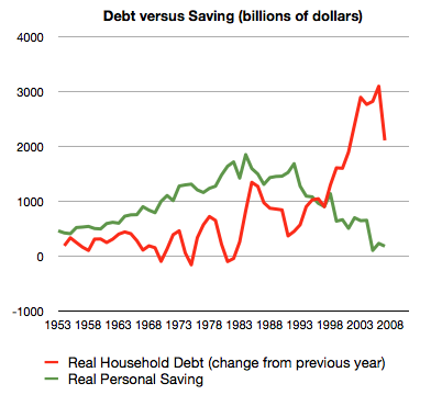
The whole sorry mess in one picture (including chart) by Philip Brewer
Take a gander at that graph. The green line is personal savings. The Bureau of Economic Analysis calculates that. It’s just income minus spending–the obvious way of figuring saving. The red line is debt. The Federal Reserve calculates that value. The value on the graph is the change from the previous year–that is, it shows each year’s new debt, just like the green line shows each year’s saving. Both values are adjusted for inflation–the graph is in billions of (year 2000) dollars.
…
Starting back in about 2005, the American consumer reached the point that they could no longer service ever-increasing amounts of debt. That led to the housing bubble popping. The result is what you can see in the last datapoint on the graph–less new borrowing in 2007.
…
Starting back in about 2005, the American consumer reached the point that they could no longer service ever-increasing amounts of debt. That led to the housing bubble popping. The result is what you can see in the last datapoint on the graph–less new borrowing in 2007.
Related: $2,540,000,000,000 in USA Consumer Debt – Americans are Drowning in Debt – save an emergency fund – Financial Illiteracy Credit Trap – posts on saving money
Comments
2 Comments so far
[…] today and the next 6 months. They have been living this way for decades. And it is not sustainable. Consumer debt levels in the USA are far too high. The UK has an even worse personal debt problem. They should come down. Reducing those levels is […]
Anyone buying government debt at these rates has reason to question the wisdom of doing so. Exporters to the USA have macro-economic reasons for buying debt (to keep the value of the dollar from collapsing) but the investing reasons for buying USA debt I find very questionable…