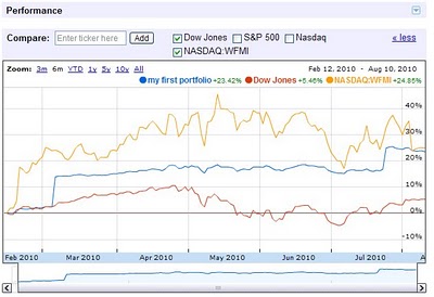
Google finance has a nice new feature to let you chart your entire portfolio. You can then compare it to the S&P 500 or other stocks. This is a very nice feature. Yahoo Finance is about the only part of Yahoo I still use. I do use Google Finance some but they still fall short and I use Yahoo Finance much more. This feature will at least encourage me to put my portfolio in Google and start tracking it.
It would be great if this could give you portfolio annual rates of return (including factoring in cash additions and withdraws and keeping track of sales over time to show a true view of the portfolio). It does look like it will factor in stock purchases and sales which is very nice. You can import csv files with transaction history – another nice feature.
It also strikes me as a very smart move (as a Google stockholder that is nice to see) as advertising rates around investing are high. The more time Google can provide financial advertisers the more income they can make.
Related: Lazy Portfolios Seven-year Winning Streak – Google Posts Good Earning But Not Good Enough for Many (April 2010) – Dollar Cost Averaging – Curious Cat Investing Books
Comments
1 Comment so far
You can also see some of the more interesting readings from the past week here…: Google finance portfolio charting @ Curious Cat Investing -Simple investing is better investing @ Oblivious Investor…