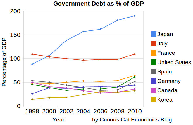
This chart shows government debt as a percent of GDP based on OECD data. The chart is limited to central government debt issuance and excludes therefore state and local government debt and social security funds.

Economic data is always a bit tricky to understand. It makes some sense that excluding social security would reduce the USA debt percentage a bit. But these debt as a percentage of GDP are lower than other sources show. There are obviously many tricks that can be used to hide debt and my guess is the main thing going on with this data is OECD intentionally trying to make things look as good as possible.
Still looking at historical trends in data is useful. And I believe looking at data from various sources is wise. There has been a dramatic increase from 2008-2010. The USA is up from 41% of GDP to 61%. Spain is up from 34% to 52% (but given all the concern with Spain this doesn’t seem to indicate the real debt problems they have.
Japan and France don’t have 2010 data, so I used a rough estimate of my own based on 2009 data. Greece has been over 100% since 1998 and now stands at 148%, 2nd worst (to Japan) for any OECD country (Europe, North America, Japan and Korea), Italy is 3rd. Ireland is at 61% (up from 28% in 2008). The UK is at 86%, up from 61%.
Related: Government Debt as Percentage of GDP 1990-2009: USA, Japan, Germany, China… (based on IMF data) – Government Debt as Percentage of GDP 1990-2008 – Government Debt Compared to GDP 1990-2007 – Top 15 Manufacturing Countries in 2009
Nonfarm payroll employment rose by 244,000 in April, and the unemployment rate edged up to 9.0% (from 8.8%) as the labor force grew slightly, the U.S. Bureau of Labor Statistics reported today. Also the number of jobs added is taken from the household survey while the unemployment rate is taken from the business payroll survey (they often have slightly different readings month to month). I, and many others, suspected the 8.8% figure might have been a bit low (and frankly the 9% figure may as well). In April of 2010 the unemployment rate was at 9.9%.
The change in total nonfarm payroll employment for February was revised from +194,000 to +235,000, and the change for March was revised from +216,000 to +221,000. Bringing the total jobs added with this report to 290,000 (244,000 + 41,000 + 5,000) – which is a very good result. Now if we can keep this up for a year that would be great. Overall this provides very encouraging news on the job front.
The number of unemployed persons stands at 13.7 million, up a little in April. Unemployment rates for several groups stood at: adult men 8.8%, adult women 7.9%, teenagers 24.9%, whites 8.0%, blacks 16.1%, Hispanics 11.8% and for Asians was 6.4%.
In another positive sign, the number of long-term unemployed (those jobless for 27 weeks and over) declined by 283,000 to 5.8 million; their share of unemployment declined to 43.4%. This is still a serious problem, but at least it is improving a bit.
The civilian labor force participation rate was 64.2% for the fourth consecutive month. The employment-population ratio, at 58.4%, changed little in April.
The private sector added 268,000 jobs. Employment rose in a number of service-providing industries, manufacturing, and mining. Since a recent low in February 2010, total payroll employment has grown by 1.8 million. Private sector employment has increased by 2.1 million over the same period.
Manufacturing employment rose by 29,000 in April. Since reaching an employment low in December 2009, manufacturing has added 250,000 jobs, including 141,000 in 2011. This is more great news. There has been real strength in manufacturing. Manufacturing is a real source of strength and if it can continue to be strong that will be very good news.
Related: USA Adds 216,00 Jobs in March and the Unemployment Rate Stands at 8.8% – USA Added 290,000 Jobs In April 2010 – Unemployment Rate Increased to 8.9% in April 2009 – USA Unemployment Rate Rises to 8.1%, Highest Level Since 1983
Read more