When 2 year US government bonds yield more than the 10 year US government bonds a recession is likely to appear soon. This chart shows why this is seen as such a reliable predictor.
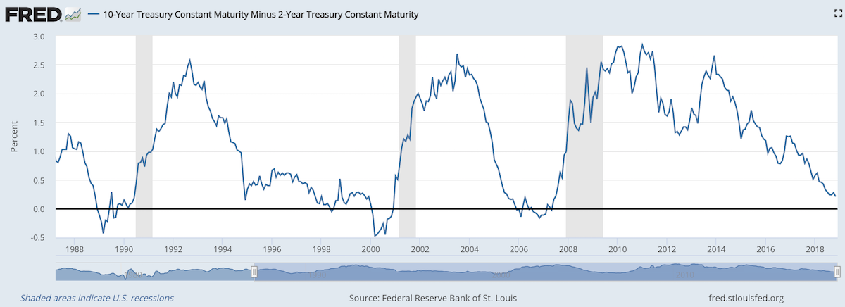
The chart shows the 10 year yield minus the 2 year yield. So when the value falls below 0 that means the 2 year yield is higher. Each time that happened, since 1988, a recession has followed (the grey shaded areas in the chart).
Do note that there were very small inversions in 1998 and 2006 that did not result in a recession in the near term. Also note that in every case the yield curve was no longer inverted by the time a recession actually started.
The reason why this phenomenon is getting so much attention recently is another thing that is apparent when looking at this chart, the 2 and 10 year yields are getting close to equal. But you can also see we are no closer than 1994 and the USA economy held off a recession for 7 more years.
Since 1970 the average length of time from the inversion of the 10 to 2 year yield curve has been 12 months (with a low of 6 months in 1973 and a high of 17 months, before the great recession of 2008).
In addition to a possibly impending yield curve inversion it has been a long time since the last recession which makes many investors and economists nervous that one may be due.
Related: 30 Year Fixed Mortgage Rates are not correlated with the Fed Funds Rate – Bond Yields Stay Very Low, Treasury Yields Drop Even More (2010) – Looking for Dividend Stocks in the Current Extremely Low Interest Rate Environment (2011) – Stock Market Capitalization by Country from 2000 to 2016
Another thing to note about yield curves at this time is that the US Federal Reserve continues to hold an enormous amount of long term government debt (trillions of dollars) which it has never done before the credit crisis of 2008. This reduces the long term yield since if they sold those assets that would add a huge amount of supply. How this impacts the predictive value of this measure will have to be seen. Also, one way for the Fed to delay the inversion would be to sell some of those bonds and drive up long term rates.
The stories you most frequently hear about China in Africa are
- resource extraction (oil, metals, etc.)
- infrastructure loans from China (with Chinese labor and Chinese companies doing the work, often to aid resource extraction)
- farming exports to China
While those are happening an excellent report from McKinsey (Dance of the Lions and Dragons) provides an in depth look at a much more entrepreneurial state of affairs. While there are big government backed efforts (including those with Chinese state owned company participation) there are many small companies making entrepreneurial investments led by Chinese entrepreneurs seeing a opening to build successful companies.
Chinese firms’ decisiveness is indicative of the relationship between the comparative advantages of Chinese entrepreneurs and the opportunities in African markets. To some, the high returns earned by Chinese firms are symptomatic of a market failure: too little competition in African markets. But in sectors such as manufacturing, there are too few African firms with the capital, technology, and skills to invest successfully and too few Western firms with the risk appetite to do so in Africa. Thus the opportunities are reaped by Chinese entrepreneurs who have the skills, capital, and willingness to live in and put their money in unpredictable developing-country settings.
What makes the decisiveness of Chinese investors all the more impressive is that they are mostly using their own money. Two-thirds of the private firms we surveyed, and over half of all firms in our sample, reported that their investments were self-financed through retained earnings or savings, or funded through personal loans. Only 13 percent of investment funds came from financing schemes linked to the Chinese government, and less than 20 percent came from Chinese or African commercial bank loans
I believe investments in Africa will provide great investment returns in the next 20 years. There are many challenges but the opportunity is much greater than most people realize. The potential returns are quite high due to the lack of capital and interest being shown in African opportunities.

Factory in Nigeria (I think) that my family toured.
Likely huge companies, such as Google, Tencent, Facebook, Toyota and Alibaba will do very well. But there are many opportunities. That Africa is made up of 54 different countries creates challenges for investors and companies seeking to grow (but also creates variation and opportunities). It will be interesting to see how big the role Chinese entrepreneurs play in the next 20 years in Africa.
The report is an excellent detailed look at Chinese investment in Africa. It is a long and worthwhile read.
Related: Kiva Loans Give Entrepreneurs a Chance to Succeed – Drone Deliveries to Hospitals in Rwanda – Using Capitalism in Mali to Create Better Lives – Promoting Innovation in Sierra Leone
The Great Convergence by Richard Baldwin makes some interesting points about “globalization.” I actually find the long term history the most interesting aspect. It is very easy for people today to forget the recently rich “West” has not always been so dominant.
That shows how quickly things changed. The industrialization of Europe and the USA was an incredibly powerful global economic force. The rapid economic gains of Japan, Korea, Singapore, China and India in the last 50 years should be understood in the context of the last 200 years not just the last 100 years.
A central point Richard advocates for in the book is realizing that the current conditions are different from the conditions in which traditional economic theory (including comparative advantage) hold. The reasoning and argument for this claim are a bit too complex to make sensibly in this post but the book does that fairly well (not convincingly in my opinion, but enough to make the argument that we can’t assume traditional economic theory for international trade is completely valid given the current conditions).
I don’t expect this blog post to convince people. I don’t even think his book will. But he makes a case that is worth listen to. And I believe he is onto something. I have for years been seeing the strains of “comparative advantage” in our current world economy. That doesn’t mean I am not mainly a fan of freer trade. I am. I don’t think complex trade deals such as TPP are the right move. And I do think more care needs to be taken to consider current economic conditions and factor that into our trade policies.
Richard Baldwin uses 3 costs and the economic consequences of those changing over time to show globalizations history, where we are today and where we are going.
It isn’t very easy to follow but the book provides lots of explanation for the dramatic consequences of these costs changing over time.
One of his themes is that mobility of labor is still fairly costly. It isn’t easy to move people from one place to another. Though he does discuss how alternatives that are similar to this (for example telepresence and remote controlled robots to allow a highly technical person to operate remotely) without actually do moving the person are going to have huge economic consequences.
The “high spillovers” are the positive externalities that spin off of a highly knowledgable workforce.
Even though there are plenty of ways to improve the economic conditions for most people today is very good compared to similar people 50 years ago. There are a few, small population segments that there are arguments for being worse off, but these are a tiny percentage of the global population.
However, we humans often compare ourselves to whoever is better off than us and feel jealous. So instead of appreciating good roads, food, shelter, health care, etc. we see where things could be better (either our parents had it a bit better or these people I see on TV or in this other country, etc.). It is good to see how we could improve if we then take action to improve. To just be frustrated that others have it better doesn’t do any good, it doesn’t seem to me.
There are significant ways governments can help or hinder the economic well being of their citizens. I am a big believer in the power of capitalism to provide wealth to society. That isn’t the same as supporting the huge push to “crony capitalism” that many of the political parties throughout the world are promoting. The “capitalism” in that phrase exists for alliteration, the real meaning is the word crony.

street scene in Seoul, South Korea (photo by John Hunter)
These Are the World’s Most Innovative Economies
These type of rankings are far from accurate, what does most innovative really mean? But they do provide some insight and I think those at the top of the list do have practices worth examining. And I do believe those near the top of this list are doing a better job of providing for the economic future of their citizens than other countries. But the reality is much messier than a ranking illustrates.
With that in mind the ranking shows
- Korea
- Sweden
- Germany
- Switzerland
- Finland
- Singapore
- Japan
- Denmark
- USA
One thing that is obvious is the ranking is very biased toward already rich countries. When you look at the measures they use to rank it is easy to see this is a strong bias with their method.
China is 21st. Malaysia is 23rd and an interesting country doing very well compared to median income (I am just guessing without actually plotting data). Hong Kong is 35th, which is lower than I imagine most people would have predicted. Thailand is 44th. Brazil is 46th and even with their problems seems low. Brazil has a great deal of potential if they can take care of serious problems that their economy faces.
In a previous post I examined the GDP Growth Per Capita for Selected Countries from 1970 to 2010, Korea is the country that grew the most (not China, Japan, Singapore…).
Related: Leading Countries for Economic Freedom: Hong Kong, Singapore, New Zealand, Switzerland – Economic Consequences Flow from Failing to Follow Real Capitalist Model and Living Beyond Our Means – Easiest Countries in Which to Operate a Businesses (2011)
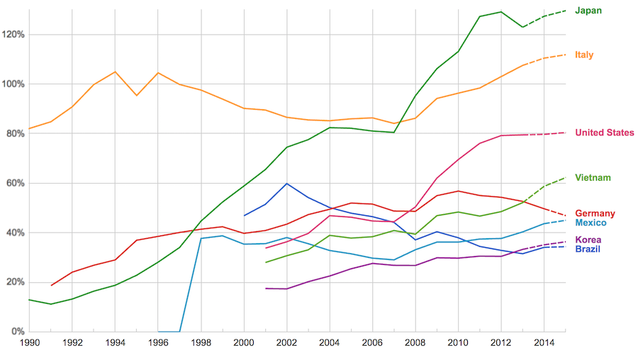
The data, from IMF, does not include China or India.
The chart shows data for net debt (gross debt reduced by certain assets: gold, currency deposits, debt securities etc.).
Viewing our post on the data in 2014 we can see that the USA improved on the expectations, managing to hold net debt to 80% instead of increasing to 88% as expected. Nearly every country managed to take on less debt than predicted (Vietnam took on more, but is very low so this is not a problem).
Taking on debt to invest in valuable resources (building roads, mass transit, internet infrastructure, education, environmental regulation and enforcement, health care, renewable energy…) that will boost long term economic performance can be very useful. The tricky part is knowing the debt levels doesn’t tell you whether the debt was taken on for investment or just to let current taxpayers send the bills for their consumption to their grandchildren.
Also government debt can become a huge burden on the economy (especially if the debt is owed outside the country). The general consensus today seems to be that 100% net debt level is the maximum safe amount and increasing beyond that gets riskier and riskier.
Delinquencies in closed-end loans fell slightly in the second quarter, driven by a drop in home equity loan delinquencies, according to results from the American Bankers Association’s Consumer Credit Delinquency Bulletin.
The composite ratio, which tracks delinquencies in eight closed-end installment loan categories, fell 3 basis points to 1.35% of all accounts – a record low. This also marked the third year that delinquency rates were below the 15-year average of 2.21%. The ABA report defines a delinquency as a late payment that is 30 days or more overdue. This is good news but the personal financial health of consumers in the USA is still in need of significantly improvements to their balance sheets. Debt levels are still too high. Savings levels are still far to low.
Home equity loan delinquencies fell 4 basis points to 2.70% of all accounts, which helped drive the composite ratio down. Other home related delinquencies increased slightly, with home equity line delinquencies rising 6 basis points to 1.21% of all accounts and property improvement loan delinquencies rising 2 basis points to 0.91% of all accounts. Home equity loan delinquencies dipped further below their 15-year average of 2.85%, while home equity line delinquencies remained just above their 15-year average of 1.15 percent.
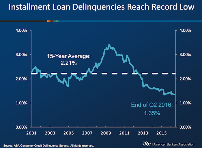
Bank card delinquencies edged up 1 basis point to 2.48% of all accounts in the second quarter. They remain significantly below their 15-year average of 3.70 percent.
The second quarter 2016 composite ratio is made up of the following eight closed-end loans. All figures are seasonally adjusted based upon the number of accounts.
Closed-end loans
Home equity loan delinquencies fell from 2.74% to 2.70%.
Mobile home delinquencies fell from 3.41% to 3.17%.
Personal loan delinquencies fell from 1.44% to 1.43%.
Direct auto loan delinquencies rose from 0.81% to 0.82%.
Indirect auto loan delinquencies rose from 1.45% to 1.56%.
Marine loan delinquencies rose from 1.03% to 1.23%.
Property improvement loan delinquencies rose from 0.89% to 0.91%.
RV loan delinquencies rose from 0.92% to 0.96%.
Open-end loans
Bank card delinquencies rose from 2.47% to 2.48%.
Home equity lines of credit delinquencies rose from 1.15% to 1.21%.
Non-card revolving loan delinquencies rose from 1.57% to 1.65%.
Related: Debt Collection Increasing Given Large Personal Debt Levels (2014) – Consumer and Real Estate Loan Delinquency Rates from 2001 to 2011 in the USA – Good News: Credit Card Delinquencies at 17 Year Low (2011) – Real Estate and Consumer Loan Delinquency Rates 1998-2009 – The USA Economy Needs to Reduce Personal and Government Debt (2009)
Even if some lobbyists and their friends in Washington DC try to distract from the long term failure of the USA health care system the data continues to pour in about how bad it is.
U.S. Health-Care System Ranks as One of the Least-Efficient
None of these rankings are perfect and neither is this one. But it is clear beyond any doubt that the USA healthcare system is extremely costly for no better health results than other rich countries (and even more expensive with again no better results than most poor countries). It is a huge drain on the economy that we continue to allow lobbyists and special interests to take advantage of the rest of us via the Democrats and Republican parties actions over the last few decades.
We have to improve. The costs imposed on everyone to support those benefiting from this decades old transfer of economic wealth to health care special interests should no longer be accepted.
The top 5 countries are: Hong Kong, Singapore, Spain, South Korea and Japan. The first four have costs about 25% of the USA. Japan costs about 40% of the USA per person cost.
Mylan’s despicable actions with Epi-pen and the direct participation of both political parties in increasing the costs foisted on the health care system by Mylan is just one in hundreds of the individual actions that continue to saddle the rest of USA economy with huge costs.
Related: Out of Pocket “Maximum”, Understanding USA Health Care Costs – Decades Later The USA Health Care System is Still a Deadly Disease for Our Economy – 2015 Health Care Price Report, Costs in the USA and Elsewhere – USA Health Care Spending 2013: $2.9 trillion $9,255 per person and 17.4% of GDP – USA Spends $7,960 Compared to Around $3,800 for Other Rich Countries on Health Care with No Better Health Results (2009 data)
The International Federation of Health Plans has published the 2015 Comparative Price Report, Variation in Medical and Hospital Prices by Country. Once again this illustrates the excessive cost of health care in the USA. See related posts for some of our previous posts on this topic.
The damage to the USA economy due to inflated health care costs is huge. A significant portion of the excessive costs are due to policies the government enacts (which only make sense if you believe the cash given to politicians by those seeking to retain the excessive costs structure in the USA the last few decades buy the votes of the political parties and the individual politicians).
In 2015, Humira (a drug from Abbvie to treat rheumatoid arthritis that is either the highest grossing drug in the world, or close to it) costs $2,669 on average in the USA; $822 in Switzerland; $1,362 in the United Kingdom. This is the cost of a 28 day supply.
All the prices shown here are for the prices reported are the average allowed costs, which include both member cost sharing and health plan payment. So it only includes costs for those covered by health plans (it doesn’t include even much larger price tags given those without insurance in the USA).
Harvoni (a drug from Gilead to treat hepatitis C is also near the top of drugs with the largest revenue worldwide). This is also a drug that has been used as a lightning rod for the whole area of overpriced drugs. One interesting thing is this is actually one that is not nearly as inflated in the USA over other countries nearly as much as most are. Again, for a 28 day supply the costs are $16,861 in Switzerland; $22,554 in the United Kingdom and $32,114 in the USA. Obviously quite a lot but “only” double the cost in the USA instead of over triple for Humira (from Switzerland to the USA).
Tecfidera is prescribed to treat relapsing multiple sclerosis. The cost for a 30 day supply vary from $663 in the United Kingdom to $5,089 in the USA ($1,855 Switzerland).
There are actually some drugs that are more expensive outside the USA (though it is rare). OxyContin is prescribed to treat severe ongoing pain and is also abused a great deal. The prices vary from $95 in Switzerland to $590 in the United Kingdom ($265 in United States).
The report also includes the cost of medical procedures. For both the drugs and the procedures they include not only average but measures to show how variable the pricing is. As you would expect (if you pay attention to the massive pricing variation in the USA system) the variation in the cost of medical procedures is wide. For an appendectomy in the USA the 25th percentile of cost was $9,322 and for the 95th was $33,250; the average USA cost was $15,930. The average cost in Switzerland was $6,040 and in the United Kingdom was $8,009.
As has been obvious for decades the USA needs to stop allowing those benefiting from the massively large excessive health care costs in the USA from buying the Democrats and Republicans support to keep prices so high. But there has been very little good movement on this front in decades.
Related: USA Heath Care System Needs Reform – USA Health Care Spending 2013: $2.9 trillion $9,255 per person and 17.4% of GDP – Decades Later The USA Health Care System is Still a Deadly Disease for Our Economy – USA Spends $7,960 per person Compared to Around $3,800 for Other Rich Countries on Health Care with No Better Health Results (2009) – Drug Prices in the USA (2005)
Peer to peer lending has grown dramatically the last few years in the USA. The largest platforms are Lending Club (you get a $25 bonus if you sign up with this link – I don’t think I get anything?) and Prosper. I finally tried out Lending Club starting about 6 months ago. The idea is very simple, you buy fractional portions of personal loans. The loans are largely to consolidate debts and also for things such as a home improvement, major purchase, health care, etc.).
With each loan you may lend as little as $25. Lending Club (and Prosper) deal with all the underwriting, collecting payments etc.. Lending Club takes 1% of payments as a fee charged to the lenders (they also take fees from the borrowers).
Borrowers can make prepayments without penalty. Lending Club waives the 1% fee on prepayments made in the first year. This may seem a minor point, and it is really, but a bit less minor than I would have guessed. I have had 2% of loans prepaid with only an average of 3 months holding time so far – much higher than I would have guessed.
On each loan you receive the payments (less a 1% fee to Lending Club) as they are made each month. Those payments include principle and interest.

This chart shows the historical performance by grade for all issued loans that were issued 18 months or more before the last day of the most recently completed quarter. Adjusted Net Annualized Return (“Adjusted NAR”) is a cumulative, annualized measure of the return on all of the money invested in loans over the life of those loans, with an adjustment for estimated future losses. From LendingClub web site Nov 2015, see their site for updated data.
Lending Club provides you a calculated interest rate based on your actual portfolio. This is nice but it is a bit overstated in that they calculate the rate based only on invested funds. So funds that are not allocated to a loan (while they earn no interest) are not factored in to your return (though they actually reduce your return). And even once funds are allocated the actual loan can take quite some time to be issued. Some are issued within a day but also I have had many take weeks to issue (and some will fail to issue after weeks of sitting idle). I wouldn’t be surprised if Lending Club doesn’t start considering funds invested until the loan is issued (which again would inflate your reported return compared to a real return), but I am not sure how Lending Club factors it in.
Total nonfarm payroll employment increased by 271,000 in October, and the unemployment rate was essentially unchanged at 5.0%. Over the prior 12 months, employment growth had averaged 230,000 per month – which is quite an excellent result. We are still recovering from the job losses suffered during the great recession but even considering that the results are excellent.
As my recent post noted, adding 50,000 jobs a month is the new 150,000 in the USA due to demographic changes. That means job gains in the last year have added about 180,000 jobs per month above the 50,000 needed to accommodate growth due to demographic changes (a larger population of adults.
The change in total nonfarm payroll employment for August was revised from +136,000 to +153,000, and the change for September was revised from +142,000 to +137,000. With these revisions, employment gains in August and September combined were 12,000 more than previously reported.
Household Survey Data
Both the unemployment rate (5.0%) and the number of unemployed persons (7.9 million) were essentially unchanged in October. Over the past 12 months, the unemployment rate dropped by 70 basis (from 5.7%) and 1.1 million fewer people are listed as unemployed.
Among the major worker groups, the unemployment rates for adult men (4.7%), adult women (4.5%), teenagers (15.9%), whites (4.4%), blacks (9.2%), Asians (3.5%), and Hispanics (6.3%) showed little or no change in October.
The number of long-term unemployed (those jobless for 27 weeks or more) was essentially unchanged at 2.1 million in October and has shown little change since June. These individuals accounted for 26.8% of the unemployed in October.