The total stock market capitalization by country gives some insight but it is also data that is a bit muddy. The data doesn’t tell you how the economies of the countries are doing as there is quite a bit of room for misinterpreting the data.
Apple, Alphabet, Intel, 3M, Abbvie… all are included in the USA market capitalization but much of their sales, earnings and employment are overseas. And USA companies have done very well in global markets so the USA totals are not just an indication how the USA has performed but includes great gains made by profiting from global growth. Also you may be surprised to learn that 26% of USA equities are owned by investors outside the USA.
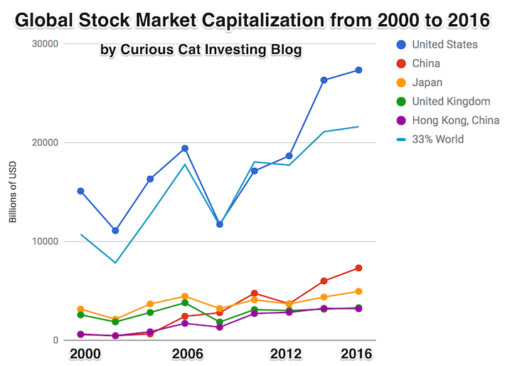
The chart shows the top countries based on stock market capitalization, with data from 2000 to 2016. The chart was created by Curious Cat Investing and Economics Blog may be used with attribution. Data from the World Bank.
It is important to keep in mind the data is shown in current USA dollars, so large swings in exchange rates can have a large impact.
China’s performance has been remarkable. China also shows some of the challenges in collecting this data. I am fairly certain Alibaba (BABA), one of the 10 most valuable companies in the world and a Chinese company has the stock issued in the USA (even this is confusing as it is a complex arrangement but the only publicly traded stock is traded in the USA). And many other Chinese companies are traded this way and therefore are not included in the Chinese total value. In addition Hong Kong is part of China but also separate. The data is reported separately by the world bank and I include them that way in the charts.
As with so much recent economic data China’s performance here is remarkable. China grew from 1.8% of world capitalization in 2000 to 6.9% in 2012 and 11.2% in 2016. Adding Hong Kong to China’s totals shows 3.7% in 2000 with growth to to 12.2% in 2012 and 16.2% in 2016. If you look at my post global stock market capitalization from 2000 to 2012 you will see significantly different historical data for Hong Kong. Collecting this data is much more complex than people realize and data determinations can change over the years resulting in changes in historical data.
The chart shows the 1/3 of the total global market capitalization in order to have the chart display look better (and it also makes it easier to compare the USA performance to the total global performance). The USA market capitalization was at 46.9% of the global market cap in 2000 and fell to 31.6% in 2000 before rising to 42% in 2016. This shows that the USA has largely held its own globally as measured by market cap. This may not seem impressive but when you consider that China has grown from 3.7% to 16.2% you can see that for the market cap outside of China the USA has actually gained quite a bit of ground. This is the result of what I mentioned before – how well USA companies have done at capture global markets (especially in high technology areas with very high profits and therefore very high market caps).
The countries I included in the first chart made up 68.4% of the global market cap in 2000 and 71.1% in 2016.

The chart shows countries outside the top 5 based on stock market capitalization, with data from 2000 to 2016. The chart created by Curious Cat Investing and Economics Blog may be used with attribution. Data from the World Bank.
One way to view the dominance of mega-companies is that the market cap for the top 4 stocks exceeds the market cap of all of Canada’s stocks (Apple $807 billion + Alphabet $687 billion + Microsoft $588 billion + Facebook $507 billion = $2.589 trillion). The next, Amazon $477 billion, bring the total for the top 5 to over $3 trillion. Something like the 8 most valuable Chinese companies would also exceed $2 trillion (including: Tencent, Alibaba, Industrial and Commercial Bank of China and China Mobile).
So this second chart is interesting for looking at the performance of stock markets in other countries but remember how small these are compared to the global market cap. The 7 countries included on this chart made up 13.9% of the global stock market cap in 2000 and 16.5% in 2016. The countries included are not the next 7 exactly (I don’t include Switzerland (which would actually be above the last 3) or Netherlands or South Africa (that beat out the 2016 market cap of Brazil by a little bit).
In this second chart India’s performance is the country that looks to me to be most deserving of attention. They have many strengths economically and many challenges. The next 10 years will be very telling for how rapidly they continue to improve economically.
Another important take away from this post is how much the large USA companies really represent investing in global prosperity. Local companies will benefit from the continued global economic gains but the huge USA companies will likely continue to do well also. It will be interesting to see how Chinese companies can adjust and seek to directly interact with consumers in other countries (so far much of China’s growth has been indirect [manufacturing for Apple…] or internal Chinese growth). There are some institutional challenges for Chinese companies seeking to make this transition so it will be interesting to see how that plays out.
On a small scale even this broad data can show that certain countries have success in the globalized world. Singapore’s market capitalization continues to grow impressively. And this is largely due to the ability of Singaporean companies to prosper in SE Asia and beyond. The data also show how quickly entire countries can slip – Brazil and Turkey show this dramatically and Mexico is also suffering (the shocking violence continues to be a huge drag on the country). To a lesser extent Malaysia’s strong performance has tripped up the last few years.
The South Africa and Indonesian markets have been performing well but like so many others in similar positions they feel as though even small problems can create big economic risks (the economies are just not robust enough to handle negative shocks well). There is a huge change when a country can reach the point where negative shocks can be absorbed fairly well. That requires many different aspects of the economy to be strong and a stock market with many strong companies are a huge help in achieving this state.
I would not be surprise to see a collection of the lower stock market capitalization countries increase in the next 20 years at rates higher than the largest (so countries like South Africa, Thailand, Mexico, Malaysia, Ghana, Indonesia, Philippines…). I would be surprised if some of the smaller countries don’t do poorly but some will likely do fantastically well and over-shadow the poor performers (from a global investors perspective).
I believe China will likely do well (while being volatile). The USA also has a chance to do very well – largely due to the international performance of many of the companies based there. The USA did many good things over the last 60 years (the smart decision by the USA in the 1950s and 1960 to push science and engineering as well, for example), but probably more of the reason for the USA’s success was the bad policies elsewhere. Today many countries in Asia and Europe are better focused on the value of science and engineering than the leaders in the USA are. The USA is coasting on the huge science and engineering infrastructure built and nourished earlier. The huge advantages of the richness of the USA are overlooked far too easily. Just coasting off that wealth allows pretty mediocre policy to result in continued prosperity for the USA and that will likely continue.
The data source I used for this post is from the World Bank and is a very well done web site [sadly the very good user experience (Ux) design found on this web site is rare]. The World Bank deserves praise for how well they have done with this web site. Even so there are oddities, such as no data for UK after 2010, so I use the value on UK data for 2012 and 2016 are not available from World Bank so I am using here for 2016 and made a guess for 2014.
* Market capitalization (also known as market value) is the share price times the number of shares outstanding. Listed domestic companies are the domestically incorporated companies listed on the country’s stock exchanges at the end of the year.
Related: – Stock Market Capitalization by Country from 1990 to 2010
Comments
1 Comment so far
[…] Stock Market Capitalization by Country from 2000 to 2016 […]