Tencent is one of the stocks in my 10 stocks for 10 years portfolio. In fact it is my largest holding (when you consider that Tencent shares owned by Naspers. Some others have performed better since my reboot of the portfolio in August of 2018: Apple (from 225 to 318) and Danaher (from 103 to 162) and Naspers (33 to 34, which might not seem so great but 2 spinoffs provide another 15) but I still like Tencent a great deal for the next 8 to 10 years.
Tencent has quite a few huge global businesses. One of the most promising areas is Tencent Gaming. Tencent has ownership in many of the largest computer gaming companies globally.

image by Fredrick Tendong
Tencent’s ownership share in Gaming companies
- Tencent Games – Honor of Kings (Arena of Valor outside of China) and esports leagues
- Riot Games (100%) – League of Legends and esports leagues
- Supercell (84%) – Clash of Clans, Clash Royale, and Brawl Stars
- Epic Games (40%) – Fortnite and Unreal Engine (gaming engine used to create many games)
- Activision Blizzard (5%) – Call of Duty, World of Warcraft, StarCraft, Diablo, Hearthstone, Heroes of the Storm, Overwatch, Guitar Hero and Candy Crush. They are also involved with esports. (Activision Blizzard is a public company in the USA valued at $46 billion)
- Ubisoft (5%) – Assassin’s Creed, Far Cry, Just Dance and Prince of Persia. (public French company worth $8.7 billion)
- Grinding Gear Games (80%) – Path of Exile
- Glu Mobile (14%) – many smaller games (public USA company valued at $915 million)
- Bluehole (12%) – PlayerUnknown’s Battlegrounds
- Paradox Interactive (5%) – Stellaris, Europa Universalis, Hearts of Iron, Crusader Kings, Cities: Skylines (public Swedish company valued at $1.2 billion?)
- Funcom (29%) (public Norwegian company valued at $145 million – after the stock price increased last week due to a Tencent a buyout offer)
- Sumo Digital (10%)
Tencent also have an undisclosed majority stake in Miniclip. And they own large portions of Huya and Douyu, both are big players in streaming games (similar to Twitch and YouTube Gaming).
Tencent’s subsidiary, TiMi Studios, developed Activision’s Call of Duty: Mobile.
Tencent gaming revenue struggled in 2019 due to regulatory actions in China created problems for all game publishers there. Long term global gaming revenue should continue to grow quickly and Tencent stands to be one of the best positioned companies to profit from that trend.
Read more
The stories you most frequently hear about China in Africa are
- resource extraction (oil, metals, etc.)
- infrastructure loans from China (with Chinese labor and Chinese companies doing the work, often to aid resource extraction)
- farming exports to China
While those are happening an excellent report from McKinsey (Dance of the Lions and Dragons) provides an in depth look at a much more entrepreneurial state of affairs. While there are big government backed efforts (including those with Chinese state owned company participation) there are many small companies making entrepreneurial investments led by Chinese entrepreneurs seeing a opening to build successful companies.
Chinese firms’ decisiveness is indicative of the relationship between the comparative advantages of Chinese entrepreneurs and the opportunities in African markets. To some, the high returns earned by Chinese firms are symptomatic of a market failure: too little competition in African markets. But in sectors such as manufacturing, there are too few African firms with the capital, technology, and skills to invest successfully and too few Western firms with the risk appetite to do so in Africa. Thus the opportunities are reaped by Chinese entrepreneurs who have the skills, capital, and willingness to live in and put their money in unpredictable developing-country settings.
What makes the decisiveness of Chinese investors all the more impressive is that they are mostly using their own money. Two-thirds of the private firms we surveyed, and over half of all firms in our sample, reported that their investments were self-financed through retained earnings or savings, or funded through personal loans. Only 13 percent of investment funds came from financing schemes linked to the Chinese government, and less than 20 percent came from Chinese or African commercial bank loans
I believe investments in Africa will provide great investment returns in the next 20 years. There are many challenges but the opportunity is much greater than most people realize. The potential returns are quite high due to the lack of capital and interest being shown in African opportunities.
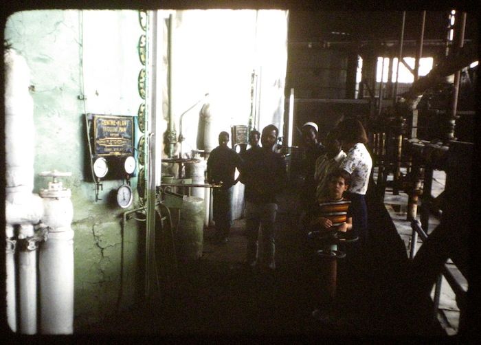
Factory in Nigeria (I think) that my family toured.
Likely huge companies, such as Google, Tencent, Facebook, Toyota and Alibaba will do very well. But there are many opportunities. That Africa is made up of 54 different countries creates challenges for investors and companies seeking to grow (but also creates variation and opportunities). It will be interesting to see how big the role Chinese entrepreneurs play in the next 20 years in Africa.
The report is an excellent detailed look at Chinese investment in Africa. It is a long and worthwhile read.
Related: Kiva Loans Give Entrepreneurs a Chance to Succeed – Drone Deliveries to Hospitals in Rwanda – Using Capitalism in Mali to Create Better Lives – Promoting Innovation in Sierra Leone
This post lists the 20 publicly traded companies with the largest market capitalization as of today. Since my May 2017 list of the 20 most valuable stocks many of the market caps have increased significantly.
In the 20 most valuable companies list there are 13 USA companies, 4 Chinese companies and 1 each for Korea, Netherlands and Switzerland. The remaining 17 companies with market caps above $200 billion are based in: USA 8, China 5, Switzerland 2, Japan 1 and Taiwan 1.
| Company | Country | Market Capitalization | |
|---|---|---|---|
| 1 | Apple | USA | $898 billion |
| 2 | Alphabet (GOOGL) | USA | $729 billion |
| 3 | Microsoft | USA | $642 billion |
| 4 | Amazon | USA | $572 billion |
| 5 | USA | $531 billion | |
| 6 | Tencent | China | $506 billion* |
| 7 | Alibaba | China | $492 billion |
| 8 | Berkshire Hathaway | USA | $451 billion |
| 9 | Johnson & Johnson | USA | $371 billion |
| 10 | Exxon Mobil | USA | $345 billion |
Tencent (China) soared $192 billion (61%) since my May 2017 post (after a 85% gain shown in the last post – behind only Samsung for largest percentage gain in that post). That gain pushed Tencent over a $500 billion market cap and moved them from 10th most valuable to 6th. Alibaba also soared $192 billion (64% for them) and moved into the top 10.
Apple gained $73 billion in market cap and is closing in on a market cap over $1 trillion since my May 2017 post. Microsoft, which continues to gain value rapidly even though it is not getting the attention of many of the internet companies, increased by $117 billion. Amazon added $106 billion to their market cap in the last 6 months. Alphabet (Google) gained $77 billion while Facebook increased by $94 billion.
The next ten most valuable companies:
| Company | Country | Market Capitalization | |
|---|---|---|---|
| 11 | JPMorgan Chase | USA | $341 billion |
| 12 | Industrial & Commercial Bank of China (ICBC) | China | $319 billion* |
| 13 | Samsung | Korea | $310 billion |
| 14 | Walmart | USA | $289 billion |
| 15 | China Unicom | China | $281 billion |
| 16 | Bank of America | USA | $277 billion |
| 17 | Wells Fargo | USA | $267 billion |
| 18 | Nestle | Switzerland | $267 billion |
| 19 | Royal Dutch Shell | Netherlands | $260 billion |
| 20 | Visa | USA | $254 billion |
Market capitalization shown are of the close of business November 26th, as shown on Google Finance.
GE continued to collapse, dropping another 62 billion add dropping well out of the top 20 (they were one of the 10 most valuable companies in 2016).
The total value of the top 20 gained $1.2 trillion since my February, 2016 post: growing from $7.2 trillion to $8.4 trillion. Remember, the companies making up the top 20 has changed (China Unicom, Visa and Royal Dutch Shell were added while GE, China Mobile and Roche dropped out).
As I noted in Stock Market Capitalization by Country from 2000 to 2016: Apple, Alphabet, Microsoft, Facebook and Amazon have a combined market capitalization greater than the entire stock market in every country but those in the USA, China and Japan.
Related: Global Stock Market Capitalization from 2000 to 2012 – Stock Market Capitalization by Country from 1990 to 2010 – Historical Stock Returns
A few other companies of interest (based on their market capitalization):
The total stock market capitalization by country gives some insight but it is also data that is a bit muddy. The data doesn’t tell you how the economies of the countries are doing as there is quite a bit of room for misinterpreting the data.
Apple, Alphabet, Intel, 3M, Abbvie… all are included in the USA market capitalization but much of their sales, earnings and employment are overseas. And USA companies have done very well in global markets so the USA totals are not just an indication how the USA has performed but includes great gains made by profiting from global growth. Also you may be surprised to learn that 26% of USA equities are owned by investors outside the USA.
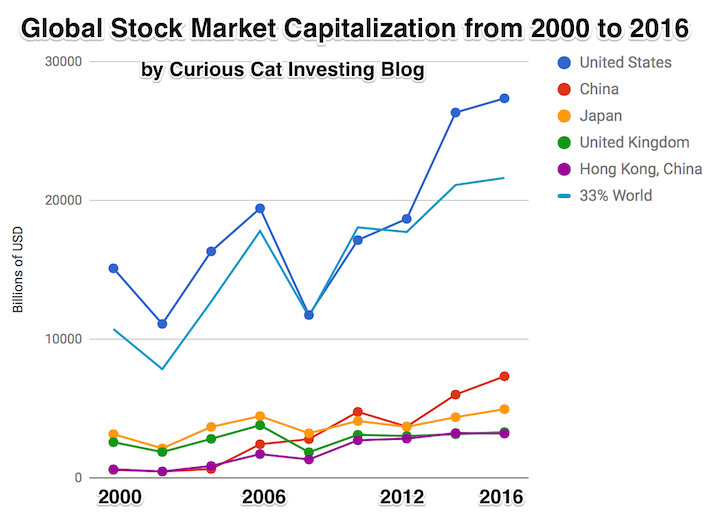
The chart shows the top countries based on stock market capitalization, with data from 2000 to 2016. The chart was created by Curious Cat Investing and Economics Blog may be used with attribution. Data from the World Bank.
It is important to keep in mind the data is shown in current USA dollars, so large swings in exchange rates can have a large impact.
China’s performance has been remarkable. China also shows some of the challenges in collecting this data. I am fairly certain Alibaba (BABA), one of the 10 most valuable companies in the world and a Chinese company has the stock issued in the USA (even this is confusing as it is a complex arrangement but the only publicly traded stock is traded in the USA). And many other Chinese companies are traded this way and therefore are not included in the Chinese total value. In addition Hong Kong is part of China but also separate. The data is reported separately by the world bank and I include them that way in the charts.
As with so much recent economic data China’s performance here is remarkable. China grew from 1.8% of world capitalization in 2000 to 6.9% in 2012 and 11.2% in 2016. Adding Hong Kong to China’s totals shows 3.7% in 2000 with growth to to 12.2% in 2012 and 16.2% in 2016. If you look at my post global stock market capitalization from 2000 to 2012 you will see significantly different historical data for Hong Kong. Collecting this data is much more complex than people realize and data determinations can change over the years resulting in changes in historical data.
The chart shows the 1/3 of the total global market capitalization in order to have the chart display look better (and it also makes it easier to compare the USA performance to the total global performance). The USA market capitalization was at 46.9% of the global market cap in 2000 and fell to 31.6% in 2000 before rising to 42% in 2016. This shows that the USA has largely held its own globally as measured by market cap. This may not seem impressive but when you consider that China has grown from 3.7% to 16.2% you can see that for the market cap outside of China the USA has actually gained quite a bit of ground. This is the result of what I mentioned before – how well USA companies have done at capture global markets (especially in high technology areas with very high profits and therefore very high market caps).
This post lists the 20 publicly traded companies with the largest market capitalization as of today. Since my February 2016 list of the 20 most valuable stocks many of the market caps have increased significantly.
| Company | Country | Market Capitalization | |
|---|---|---|---|
| 1 | Apple | USA | $825 billion |
| 2 | Alphabet (GOOGL) | USA | $652 billion |
| 3 | Microsoft | USA | $525 billion |
| 4 | Amazon | USA | $466 billion |
| 5 | USA | $437 billion | |
| 6 | Berkshire Hathaway | USA | $403 billion |
| 7 | Exxon Mobil | USA | $350 billion |
| 8 | Johnson & Johnson | USA | $334 billion |
| 9 | Samsung | Korea | $316 billion** |
| 10 | Tencent | China | $314 billion* |
Apple gained an amazing $284 billion in market cap since my February 2016 post. Only 12 companies (including Apple) are worth more than $284 billion. Amazon soared $204 billion (a 78% increase). Alphabet (Google) gained $156 billion in market cap.
Samsung soared $163 billion (a 107% gain) and Tencent soared $144 billion (a 85% gain) to move from outside the top 20 to become the 9th and 10th most valuable companies and the most valuable based outside the USA.
Facebook gained $126 billion and Microsoft gained $117 billion. GE lost $60 billion to drop out of the top ten. Wells Fargo also dropped out of the top 10.
The next ten most valuable companies:
| Company | Country | Market Capitalization | |
|---|---|---|---|
| 11 | JPMorgan Chase | USA | $308 billion |
| 12 | Alibaba | China | $298 billion |
| 13 | Wells Fargo | USA | $261 billion |
| 14 | Industrial & Commercial Bank of China | China | $258 billion* |
| 15 | Nestle | Switzerland | $253 billion |
| 16 | GE | USA | $240 billion |
| 17 | Bank of America | USA | $238 billion |
| 18 | Roche | Switzerland | $231 billion |
| 19 | Walmart | USA | $228 billion |
| 20 | China Mobile | China | $225 billion* |
Market capitalization shown are of the close of business May 12th, as shown on Google Finance.
In the 20 most valuable companies list there are 13 USA companies, 4 Chinese companies, 2 Swiss companies and 1 Korean company.
Alibaba (China) soared $131 billion (78%) and climbed to the 11th spot (from outside the top 20 last time). Bank of America soared $105 billion (up 79%).
Verizon was one of 2 companies in the top 20 to lose value in the period, Verizon declined $23 billion (over 10%) and dropped out of the top 20.
The total value of the top 20 gained $1.3 trillion since my February, 2016 post: growing from $5.9 trillion to $7.2 trillion. Remember, the companies making up the top 20 has changed.
Related: Global Stock Market Capitalization from 2000 to 2012 – Stock Market Capitalization by Country from 1990 to 2010 – Historical Stock Returns
A few other companies of interest (based on their market capitalization):
Read more
The Great Convergence by Richard Baldwin makes some interesting points about “globalization.” I actually find the long term history the most interesting aspect. It is very easy for people today to forget the recently rich “West” has not always been so dominant.
That shows how quickly things changed. The industrialization of Europe and the USA was an incredibly powerful global economic force. The rapid economic gains of Japan, Korea, Singapore, China and India in the last 50 years should be understood in the context of the last 200 years not just the last 100 years.
A central point Richard advocates for in the book is realizing that the current conditions are different from the conditions in which traditional economic theory (including comparative advantage) hold. The reasoning and argument for this claim are a bit too complex to make sensibly in this post but the book does that fairly well (not convincingly in my opinion, but enough to make the argument that we can’t assume traditional economic theory for international trade is completely valid given the current conditions).
I don’t expect this blog post to convince people. I don’t even think his book will. But he makes a case that is worth listen to. And I believe he is onto something. I have for years been seeing the strains of “comparative advantage” in our current world economy. That doesn’t mean I am not mainly a fan of freer trade. I am. I don’t think complex trade deals such as TPP are the right move. And I do think more care needs to be taken to consider current economic conditions and factor that into our trade policies.
Richard Baldwin uses 3 costs and the economic consequences of those changing over time to show globalizations history, where we are today and where we are going.
It isn’t very easy to follow but the book provides lots of explanation for the dramatic consequences of these costs changing over time.
One of his themes is that mobility of labor is still fairly costly. It isn’t easy to move people from one place to another. Though he does discuss how alternatives that are similar to this (for example telepresence and remote controlled robots to allow a highly technical person to operate remotely) without actually do moving the person are going to have huge economic consequences.
The “high spillovers” are the positive externalities that spin off of a highly knowledgable workforce.
Even though there are plenty of ways to improve the economic conditions for most people today is very good compared to similar people 50 years ago. There are a few, small population segments that there are arguments for being worse off, but these are a tiny percentage of the global population.
However, we humans often compare ourselves to whoever is better off than us and feel jealous. So instead of appreciating good roads, food, shelter, health care, etc. we see where things could be better (either our parents had it a bit better or these people I see on TV or in this other country, etc.). It is good to see how we could improve if we then take action to improve. To just be frustrated that others have it better doesn’t do any good, it doesn’t seem to me.
There are significant ways governments can help or hinder the economic well being of their citizens. I am a big believer in the power of capitalism to provide wealth to society. That isn’t the same as supporting the huge push to “crony capitalism” that many of the political parties throughout the world are promoting. The “capitalism” in that phrase exists for alliteration, the real meaning is the word crony.

street scene in Seoul, South Korea (photo by John Hunter)
These Are the World’s Most Innovative Economies
These type of rankings are far from accurate, what does most innovative really mean? But they do provide some insight and I think those at the top of the list do have practices worth examining. And I do believe those near the top of this list are doing a better job of providing for the economic future of their citizens than other countries. But the reality is much messier than a ranking illustrates.
With that in mind the ranking shows
- Korea
- Sweden
- Germany
- Switzerland
- Finland
- Singapore
- Japan
- Denmark
- USA
One thing that is obvious is the ranking is very biased toward already rich countries. When you look at the measures they use to rank it is easy to see this is a strong bias with their method.
China is 21st. Malaysia is 23rd and an interesting country doing very well compared to median income (I am just guessing without actually plotting data). Hong Kong is 35th, which is lower than I imagine most people would have predicted. Thailand is 44th. Brazil is 46th and even with their problems seems low. Brazil has a great deal of potential if they can take care of serious problems that their economy faces.
In a previous post I examined the GDP Growth Per Capita for Selected Countries from 1970 to 2010, Korea is the country that grew the most (not China, Japan, Singapore…).
Related: Leading Countries for Economic Freedom: Hong Kong, Singapore, New Zealand, Switzerland – Economic Consequences Flow from Failing to Follow Real Capitalist Model and Living Beyond Our Means – Easiest Countries in Which to Operate a Businesses (2011)
Solar energy capacity has been growing amazingly quickly the last few years. Part of the reason for this is the starting point was so low, making it easy to have large gains.
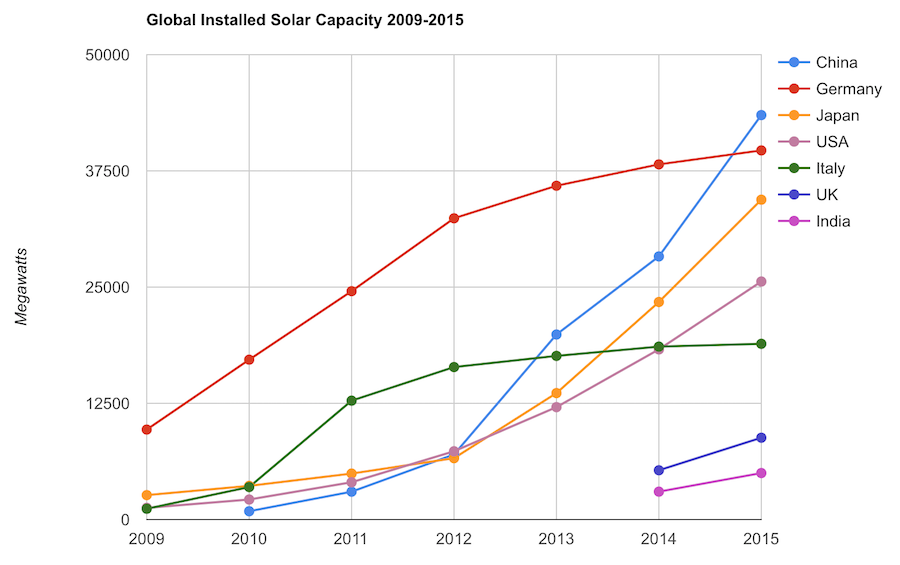
Chart by Curious Cat Economics Blog using data from the International Energy Agency (IEA) and the US Department of Energy. Chart may be used with attribution as specified here.
The 2014 and 2015 data on this chart is from IAE report for total installed photovoltaic (PV) solar capacity. See previous post on chart of Solar Energy Capacity by Country from 2009 to 2013. Different data sources for different year (and/or countries in the same year) is not ideal but for the purposes of this data in this post is sufficient.
Installed PV capacity is even more questionable that much other economic data. Economic data are always approximations of reality but with PV you have additional questions. The same plant located outside London or Rome have different capability to produce (and there are many factors that contribute not just the most obvious such as how much sun shines in a particular geography). Installed PV data is based on the capability of the equipment regardless of the solar potential of the location.
So even with the same investment it is likely Italy gets more production than Germany. The IAE report attempted to determine what was the likely ability of the solar PV capacity to produce for each country as a percentage of total electricity needs. They estimate Italy has the largest percentage of electricity needs capable of being produced by installed PV systems at 8%, with Greece at 7.4% and Germany at 7.1%. Japan is ranked 5th at just under 4%, UK is 12th at 2.5%, China is 22nd at 1%, India 24th and the USA 25th at close to .9%. They estimate the total global percentage at 1.3%.
These figures also show the huge power needs of China and the USA. Even with huge investments in Solar they us so much electricity that it is slow to make large gains in the percentage of total power generated by solar.
In the USA in 2013 solar energy capacity was under 1% USA total electrical capacity. In 2013 hydropower was 6.8%, wind was 5.3% and biomass was 1.3%. The increase in solar capacity should continue to grow rapidly and is making significant contributions to the macroeconomic energy picture (even if it doesn’t appear dramatic).
Related: Chart of Global Wind Energy Capacity by Country from 2005 to 2015 – Leasing or Purchasing a Solar Energy System For Your House – Nuclear Power Generation by Country from 1985-2010 – Manufacturing Output by Country 1999-2011: China, USA, Japan, Germany
The 10 publicly traded companies with the largest market capitalizations. Since October of last year the top 20 list has seen quite a bit of profit for stockholders (mainly in Apple and Chinese companies).
| Company | Country | Market Capitalization | |
|---|---|---|---|
| 1 | Apple | USA | $741 billion |
| 2 | Microsoft | USA | $374 billion |
| 3 | USA | $370 billion | |
| 4 | Exxon Mobil | USA | $352 billion |
| 5 | Berkshire Hathaway | USA | $346 billion |
| 6 | China Mobile | China | $340 billion* |
| 7 | Industrial & Commercial Bank of China | China | $306 billion** |
| 8 | Wells Fargo | USA | $292 billion |
| 9 | GE | USA | $275 billion |
| 10 | Johnson & Johnson | USA | $273 billion |
Apple’s market cap is up $115 billion since the last list was created in October of 2014. That increase is more than 50% of the value of the 14th most valuable company in the world (in October 2014).
China Mobile increased $100 billion and moved into 6th place. Industrial and Commercial Bank of China (ICBC) increased $78 billion to move into 7th place.
Exxon Mobil lost over $50 billion (oil prices collapsed as OPEC decided to stop attempting to hold back supply in order to maximize the price of oil). Alibaba (the only non-USA company in the last list) and Walmart dropped out of the top 10.
The total value of the top 20 increased from $5.722 trillion to $6.046 trillion, an increase of $324 billion. Several companies have been replaced in the new top 20 list.
The next ten most valuable companies:
| Company | Country | Market Capitalization | |
|---|---|---|---|
| 11 | JPMorgan Chase | USA | $250 billion |
| 12 | China Construction Bank | China | $250 billion** |
| 13 | Novartis (NVS) | Switzerland | $246 billion |
| 14 | Petro China | China | $237 billion |
| 15 | Wal-Mart | USA | $236 billion |
| 16 | Tencent | China | $235 billion** |
| 17 | Nestle | Switzerland | $235 billion*** |
| 18 | USA | $231 billion | |
| 19 | Hoffmann-La Roche (ROG.VX) | Switzerland | $231 billion |
| 20 | Alibaba | China | $226 billion |
Market capitalization shown are of the close of business last Friday, as shown on Yahoo Finance.
The current top 10 includes 8 USA companies and 2 Chinese companies. The 11th to 20th most valuable companies includes 4 Chinese companies, 3 Swiss companies and 3 USA companies. Facebook (after increasing $21 billion), China Construction Bank (increasing $68 billion – it is hard for me to be sure what the value is, I am not sure I am reading the statements correctly but this is my best guess) and Tencent moved into the top 20; which dropped Procter & Gamble, Royal Dutch Shell and Chevron from the top 20.
Related: Historical Stock Returns – Global Stock Market Capitalization from 2000 to 2012 – Stock Market Capitalization by Country from 1990 to 2010 – Solar Energy Capacity by Country (2009-2013)
A few other companies of interest (based on their market capitalization):
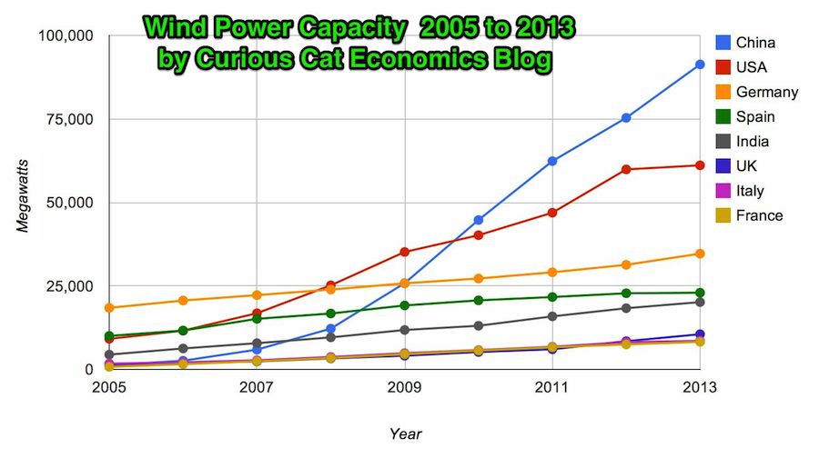
Chart by Curious Cat Economics Blog using data from the Wind Energy Association. Chart may be used with attribution as specified here.
In 2013 the addition to wind power capacity slowed a great deal in most countries. Globally capacity was increased just 13% (the increases in order since 2006: 26%, 27%, 29%, 32%, 25%, 19% and again 19% in 2012). China alone was responsible for adding 16,000 megawatts of the 25,838 total added globally in 2013.
At the end of 2013 China had 29% of global capacity (after being responsible for adding 62% of all the capacity added in 2013). In 2005 China had 2% of global wind energy capacity.
The 8 countries shown on the chart account for 81% of total wind energy capacity globally. From 2005 to 2013 those 8 countries have accounted for between 79 and 82% of total capacity – which is amazingly consistent.
Wind power now accounts for approximately 4% of total electricity used.
Related: Chart of Global Wind Energy Capacity by Country 2005 to 2012 – In 2010 Global Wind Energy Capacity Exceeded 2.5% of Global Electricity Needs – Global Trends in Renewable Energy Investment – Nuclear Power Generation by Country from 1985-2010