Solar energy capacity has been growing amazingly quickly the last few years. Part of the reason for this is the starting point was so low, making it easy to have large gains.
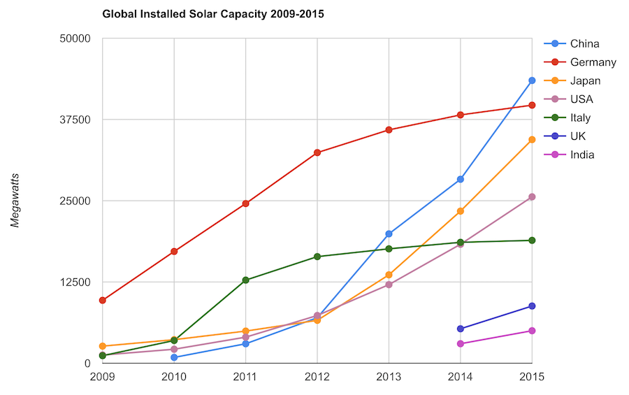
Chart by Curious Cat Economics Blog using data from the International Energy Agency (IEA) and the US Department of Energy. Chart may be used with attribution as specified here.
The 2014 and 2015 data on this chart is from IAE report for total installed photovoltaic (PV) solar capacity. See previous post on chart of Solar Energy Capacity by Country from 2009 to 2013. Different data sources for different year (and/or countries in the same year) is not ideal but for the purposes of this data in this post is sufficient.
Installed PV capacity is even more questionable that much other economic data. Economic data are always approximations of reality but with PV you have additional questions. The same plant located outside London or Rome have different capability to produce (and there are many factors that contribute not just the most obvious such as how much sun shines in a particular geography). Installed PV data is based on the capability of the equipment regardless of the solar potential of the location.
So even with the same investment it is likely Italy gets more production than Germany. The IAE report attempted to determine what was the likely ability of the solar PV capacity to produce for each country as a percentage of total electricity needs. They estimate Italy has the largest percentage of electricity needs capable of being produced by installed PV systems at 8%, with Greece at 7.4% and Germany at 7.1%. Japan is ranked 5th at just under 4%, UK is 12th at 2.5%, China is 22nd at 1%, India 24th and the USA 25th at close to .9%. They estimate the total global percentage at 1.3%.
These figures also show the huge power needs of China and the USA. Even with huge investments in Solar they us so much electricity that it is slow to make large gains in the percentage of total power generated by solar.
In the USA in 2013 solar energy capacity was under 1% USA total electrical capacity. In 2013 hydropower was 6.8%, wind was 5.3% and biomass was 1.3%. The increase in solar capacity should continue to grow rapidly and is making significant contributions to the macroeconomic energy picture (even if it doesn’t appear dramatic).
Related: Chart of Global Wind Energy Capacity by Country from 2005 to 2015 – Leasing or Purchasing a Solar Energy System For Your House – Nuclear Power Generation by Country from 1985-2010 – Manufacturing Output by Country 1999-2011: China, USA, Japan, Germany
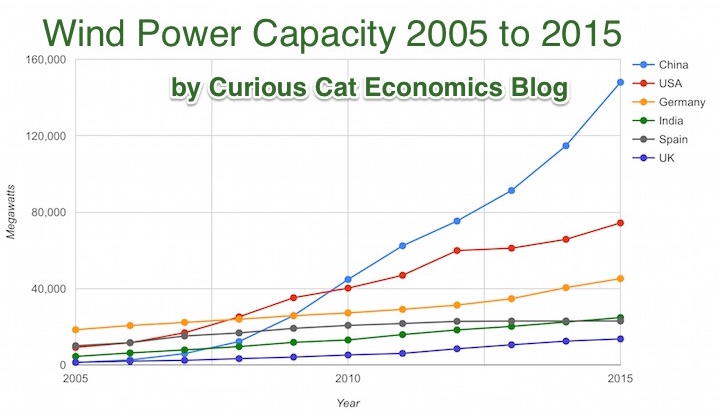
Chart by Curious Cat Economics Blog using data from the Wind Energy Association, data for 2014 and 2015. Chart may be used with attribution as specified here.
After a slowing of additional capacity added in 2013, both 2014 and 2015 saw a bit of a rebound in additions to global wind energy capacity. In 2013 capacity increased only 13% while in both 2014 and 2015 it increased 17%. Still 17% is less than any year in the last 10, except 2013.
At the end of 2013 China had 29% of global capacity (after being responsible for adding 62% of all the capacity added in 2013). In 2005 China had 2% of global wind energy capacity.
At the end of 2015 China accounted for 34% of global capacity, the only country in the top 8 increasing their share of global capacity. The USA now has 17% of capacity. Germany has 10%.
Europe moved first in adding large scale wind energy capacity but has added capacity very slowly in the last 5 years. Germany had 31% of global capacity in 2005. Spain had 17% in 2005 and now has just 5% (during that time Spain has more than doubled their wind energy capacity).
The 6 countries shown on the chart account for 76% of total wind energy capacity globally. From 2005 to 2015 those 8 countries have accounted for between 74 and 77% of total capacity – which is amazingly consistent.
Wind power now accounts for approximately 4 to 5% of total electricity used.
Related: Chart of Global Wind Energy Capacity by Country 2005 to 2013 – Solar Energy Capacity by Country (2005 to 2013) – Nuclear Power Generation by Country from 1985-2010 – Chart of Largest Petroleum Consuming Countries from 1980 to 2010
When I lived in Malaysia I learned that the residential electricity rates were very low for the low levels of use and climbed fairly rapidly as you used a lot of electricity (say running your air conditioner a lot). I think this is a very good idea (especially for the not yet rich countries). In rich countries even most of the “poor” have high use of electricity and it isn’t a huge economic hardship to pay the costs.
Effectively the rich end up subsidizing the low rates for the poor, which is a very sensible setup it seems to me. The market functions fairly well even though it is distorted a bit to let the poor (or anyone that uses very little electricity) to pay low rates.
In a country like Malaysia as people become rich they may well decide to use a great deal of electricity for air conditioning (it is in the tropics). But their ancestors didn’t have that luxury and having that be costly seems sensible to me. Allowing the poor to have access to cheap electricity is a very good thing with many positive externalities. And subsidizing the rate seems to be a good idea to me.
Often you get bad distortions in how markets work when you try to use things like subsidies (this post is expanded from a comment I made on Reddit discussing massive bad investments created by free electricity from the power company to city governments – including free electricity to their profit making enterprises, such as ice rinks in Puerto Rico).
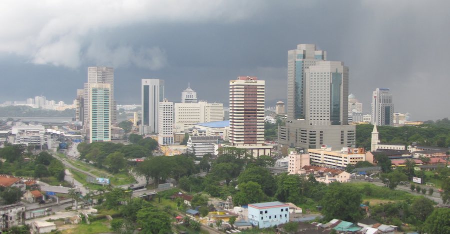
View of downtown Johor Bahru from my condo (a small view of Singapore visible is in the background)
With the model of low residential rates for low usage you encourage people to use less electricity but you allow everyone to have access at a low cost (which is important in poor or medium income countries). And as people use more they have to pay higher rates (per kwh) and those rates allow the power company to make a profit and fund expansion. Often in developing countries the power company will be semi-private so the government is involved in providing capital and sharing in profits (as well as stockholders).
The USA mainly uses central air conditioning everywhere. In Malaysia, and most of the world actually, normally they just have AC units in some of the rooms. In poor houses they may well have none. In middle class houses they may have a one or a couple rooms with AC units.
Even in luxury condos (and houses) they will have some rooms without AC at all. I never saw a condo or house with AC for the kitchen or bathrooms. The design was definitely setup to use AC in fairly minimal ways. The hallways, stairways etc. for the “interior” of the high rise condos were also not air conditioned (they were open to the outside to get good air flow). Of course as more people become rich there is more and more use of AC.
Related: Traveling for Health Care – Expectations – Looking at the Malaysian Economy (2013) – Pursuing a Growing Economy While Avoiding the Pitfalls That Befall to Many Middle Income Countries – Singapore and Iskandar Malaysia – Looking at GDP Growth Per Capita for Selected Countries from 1970 to 2010 – Malaysian Economy Continues to Expand, Budget Deficits Remain High (2012) – Iskandar Malaysia Housing Real Estate Investment Considerations (2011)
Solar energy capacity has been growing amazingly quickly the last few years. Part of the reason for this is the starting point was so low, making it easy to have large gains.
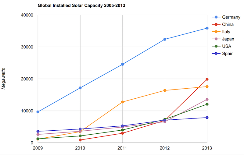
Chart by Curious Cat Economics Blog using data from the US Department of Energy. Chart may be used with attribution as specified here.
As with so many macro economic measures China has made enormous investments in solar energy the last few years. China’s increase in 2013 was larger than the USA’s total capacity at the end of 2013. Since solar energy use on a large scale is still small investments are quickly ramping up. Europe was a few years ahead of others putting countries like Germany, Spain and Italy far in the lead. China, the USA and Japan have been investing huge amounts the last few years and will likely leave those other than Germany (which already has such a large capacity) far behind very shortly.
In the USA, even after growing 60% in 2008, 53% in 2009, 71% in 2010, 86% in 2011, 83% in 2012 and 64% in 2013 solar energy capacity only totaled 1% of USA total electrical capacity. In 2013 hydropower was 6.8%, wind was 5.3% and biomass was 1.3%. The increase in solar capacity should continue to grow rapidly and is starting to make significant contributions to the macroeconomic energy picture.
When you look at total electricity generation solar only represented .5% (compared to 6.6% for hydropower 4.1% for wind and 1.5% for biomass).
USA data based on only solar capacity that is connected to the grid (and my guess would be that is the measure used in other countries too). Data is largely from that Department of energy report, with historical data for other countries pulled from previous editions.
The US Energy Information Agency (USEIA) expects the USA to add (net) 9,841 MW of wind capacity; 4,318 MW of natural gas capacity and 2,235 MW of solar in 2015. In 2015 they also predict a net decline of 12,922 MW of coal capacity. They also share that nuclear plants and natural gas combined-cycle generators having utilization factors 3 to 5 times those of wind and solar generators, which means capacity measures are significantly different from actually produced electricity measures.
The USEIA has predicted “global solar PV capacity seen rising from 98 GW in 2012 to 308 GW in 2018.” They predicted in 2018 China would have the most solar PV capacity followed by Germany, Japan and the USA.
The Solar Energy Industries Association (USA) states that 5,000 MW of solar capacity was added in the USA in 2013 and 7,000 MW in 2014. They forecast 8,000 MW to be added in 2015 and 12,000 MW in 2016.
Related: Solar Direct Investing Bonds – Chart of Global Wind Energy Capacity by Country 2005 to 2013 – Leasing or Purchasing a Solar Energy System For Your House – Nuclear Power Generation by Country from 1985-2010 – Google Invests $168 million in Largest Solar Tower Power Project (2011) – Molten Salt Solar Reactor Approved by California (2010) – 15 Photovoltaics Solar Power Innovations (2008)
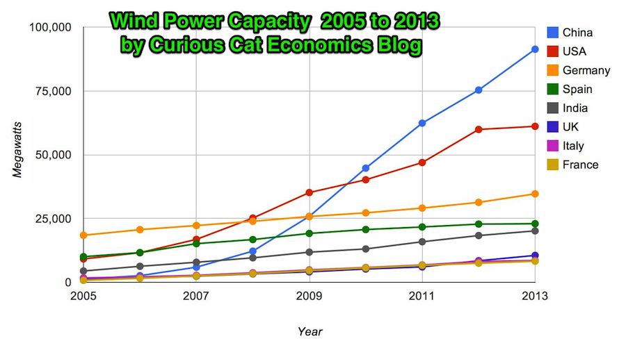
Chart by Curious Cat Economics Blog using data from the Wind Energy Association. Chart may be used with attribution as specified here.
In 2013 the addition to wind power capacity slowed a great deal in most countries. Globally capacity was increased just 13% (the increases in order since 2006: 26%, 27%, 29%, 32%, 25%, 19% and again 19% in 2012). China alone was responsible for adding 16,000 megawatts of the 25,838 total added globally in 2013.
At the end of 2013 China had 29% of global capacity (after being responsible for adding 62% of all the capacity added in 2013). In 2005 China had 2% of global wind energy capacity.
The 8 countries shown on the chart account for 81% of total wind energy capacity globally. From 2005 to 2013 those 8 countries have accounted for between 79 and 82% of total capacity – which is amazingly consistent.
Wind power now accounts for approximately 4% of total electricity used.
Related: Chart of Global Wind Energy Capacity by Country 2005 to 2012 – In 2010 Global Wind Energy Capacity Exceeded 2.5% of Global Electricity Needs – Global Trends in Renewable Energy Investment – Nuclear Power Generation by Country from 1985-2010
Global wind power capacity has increased 391% from 2005 to 2012. The capacity has grown to over 3% of global electricity needs.
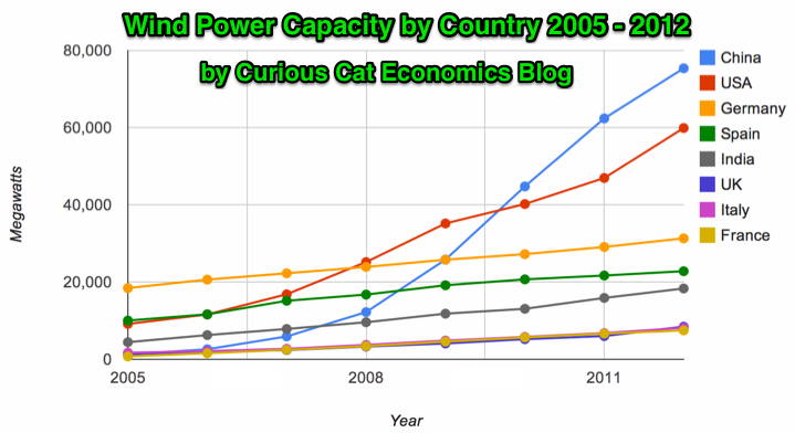
Chart by Curious Cat Economics Blog using data from the Wind Energy Association. Chart may be used with attribution as specified here.
The 8 countries shown on the chart account for 82% of total wind energy capacity globally. From 2005 to 2012 those 8 countries have accounted for between 79 and 82% of total capacity – which is amazingly consistent.
Japan and Brazil are 13th and 15th in wind energy capacity in 2012 (both with just over one third of France’s capacity). Japan has increased capacity only 97% from 2005 to 2012 and just 13% from 2010 to 2012. Globally wind energy capacity increased 41% from 2010 to 2012. The leading 8 countries increased by 43% collectively lead by China increasing by 68% and the USA up by 49%. Germany added only 15% from 2010 through 2012 and Spain just 10%.
Brazil has been adding capacity quickly – up 170% from 2010 through 2012, by far the largest increase for a county with significant wind energy capacity. Mexico, 24th in 2012, is another country I would expect to grow above the global rate in the next 10 years (I also expect Brazil, India and Japan to do so).
In 2005 China accounted for 2% of wind energy capacity globally they accounted for 30% in 2012. The USA went from 15% to 24%, Germany from 31% to 12%, Spain from 17% to 9% and India from 8% to 7%.
Related: Global Wind Energy Capacity Exceeds 2.5% of Global Electricity Needs (2011) – Nuclear Power Generation by Country from 1985-2010 – Chart of Wind Power Generation Capacity Globally 2005 to 2012 (through June)
The extremely large investment risks due to global climate change are in the minds of sensible investors. One risk people often fail to consider is the damage that can be done to our electronics and our electrical system (large scale distribution) by solar storms.
That’s not a lurid sci-fi fantasy. It’s a sober new assessment by Lloyd’s of London, the world’s oldest insurance market. The report notes that even a much smaller solar-induced geomagnetic storm in 1989 left 6 million people in Quebec without power for nine hours.
“We’re much more dependent on electricity now than we were in 1859,” explains Neil Smith, an emerging-risks researcher at Lloyd’s and co-author of the report. “The same event today could have a huge financial impact” — which the insurer pegs at up to $2.6 trillion for an especially severe storm. (To put that in context, Hurricane Sandy caused about $68 billion in damage.)
…
A truly severe geomagnetic storm could create currents powerful enough to overload electric grids and damage a significant number of high-voltage transformers, which can take a long time to repair or replace. That could leave millions without power for months or years.
…
there are technologies that could harden the grid, such as capacitors that can help block the flow of ground currents induced by a geomagnetic event. In Quebec, the Canadian government has spent about $1.2 billion on these technologies since the 1989 blackout.
Likely in the event of extremely large solar storms that knock out a significant number of large transformers would provide business to companies that manufacture replacements and companies that offer protection (once insurers raise insurance rates for unprotected equipment the economics will quickly justify the expenses).
I am still looking for investment ideas that stand to benefit from global climate change. We seem pretty determined not to take actions to reduce the risks so reducing the impacts seems unlikely. Mostly this will cause great damage to our standards of living (and even endangering many lives). But even so I image there will be some investments that should benefit.
Even if say global climate changes reduce global economic well being by 10% I don’t think it will be 10% evenly distributed. Some places/businesses.. will go down 20%, some 12% some 3% and I would think there is also the chance some will actually increase. But I have not been successful in thinking of investments that will benefit due to global climate change (and our refusal to take sensible steps to reduce the damage). If you have ideas add a comment.
I wish we would take significant action to reduce the damage global climate change will cause. But since we are not, and the damage will be huge, reducing what I can expect from average investment returns, seeking investments to help balance those losses is a wise step to take.
Related: Investment Risk Matters Most as Part of a Portfolio, Rather than in Isolation – Disability Insurance is Very Important – Unless We Take Decisive Action, Climate Change Will Ravage Our Planet – Solar Cycle Prediction – Don’t Expect to Spend Over 4% of Your Retirement Investment Assets Annually
Mosaic offers a new investment option to easily invest in solar energy projects. Mosaic connects investors seeking steady, reliable returns to high quality solar projects. To date, over $2.1 million has been invested through Mosaic and investors have received 100% on-time repayments.
The site provides full prospectives on each project. The yields have been between 4.5% and 5% for 8 to 10 year projects. The funds pay for solar installation and then the locations that take the loans pay them back with the saving on their electricity bill (sometimes selling power to the utility based on the organizations electricity needs and amount generated at any specific time).
The bonds have risks, of course. And I am pretty sure they are very illiquid. But for those looking for some decent yield alternatives they may offer a good choice. They also provide the benefit of supporting green energy
The current bond being offered, 657 kW on Pinnacle Charter School in Federal Heights, Colorado offers a yield of 5.4%. The public offerings have only been available for a few months and they have sold out quickly so far.
Mosaic has done a good job creating a simple process to invest online. You create your account and if you chose to invest and are allocated a portion of an offering it is funded from your bank account. You can invest as little as $25.
Related: Looking for Yields in Stocks and Real Estate – Taking a Look at Some Dividend Aristocrats – Pay as You Go Solar in India – posts on solar energy on Curious Cat Science and Engineering blog
Global Trends in Renewable Energy Investment 2012
…
renewable power (excluding large hydro) accounted for 44% of new generation
capacity added worldwide in 2011, up from 34% in 2010 [and 10% in 2004]. The $237 billion invested in building these green power plants compares with $223 billion of net new expenditure annually on building additional fossil-fuelled power plants globally last year.
…
Current predictions are that total installed capacity in non-hydro renewable power will rise ninefold to 2.5Tw by 2030, with investment in assets rising from $225 billion in 2011 to $395 billion-a-year by 2020 and $460 billion-a-year by 2030
Total investment in solar in 2011 increased 52% to $147 billion, driven by a drop of 50% in photovoltaic module prices. Investment in wind dropped 12% to $84 billion, while onshore wind turbine prices fell between 5 and 10%. Biomass and waste to energy was the 3rd largest renewable sector at $11 billion in investments (down 12% from 2010).
USA investment surged 51% to $51 billion just behind China at $52 billion (China increased investment in renewable energy by 17% from 2010). German investment dropped 12% to $31 billion.
In 2011 renewable energy power capacity (excluding large hydropower), as a percentage of total system capacity, reached 9%, up from 4% in 2004. Total renewable energy generation (excluding large hydro) reached 6%, up from 4% in 2004.
Related: Top Countries For Renewable Energy Capacity – Wind Energy Capacity Exceeds 2.5% of Global Electricity Needs – Leasing or Purchasing a Solar Energy System For Your Home
 The chart shows the top nuclear power producing countries from 1985 to 2010. The chart created by Curious Cat Investing and Economics Blog may be used with attribution. Data from US Department of Energy.
___________________
Nuclear power provided 14% of the world’s electricity in 2010. Wind power capacity increased 233% Worldwide from 2005 2010, to a total of 2.5% of global electricity needs. Nuclear power generation declined by .72% for the same period.
Burning coal was responsible for 41% of electricity generation in 2010. Burning natural gas accounted for 21% and hydroelectric generation accounted for 15%.
Japan just announced that they have closed their last operating nuclear power plant. They have no nuclear power plant generating electricity for the first time in more than 40 years. It will be interesting to see how low their actual generation totals fall this year. They plan to re-open some of the plants but it is a political issue that is far from settled.
Globally nuclear power production increased 84% from 1985 to 2010. This is a very low percentage. Global output over that period increased much more than that, as did global electricity use. The share of electricity production provided by nuclear power peaked at about 17% for much of the 1990s.
Related: Nuclear Power Production Globally from 1985 to 2009 – Oil Production by Country 1999-2009 – Top 10 Countries for Manufacturing Production from 1980 to 2010: China, USA, Japan, Germany… – Japan to Add Personal Solar Subsidies – Nuclear Energy Institute (statistics)
Another view of data on nuclear power shows which of the leading nuclear producing countries have the largest percentages of their electrical generating capacity provided by nuclear power plants (as of 2009). France has 75% of all electricity generated from nuclear power. Ukraine had the second largest percentage at 49%, then Sweden at 37% and South Korea at 35%. Japan is at 28% compared to 20% for the USA. Russia was at 18% and China was at just 2%.