The Great Convergence by Richard Baldwin makes some interesting points about “globalization.” I actually find the long term history the most interesting aspect. It is very easy for people today to forget the recently rich “West” has not always been so dominant.
That shows how quickly things changed. The industrialization of Europe and the USA was an incredibly powerful global economic force. The rapid economic gains of Japan, Korea, Singapore, China and India in the last 50 years should be understood in the context of the last 200 years not just the last 100 years.
A central point Richard advocates for in the book is realizing that the current conditions are different from the conditions in which traditional economic theory (including comparative advantage) hold. The reasoning and argument for this claim are a bit too complex to make sensibly in this post but the book does that fairly well (not convincingly in my opinion, but enough to make the argument that we can’t assume traditional economic theory for international trade is completely valid given the current conditions).
I don’t expect this blog post to convince people. I don’t even think his book will. But he makes a case that is worth listen to. And I believe he is onto something. I have for years been seeing the strains of “comparative advantage” in our current world economy. That doesn’t mean I am not mainly a fan of freer trade. I am. I don’t think complex trade deals such as TPP are the right move. And I do think more care needs to be taken to consider current economic conditions and factor that into our trade policies.
Richard Baldwin uses 3 costs and the economic consequences of those changing over time to show globalizations history, where we are today and where we are going.
It isn’t very easy to follow but the book provides lots of explanation for the dramatic consequences of these costs changing over time.
One of his themes is that mobility of labor is still fairly costly. It isn’t easy to move people from one place to another. Though he does discuss how alternatives that are similar to this (for example telepresence and remote controlled robots to allow a highly technical person to operate remotely) without actually do moving the person are going to have huge economic consequences.
The “high spillovers” are the positive externalities that spin off of a highly knowledgable workforce.
Even though there are plenty of ways to improve the economic conditions for most people today is very good compared to similar people 50 years ago. There are a few, small population segments that there are arguments for being worse off, but these are a tiny percentage of the global population.
However, we humans often compare ourselves to whoever is better off than us and feel jealous. So instead of appreciating good roads, food, shelter, health care, etc. we see where things could be better (either our parents had it a bit better or these people I see on TV or in this other country, etc.). It is good to see how we could improve if we then take action to improve. To just be frustrated that others have it better doesn’t do any good, it doesn’t seem to me.
There are significant ways governments can help or hinder the economic well being of their citizens. I am a big believer in the power of capitalism to provide wealth to society. That isn’t the same as supporting the huge push to “crony capitalism” that many of the political parties throughout the world are promoting. The “capitalism” in that phrase exists for alliteration, the real meaning is the word crony.

street scene in Seoul, South Korea (photo by John Hunter)
These Are the World’s Most Innovative Economies
These type of rankings are far from accurate, what does most innovative really mean? But they do provide some insight and I think those at the top of the list do have practices worth examining. And I do believe those near the top of this list are doing a better job of providing for the economic future of their citizens than other countries. But the reality is much messier than a ranking illustrates.
With that in mind the ranking shows
- Korea
- Sweden
- Germany
- Switzerland
- Finland
- Singapore
- Japan
- Denmark
- USA
One thing that is obvious is the ranking is very biased toward already rich countries. When you look at the measures they use to rank it is easy to see this is a strong bias with their method.
China is 21st. Malaysia is 23rd and an interesting country doing very well compared to median income (I am just guessing without actually plotting data). Hong Kong is 35th, which is lower than I imagine most people would have predicted. Thailand is 44th. Brazil is 46th and even with their problems seems low. Brazil has a great deal of potential if they can take care of serious problems that their economy faces.
In a previous post I examined the GDP Growth Per Capita for Selected Countries from 1970 to 2010, Korea is the country that grew the most (not China, Japan, Singapore…).
Related: Leading Countries for Economic Freedom: Hong Kong, Singapore, New Zealand, Switzerland – Economic Consequences Flow from Failing to Follow Real Capitalist Model and Living Beyond Our Means – Easiest Countries in Which to Operate a Businesses (2011)
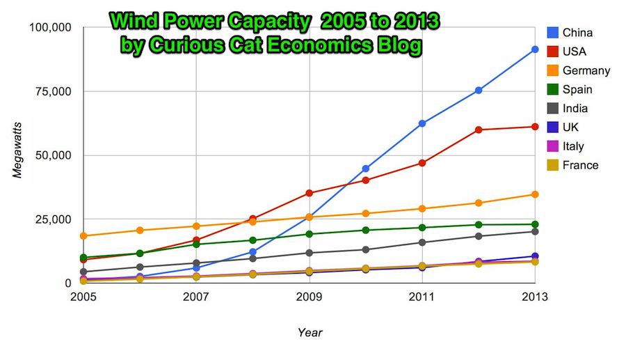
Chart by Curious Cat Economics Blog using data from the Wind Energy Association. Chart may be used with attribution as specified here.
In 2013 the addition to wind power capacity slowed a great deal in most countries. Globally capacity was increased just 13% (the increases in order since 2006: 26%, 27%, 29%, 32%, 25%, 19% and again 19% in 2012). China alone was responsible for adding 16,000 megawatts of the 25,838 total added globally in 2013.
At the end of 2013 China had 29% of global capacity (after being responsible for adding 62% of all the capacity added in 2013). In 2005 China had 2% of global wind energy capacity.
The 8 countries shown on the chart account for 81% of total wind energy capacity globally. From 2005 to 2013 those 8 countries have accounted for between 79 and 82% of total capacity – which is amazingly consistent.
Wind power now accounts for approximately 4% of total electricity used.
Related: Chart of Global Wind Energy Capacity by Country 2005 to 2012 – In 2010 Global Wind Energy Capacity Exceeded 2.5% of Global Electricity Needs – Global Trends in Renewable Energy Investment – Nuclear Power Generation by Country from 1985-2010
Global wind power capacity has increased 391% from 2005 to 2012. The capacity has grown to over 3% of global electricity needs.
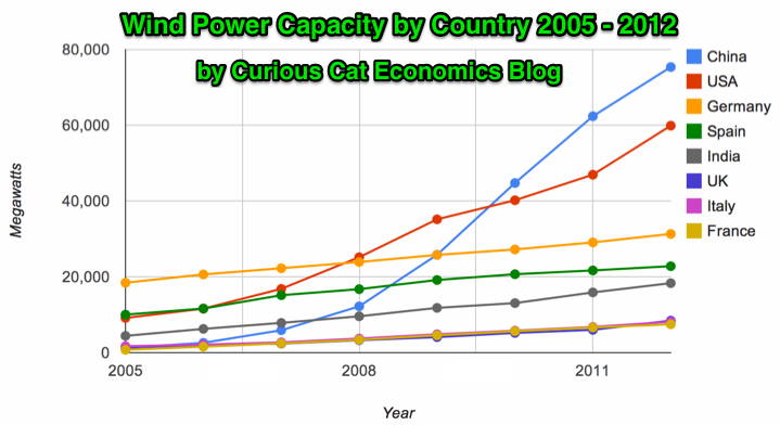
Chart by Curious Cat Economics Blog using data from the Wind Energy Association. Chart may be used with attribution as specified here.
The 8 countries shown on the chart account for 82% of total wind energy capacity globally. From 2005 to 2012 those 8 countries have accounted for between 79 and 82% of total capacity – which is amazingly consistent.
Japan and Brazil are 13th and 15th in wind energy capacity in 2012 (both with just over one third of France’s capacity). Japan has increased capacity only 97% from 2005 to 2012 and just 13% from 2010 to 2012. Globally wind energy capacity increased 41% from 2010 to 2012. The leading 8 countries increased by 43% collectively lead by China increasing by 68% and the USA up by 49%. Germany added only 15% from 2010 through 2012 and Spain just 10%.
Brazil has been adding capacity quickly – up 170% from 2010 through 2012, by far the largest increase for a county with significant wind energy capacity. Mexico, 24th in 2012, is another country I would expect to grow above the global rate in the next 10 years (I also expect Brazil, India and Japan to do so).
In 2005 China accounted for 2% of wind energy capacity globally they accounted for 30% in 2012. The USA went from 15% to 24%, Germany from 31% to 12%, Spain from 17% to 9% and India from 8% to 7%.
Related: Global Wind Energy Capacity Exceeds 2.5% of Global Electricity Needs (2011) – Nuclear Power Generation by Country from 1985-2010 – Chart of Wind Power Generation Capacity Globally 2005 to 2012 (through June)
Printing money (and the newer fancier ways to introduce liquidity/capital) work until people realize the money is worthless. Then you have massive stagflation that is nearly impossible to get out from under. The decision by the European and USA government to bail out the too big to fail institutions and do nothing substantial to address the problem leaves an enormous risk to the global economy unaddressed and hanging directly over our heads ready to fall at any time.
The massively too big to fail financial institutions that exist on massive leverage and massive government assistance are a new (last 15? years) danger make it more likely the currency losses value rapidly as the government uses its treasury to bail out their financial friends (this isn’t like normal payback of a few million or billion dollars these could easily cost countries like the USA trillions). How to evaluate this risk and create a portfolio to cope with the risks existing today is extremely challenging – I am not sure what the answer is.
Of the big currencies, when I evaluate the USA $ on its own I think it is a piece of junk and wouldn’t wan’t my financial future resting on it. When I look at the other large currencies (Yen, Yuan, Euro) I am not sure but I think the USD (and USA economy) may be the least bad.
In many ways I think some smaller countries are sounder but smaller countries can very quickly change – go from sitting pretty to very ugly financial situations. How they will wether a financial crisis where one of the big currencies losses trust (much much more than we have seen yet) I don’t know. Still I would ideally place a bit of my financial future scattered among various of these countries (Singapore, Australia, Malaysia, Thailand, Brazil [maybe]…).
Basically I don’t know where to find safety. I think large multinational companies that have extremely strong balance sheets and businesses that seem like they could survive financial chaos (a difficult judgement to make) may well make sense (Apple, Google, Amazon, Toyota, Intel{a bit of a stretch}, Berkshire Hathaway… companies with lots of cash, little debt, low fixed costs, good profit margins that should continue [even if sales go down and they make less they should make money – which many others won’t]). Some utilities would also probably work – even though they have large fixed costs normally. Basically companies that can survive very bad economic times – they might not get rich during them but shouldn’t really have any trouble surviving (they have much better balance sheets and prospects than many governments balance sheets it seems to me).
In many ways real estate in prime areas is good for this “type” of risk (currency devaluation and financial chaos) but the end game might be so chaotic it messes that up. Still I think prime real estate assets are a decent bet to whether the crisis better than other things. And if there isn’t any crisis should do well (so that is a nice bonus).
Basically I think the risks are real and potential damage is serious. Where to hide from the storm is a much tricker question to answer. When in that situation diversification is often wise. So diversification with a focus on investments that can survive very bad economic times for years is what I believe is wise.
Related: Investing in Stocks That Have Raised Dividends Consistently – Adding More Banker and Politician Bailouts in Not the Answer –
Failures in Regulating Financial Markets Leads to Predictable Consequences – Charlie Munger’s Thoughts on the Credit Crisis and Risk – The Misuse of Statistics and Mania in Financial Markets
Eurozone unemployment hits new high with quarter of under-25s jobless
The problem was most extreme in Greece where almost two-thirds of those under-25 are unemployed. The rate was 62.5% in February, the most recently available data.
…
Youth unemployment in Spain is 56.4%, in Portugal 42.5%. Italy recorded its highest overall unemployment rate since records began in 1977, at 12%, with youth joblessness at 40.5%. Economists said that the rise in unemployment was fairly broad-based with rises in so-called core countries as well, including Belgium and the Netherlands. The rate in France was 11%.
…
Ireland recorded one of the biggest falls in unemployment, down to 13.5% from 14.9% a year ago. That compares with a rate of 7.7% for the UK, where youth unemployment is 20.2%. The lowest rates for youth unemployment were in Germany at 7.5% and Austria at 8%.
Unemployment continues to be a huge problem. The slow recovery from the great recession caused by the too big to fail financial institutions continues to do great damage. That damage is very visible in unemployment figures and the huge transfer of wealth from savers to bail out otherwise failed financial institutions (that not only haven’t been made to be small enough to fail but continue to pay themseves enormous bonuses while taking the billions in transfer of wealth from retirees that have had their income sliced by the interest rate policies necessatated to bail out the bankers).
The USA employment situation is still bad but has actually could easily be much worse. Unemployment in the USA stands at 7.5% now (the rate for teenagers is 24.1%).
Related: 157,000 Jobs Added in January and Adjustments for the Prior Two Months add 127,000 More (Feb 2013) – USA Unemployment Rate Drops to 7.8%, 200,000 Jobs Added (Oct 2012) – USA Adds 216,00 Jobs in March and the Unemployment Rate Stands at 8.8% (March 2011)
When critics say that Europe is running out of time to deal with the financial crisis I wonder if they are not years too late. Both in Europe responding and those saying it is too late.
It feels to me similar to a situation where I have maxed out 8 credit cards and have a little bit left on my 9th. You can say that failing to approve my 10th credit card will lead to immediate pain. Not just to me, but all those I owe money to. That is true.
But wasn’t the time to intervene likely when I maxed out my 2nd credit card and get me to change my behavior of living beyond my means then? If you only look at how to avoid the crisis this month or year, yeah another credit card to buy more time is a decent “solution.”
But I am not at all sure that bailing out more bankers and politicians for bad financial decisions is a great long term strategy. It has been the primary strategy in the USA and Europe since the large financial institution caused great recession started. And, actually, for long before that the let-the-grandkids-pay-for-our-high-living-today has been the predominate economic “strategy” of the last 30 years in the USA and Europe.
That has not been the strategy in Japan, Korea, China, Singapore, Brazil, Malaysia… The Japanese government has adopted that strategy (with more borrowing than even the USA and European government) but for the economy overall in Japan has not been so focused on living beyond what the economy produces (there has been huge personal savings in Japan). Today the risks of excessive government borrowing in Japan and borrowing in China are potentially very serious problems.
I can understand the very serious economic problems people are worried about if bankers and governments are not bailed out. I am very unclear on how those wanting more bailout now see the long term problem being fixed. Unless you have some system in place to change the long term situation I don’t see the huge benefit in delaying the huge problems by getting a few more credit cards to maintain the fiction that this is sustainable.
We have seen what bankers and politicians have done with the trillions of dollars they have been given (by governments and central banks). It hardly makes me think giving them more is a wonderful strategy. I would certainly consider it, if tied to some sensible long term strategy. But if not, just slapping on a few more credit cards to let the bankers and politicians continue their actions hardly seems a great idea.
Related: Is the Euro Going to Survive in the Long Run? (2010) – Which Currency is the Least Bad? – Let the Good Times Roll (using Credit) – The USA Economy Needs to Reduce Personal and Government Debt (2009 – in the last year this has actually been improved, quite surprisingly, given how huge the federal deficit is) – What Should You Do With Your Government “Stimulus” Check? – Americans are Drowning in Debt – Failure to Regulate Financial Markets Leads to Predictable Consequences
 The chart shows the top nuclear power producing countries from 1985 to 2010. The chart created by Curious Cat Investing and Economics Blog may be used with attribution. Data from US Department of Energy.
___________________
Nuclear power provided 14% of the world’s electricity in 2010. Wind power capacity increased 233% Worldwide from 2005 2010, to a total of 2.5% of global electricity needs. Nuclear power generation declined by .72% for the same period.
Burning coal was responsible for 41% of electricity generation in 2010. Burning natural gas accounted for 21% and hydroelectric generation accounted for 15%.
Japan just announced that they have closed their last operating nuclear power plant. They have no nuclear power plant generating electricity for the first time in more than 40 years. It will be interesting to see how low their actual generation totals fall this year. They plan to re-open some of the plants but it is a political issue that is far from settled.
Globally nuclear power production increased 84% from 1985 to 2010. This is a very low percentage. Global output over that period increased much more than that, as did global electricity use. The share of electricity production provided by nuclear power peaked at about 17% for much of the 1990s.
Related: Nuclear Power Production Globally from 1985 to 2009 – Oil Production by Country 1999-2009 – Top 10 Countries for Manufacturing Production from 1980 to 2010: China, USA, Japan, Germany… – Japan to Add Personal Solar Subsidies – Nuclear Energy Institute (statistics)
Another view of data on nuclear power shows which of the leading nuclear producing countries have the largest percentages of their electrical generating capacity provided by nuclear power plants (as of 2009). France has 75% of all electricity generated from nuclear power. Ukraine had the second largest percentage at 49%, then Sweden at 37% and South Korea at 35%. Japan is at 28% compared to 20% for the USA. Russia was at 18% and China was at just 2%.
I really can’t figure out which currency is something I would want to hold if I had the option. It doesn’t really matter, since I am not going to act on it in a very direct way (maybe if I felt very strongly I would do something but it would probably be pretty limited), but I still keep thinking about this issue out of curiosity.
The USA dollar seems lousy to me. Huge debt (both government and consumer). Government debt is huge on the books and huge off the books (state and local retirement – and federal medical care [social security is really in much better shape than people think, though it also has issues 30 + years out}).
The Euro seemed a bit lame 3 years ago. Today it seems crazy to think at least one Euro country won’t default in the next 3 years – and likely more. And if they take steps to avoid that it seems like it is going to make the case for the Euro worse).
The Japanese Yen is much stronger than makes any sense to me. I think it is mainly because of how lousy all the options are. The huge government debt (worse than almost anywhere) and lousy demographics (and the refusal to deal with demographics with immigration or something) are big problems. The biggest reason for strength is that the individuals have huge savings (when your citizens own the debt it is much less horrible than when others do – especially when you are looking at currency value).
The Chinese Yuan is the best looking at the economic data. The problem is economic data is questionable for the best cases (looking at the USA, Japan…). China’s economic data is far from transparent. There is also great political and social risk. The current worries of a real estate bubble seems justified to me and China just this week took exactly the wrong action – trying to prop up the bubble (in order to decrease the economic slowdown). I can see either of these cases playing out 10 years from now: It was obvious the Yuan was the strongest currency you are an idiot for not being able to see that or It was obvious China was a bubble with unsustainable policies and likely social upheaval thinking that was anything but a sign to sell the Yuan was foolish.
Given all this I think I weakly come down on the side that the Yuan is likely to be the strongest.
The safest play I think is the US dollar (as lousy as it is on an absolute basis the options make it look almost good). It could get clobbered. But that seems less likely than the others getting clobbered.
Smaller currencies have some promise but they can be swamped by global moves. I really have no idea about the Brazilian Real. That might actually be a really good option. The Australian Dollar and Canadian Dollar may also. But those economies are really small. I don’t trust India: they have many good macro-economic factors but the climate for business leaves far too much to be desired (as does the pace of progress fixing those weaknesses). Many economist like them due to demographic factors. I understand that demographic factors will help, but without systemic reform I question how well India can do (it certainly has the potential to do amazingly well, but they seem to be significantly farther away from reaching their potential compared to many countries).
The Singapore Dollar seems good on many levels, but the economy is small. I am not really sure about emerging economies, there currencies can get swamped in a hurry. Thailand and Indonesia experienced this recently. Thailand, Indonesia and Malaysia are interesting to me in thinking about what their currencies may experience, I would like to read more on this.
This is more an intellectual and curiosity exercise than something I see directly tied to my investing strategy. But having clear answers of what I thought reasonable scenarios were for currencies going forward that would factor into my investing decisions. Right now, the confusing this causes me, leads me to favor companies that should be fine whatever happens: Apple, Google, Toyota, Intel (I don’t really like Facebook overall but in this way they fit). Lots of the stocks in my 12 stocks for 10 years portfolio, you might notice.
Related: Is the Euro Going to Survive in the Long Run? – Why the Dollar is Falling – Strong Singapore Dollar – Warren Buffett Cautions Against Buying Long Term USD Bonds
 Chart by Curious Cat Economics Blog using data from the Wind Energy Association. 2011 data is for the capacity on June 30, 2011. Chart may be used with attribution as specified here.
_________________________
In 2007 wind energy capacity reached 1% of global electricity needs. In just 4 years wind energy capacity has grown to reach 2.5% of global electricity demand. And by the end of 2011 it will be close to 3%.
By the end of 2011 globally wind energy capacity will exceed 240,000 MW of capacity. As of June 30, 2011 capacity stood at 215,000. And at the end of 2010 it was 196,000.
As the chart shows Chinese wind energy capacity has been exploding. From the end of 2005 through the end of 2011 they increased capacity by over 3,400%. Global capacity increased by 233% in that period. The 8 countries shown in the chart made up 79% of wind energy capacity in 2005 and 82% at the end of 2010. So obviously many of other countries are managing to add capacity nearly as quickly as the leading countries.
USA capacity grew 339% from 2005 through 2010 (far below China but above the global increase). Germany and Spain were leaders in building capacity early; from 2005 to 2010 Germany only increased 48% and Spain just 106%. Japan is an obvious omission from this list; given the size of their economy. Obviously they have relied heavily on nuclear energy. It will be interesting to see if Japan attempts to add significant wind and solar energy capacity in the near future.
Related: Nuclear Power Production by Country from 1985-2009 – Top Countries For Renewable Energy Capacity – Wind Power Capacity Up 170% Worldwide from 2005-2009 – USA Wind Power Installed Capacity 1981 to 2005 – Oil Consumption by Country 1990-2009