This chart shows government debt as a percent of GDP based on OECD data. The chart is limited to central government debt issuance and excludes therefore state and local government debt and social security funds.

Economic data is always a bit tricky to understand. It makes some sense that excluding social security would reduce the USA debt percentage a bit. But these debt as a percentage of GDP are lower than other sources show. There are obviously many tricks that can be used to hide debt and my guess is the main thing going on with this data is OECD intentionally trying to make things look as good as possible.
Still looking at historical trends in data is useful. And I believe looking at data from various sources is wise. There has been a dramatic increase from 2008-2010. The USA is up from 41% of GDP to 61%. Spain is up from 34% to 52% (but given all the concern with Spain this doesn’t seem to indicate the real debt problems they have.
Japan and France don’t have 2010 data, so I used a rough estimate of my own based on 2009 data. Greece has been over 100% since 1998 and now stands at 148%, 2nd worst (to Japan) for any OECD country (Europe, North America, Japan and Korea), Italy is 3rd. Ireland is at 61% (up from 28% in 2008). The UK is at 86%, up from 61%.
Related: Government Debt as Percentage of GDP 1990-2009: USA, Japan, Germany, China… (based on IMF data) – Government Debt as Percentage of GDP 1990-2008 – Government Debt Compared to GDP 1990-2007 – Top 15 Manufacturing Countries in 2009
 The chart shows the leading nuclear power producing countries from 1985-2009. The chart created by Curious Cat Investing and Economics Blog may be used with attribution. Data from US Department of Energy.
___________________
Nuclear power provided 14% of the world’s electricity in 2009. Wind power capacity increased 170% Worldwide from 2005-2009, to a total of 2% of electricity used (38,025 Megawatts of capacity). The USA produced nearly twice as much electricity using nuclear power than any other country, which surprised me.
Another view of data on nuclear power shows which of the leading nuclear producing countries have the largest percentages of their electrical generating capacity provided by nuclear power plants (as of 2009). France has 75% of all electricity generated from nuclear power. Ukraine had the second largest percentage at 49%, then Sweden at 37% and South Korea at 35%. Japan is at 28% compared to 20% for the USA (I am surprised these are so close _ would have thought France and Japan would be much closer). Russia is at 18% and China was at just 2%. As of January 2011, 29 countries worldwide are operating 442 nuclear reactors for electricity generation and 65 new nuclear plants are under construction in 15 countries. Source, Nuclear Energy Institute.
From 1985 to 2009, USA production increased 108%, France 84% and Japan up 77%. South Korea is up 550% (from a very low starting point). Globally nuclear power production increased 80% from 1985 to 2009. From 2000-2009 production increased 5% in the USA and decreased by 1% in France and 13% in Japan. China was up 318% (from a very low level) from 2000-2009 (they did not have nuclear power capacity prior to 1995.
The global capacity of nuclear power was scheduled to increase more rapidly in the future before the earthquake in Japan and the crisis at the Kashiwazaki-Kariwa Nuclear Power Plant. China was going to add a great deal of capacity and is likely to over the next few years (nuclear power plants take many year to bring online so those coming online in the next few years have already had hundreds of millions invested in building them). Several European countries have already announced temporary closing of some plants (especially some plants nearing the end of their originally scheduled lives – which those countries had been in the process of extending).
As a comparison global oil production increased by 10.5% from 1999-2009, while nuclear global production increased by 5% from 2000-2009. From 1999-2009 USA oil production decreased 7%. Russia increased production 62% in the decade, moving it into first place ahead of Saudi Arabia that increased production 10%.
Related: Oil Production by Country 1999-2009 – Oil Consumption by Country 1990-2009 – Japan to Add Personal Solar Subsidies – Solar Thermal in Desert, to Beat Coal by 2020
The world today has a much different economic landscape than just 20 years ago. China’s amazing economic growth is likely the biggest story. But the overwhelming success of many other countries is also a huge story. Today it is not the developing world that has governments spending taxes they promise their grandchildren will pay, but instead the richest countries on earth that choose to spend today and pay tomorrow. While “developing” countries have well balanced government budgets overall.
 The chart shows gross government debt as percentage GDP from 1990-2009. By Curious Cat Investing and Economics Blog, Creative Commons Attribution. Data source: IMF
___________________________
There are plenty of reasons to question this data but I think it gives a decent overall picture of where things stand. It may seem like government debt should be an easy figure to know but even just agreeing what would be the most reasonable figure for one country is very difficult, comparing between countries gets even more difficult and the political pressures to reduces how bad the data looks encourages countries to try and make the figures look as good as they can.
The poster child for irresponsible spending is Japan which has gross government debt of 218% of GDP (Japan’s 2009 figure is an IMF estimate). Greece is at 115%. Gross debt is not the only important figure. Government debt held within the country is much less damaging than debt held by those outside the country. Japan holds a large portion of its own debt. If foreigners own your debt then debt payments you make each year are paid outside your country and it is in essence a tax of a portion of your economic production that must be paid. If the debt is internal it mean taxpayers have to support bond holders each year (but at least when those bondholders spend the money it stays within your economy).
Read more
Countries that can still be travelled on the cheap
If you’re keen to surf or lie on the beach you’re all set to have an adventure for peanuts. As long as you steer clear of tourist-trap resorts, you’ll struggle to spend more than $23.50 a day. Nourish your inner cheapskate and buy souvenirs away from the tourist areas; head to the central market in Denpasar or Ubud’s Pasar Sukowati.
…
Eastern Europe used to be dirt cheap back in the good old days of the Cold War. Now that peace has broken out, costs are on the up. Poland, though, is still at the inexpensive end: a daily budget of $29 will easily get you around the country.
Poland is a nation that’s been run over so many times by invading forces that it’s become bulletproof. Now this EU member is on the rise, so get in quick before the prices go up for good. Rural towns are picturesque and cheap to visit; tiny towns like Krasnystaw in the Lubelskie region are a miser’s wonderland.
…
If you’re looking for a scuba-diving destination where you can put your entire budget into going under, Honduras is the place to be. With sleeping budgets as low as $12 a night and meals available for even less you can really stretch out the funds.
Sitting pretty next door to the Caribbean Sea, you’ll have plenty of time to count your pennies as you sun yourself on the golden beaches. The developers haven’t invaded quite yet, but you’d better get in quick, before the good old days slip into the past.
After snorkelling and kayaking around Roatan’s West Beach, splurge on a visit to the Unesco-listed Archaeological Park of Copan; entry is $18.
Related: Great Time for a Vacation – Travel guide books – Traveling To Avoid USA Health Care Costs – Travel Photo blog
In previous posts I have shown data for global manufacturing output by country. One of the things those posts have showed is that manufacturing output in China is growing tremendously, but it is also growing in the United States. The chart below shows manufacturing production by country as a percent of GDP. China dominates again, with over 30% of the GDP from manufacturing.

Chart showing manufacturing output, as percent of GDP, by country was created by the Curious Cat Economics Blog based on UN data* (based on current USA dollars). You may use the chart with attribution.
For the 14 biggest manufacturing countries in 2008, the overall manufacturing GDP percentage was 23.7% of GDP in 1980 and dropped to 17% in 2008. I left India (15% in 1980, 15% in 2008), Mexico (20%, 18%), Canada (17%, 13%), Spain (25%, 14%) and Russia (21% in 1990 [it was part of USSR in 1980], 15%) off the chart.
Over the last few decades Korea, and to some extent China, are the only countries that have increased the percent of GDP from manufacturing. China has not only grown manufacturing activity tremendously but also other areas of the economy (construction, mining, information technology). The countries with the largest manufacturing portions of their economies in 2008 were: China 32%, South Korea 25%, Japan and Germany at 21%. The next highest is Mexico at 18% which declined slightly over the last 15 years (with NAFTA in place). Globally, while manufacturing has grown, other areas of economic activity have been growing faster than manufacturing.
The manufacturing share of the USA economy dropped from 21% in 1980 to 18% in 1990, 16% in 2000 and 13% in 2008. Still as previous posts show the USA manufacturing output has grown substantially: over 300% since 1980, and 175% since 1990. The proportion of manufacturing output by the USA (for the top 14 manufacturers) has declined from 31% in 1980, 28% in 1990, 32% in 2000 to 24% in 2008. The proportion of USA manufacturing has declined from 33% in 1980, 29% in 1990, 36% in 2000 to 30% in 2008. While manufacturing output has grown in the USA it has done so more slowly than the economy overall.
Related: The Relative Economic Position of the USA is Likely to Decline – Manufacturing Data, Accuracy Questions – Top 12 Manufacturing Countries in 2007 – Manufacturing Employment Data: 1979 to 2007 – USA Manufacturing Output Continues to Increase (over the long term)
* I made edits to the 1980 Brazil manufacturing data and 1980, 1985 and 2008 China manufacturing data because the UN data only showed manufacturing data combined with mining and utility data. And I am using older UN data that had manufacturing separated from mining and utility figures for China in the other years.
To me, the prospects of a Euro currency surviving over the long term were not helped this week. The markets have behaved as though some great solutions have been adopted but it seems to me the fundamental problems if anything are worse now. It is true the short term is more stable. But at what cost?
Bailout Is ‘Nail in the Coffin’ for Euro, Rogers Says
“I was stunned,” Rogers, chairman of Rogers Holdings, said in a Bloomberg Television interview in Singapore. “This means that they’ve given up on the euro, they don’t particularly care if they have a sound currency, you have all these countries spending money they don’t have and it’s now going to continue.”
…
“It’s a political currency and nobody is minding the economics behind the necessities to have a strong currency,” Rogers said. “I’m afraid it’s going to dissolve. They’re throwing more money at the problem and it’s going to make things worse down the road.”
This makes sense to me. The problems with the Euro also explain why the dollar hasn’t fallen more over the last few years. The only significant alternative is the Yen. The BRIC countries (Brazil, Russia, India and China) are looking to increase the profile of their currencies supposedly – or even forming their version of the Euro (I can’t see how that could happen).
…
[Rogers suggests] Investors should instead buy precious metals including gold or currencies of countries that have large natural resources, Rogers said. Among other asset classes, he favors agricultural commodities as the best bet for the next decade as well as silver because prices haven’t rallied.
It is very difficult for the politicians in the USA, United Kingdom and other countries to behave fiscally responsible when their taxpayers will eventually have to pay the bill. When you can hope to have others bail you out it seems that much less likely people will behave responsibly. Then again I was skeptical the Euro would be created without first having more consolidation of European governments. There are lots of good things about having the Euro, but in the long run there are very challenging issues to deal with.
Related: Jim Rogers on the Financial Market Mess – Why the Dollar is Falling – A Bull on China
Roubini Says Rising Sovereign Debt Leads to Inflation, Defaults
“The thing I worry about is the buildup of sovereign debt,” said Roubini
…
If the problem isn’t addressed, he said, nations will either fail to meet obligations or experience higher inflation as officials “monetize” their debts, or print money to tackle the shortfalls.
…
“While today markets are worried about Greece, Greece is just the tip of the iceberg, or the canary in the coal mine for a much broader range of fiscal problems,”
…
Greece “could eventually be forced to get out” of the 16- nation euro region, he said in a Bloomberg Television interview yesterday. That would lead to a decline in the euro and make it “less of a liquid currency,” he said. While a smaller euro zone “makes sense,” he said, “it could be very messy.”
…
[Roubini supports] a carbon tax on gasoline, with Roubini saying it would reduce American dependence on oil from overseas, shrink the trade deficit and carbon emissions, and help pay down the U.S. budget deficit.
I agree that the damage done by those (which is nearly all of them) countries living beyond their means is significant. The USA and many countries in Europe and Asia (South Korea and China are two exceptions) have raised taxes on the future (by default – spending more than you have necessarily increases taxes later) to consume today. The strong emerging markets are another exception, many having learned their lessons and stopped spending money they didn’t have in the 1990’s.
However the richest countries have been spending money they don’t have for decades and the increase in government debt as a portion of GDP is an increasingly serious problem. It would be nice if the government of the rich countries could behave responsibly but it does not look like many of them have citizens who will elect honest and competent leaders. As long as they elect leaders that insist on raising taxes on the future (and lying to the populace by claiming they cut taxes – because they eliminate taxes today) those countries will pay severely for the irresponsible spending.
Saying you cut taxes when you just delay them is equivalent to saying I paid off my credit card bill when all I did was get 2 new credit cards, borrow all the money I owed on my original card, pay that one off, and then borrow more to increase my debt even more. Yes it is true I did pay off my original credit card, but that is hardly the salient point. My credit card debt increase. All that has happened in the USA since the Clinton administration had a balanced budget is politicians used a credit card thinking to lower taxes while necessarily increasing them in the future. You don’t reduce debt by spending money you don’t have.
Read more
From Greg Mankiw’s Blog
Taxes/GDP x GDP/Person = Taxes/Person
France .461 x 33,744 = $15,556
Germany .406 x 34,219 = $13,893
UK .390 x 35,165 = $13,714
US .282 x 46,443 = $13,097
Canada .334 x 38,290 = $12,789
Italy .426 x 29,290 = $12,478
Spain .373 x 29,527 = $11,014
Japan .274 x 32,817 = $8,992
The USA is the 2nd lowest for percent of GDP taxes 28.2% v 27.4% for Japan. But in taxes per person toward the middle of the pack. France which has 46% taxes/GDP totals $15,556 in tax per person compared to $13,097 for the USA.
Related: Government Debt as Percentage of GDP 1990-2008 – USA, Japan, Germany… – Oil Consumption by Country in 2007 – USA, China and Japan Lead Manufacturing Output in 2008 – Bigger Impact: 15 to 18 mpg or 50 to 100 mpg?
Recently Greece and the huge USA federal deficits have highlighted the problem of excessive government debt. The above chart shows gross government debt by country from the IMF.
Korea has essentially no gross government debt (under 2% of GDP for the entire period). At the other end of the spectrum Japan has seen gross government debt rise to 197% (Japan’s 2008 figure is an IMF estimate). The IMF did not have data for Greece (which would likely look very bad) or China (which I would think would be very low – maybe even negative – the government having more assets than debt).
The USA debt stood at 64% in 1990, 71% in 1995, 55% in 2000, 61% in 2005 and 70% in 2008. Most countries are expected to see significant increases in 2009. The IMF sees the USA going to 85% in 2009 and 100% in 2012. They see Germany at 79% in 2009 and 90% in 2012. They See the UK at 69% in 2009 and 94% in 2012. They see Japan at 237% in 2012.
 The chart shows gross government debt as percentage GDP 1990-2008. By Curious Cat Investing and Economics Blog, Creative Commons Attribution.
___________________________
The data here is very similar to the OECD data I provided earlier, Government Debt Compared to GDP 1990 to 2007, though with some notable differences. In the OECD data was still in the best shape, but is seen as having 29% debt to GDP in 2007. The IMF data attempts to avoid issues where some countries have debt of non-federal governments that are hidden when looking just at federal government debt.
Data source: IMF data (for some countries the data is also from that site but at different urls).
Related: The Long-Term USA Federal Budget Outlook – USA, China and Japan Lead Manufacturing Output in 2008 – Oil Consumption by Country in 2007 – Saving Spurts as Spending Slashed
Once again the USA was the leading country in manufacturing in 2008. And once again China grew their manufacturing output amazingly. In a change with recent trends Japan grew output significantly. Of course, the 2009 data is going to show the impact of a very severe worldwide recession.
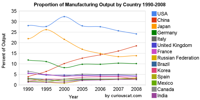 Chart showing the percentage output of top manufacturing countries from 1990-2008 by Curious Cat Management Blog, Creative Commons Attribution.
The first chart shows the USA’s share of the manufacturing output, of the countries that manufactured over $185 billion in 2008, at 28.1% in 1990, 27.7% in 1995, 32% in 2000, 28% in 2005, 28% in 2006, 26% in 2007 and 24% in 2008. China’s share has grown from 4% in 1990, 6% in 1995, 10% in 2000, 13% in 2005, 14% in 2006, 16% in 2007 to 18% in 2008. Japan’s share has fallen from 22% in 1990 to 14% in 2008. The USA has about 4.5% of the world population, China about 20%. See Curious Cat Investment blog post” Data on the Largest Manufacturing Countries in 2008.
Even with just this data, it is obvious the belief in a decades long steep decline in USA manufacturing is not in evidence. And, in fact the USA’s output has grown substantially over this period. It has just grown more slowly than that of China (as has every other country), and so while output in the USA has grown the percentage with China has shrunk. The percentage of manufacturing output by the USA (excluding output from China) was 29.3% in 1990 and 29.6% in 2008. The second chart shows manufacturing output over time.
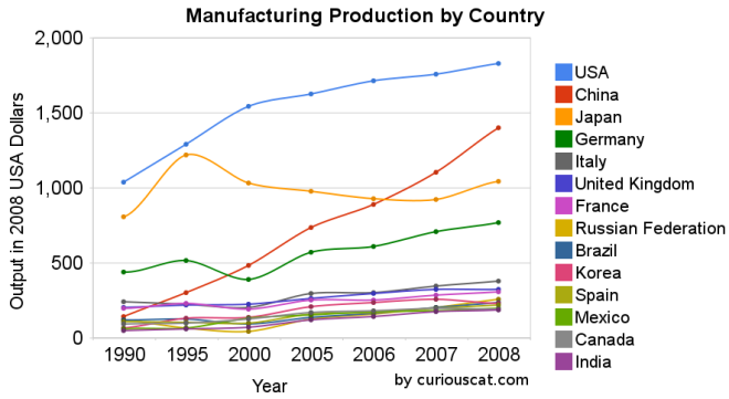 Chart showing the output of the top manufacturing countries from 1990-2008 by Curious Cat Management Blog, Creative Commons Attribution.
The 2008 China data is not provided for manufacturing alone (the latest UN Data, for global manufacturing, in billions of current USA dollars). The percentage of manufacturing (to manufacturing, mining and utilities) was 78% for 2005-2007 (I used 78% of the manufacturing, mining and utilities figure provided in the 2008 data). There is a good chance this overstates China manufacturing output in 2008 (due to very high commodity prices in 2008).
Hopefully these charts provide some evidence of what is really going on with global manufacturing and counteracts the hype, to some extent. Global economic data is not perfect. These figures are an attempt to capture the economic reality in the world but they are not a perfect proxy. This data is shown in 2008 USA dollars which is good in the sense that it shows all countries in the same light and we can compare the 1995 USA figure to 2005 without worrying about inflation. However foreign exchange fluctuations over time can show a country, for example, having a decline in manufacturing output in some year when in fact the output increased (just the decline against the USA dollar that year results in the data showing a decrease – which is accurate when measured in terms of USA dollars).
If the dollar declines substantially between when the 2008 data was calculated and the 2009 data is calculated that will give result in the data showing a substantial increase in those countries that had a currency strengthen against the USA dollar. At this time the Chinese Renminbi has not strengthened while most other currencies have – the Chinese government is retaining a peg to a specific exchange rate.
Korea (1.8% in 1990, 3% in 2008), Mexico (1.7% to 2.6%) and India (1.4% to 2.5%) were the only countries to increase their percentage of manufacturing output (other than China, of course, which grew from 3.9% to 18.5%).
Related: posts on manufacturing – Global Manufacturing Data by Country (2007) – Global Manufacturing Employment Data – 1979 to 2007 – Top 10 Manufacturing Countries 2006 – Top 10 Manufacturing Countries 2005