The $1.9 trillion covid19 relief law (American Rescue Plan Act) includes large increases in health insurance subsidies in addition to the $1,400 per person payments to individuals. The law increases subsidies for 2 years.
Under the new law, nobody will have to pay more than 8.5% of their income on health insurance. The government will also pick up 100% of COBRA premiums through September. COBRA is health insurance for people who’ve lost their jobs.
“Probably about three-quarters of uninsured people in the U.S. who are citizens are going to be eligible for some sort of financial help,” said Cynthia Cox, a vice president at the Kaiser Family Foundation.
I wrote before about the fact that under the old law, based on how the subsidy worked you could lose over $5,000 in health care subsidy payments by earning just enough to no longer be eligible for the subsidy. This new law eliminates that issue (for 2 years) as health insurance costs are now subsidized so that they cost no more than 8.5% of income (instead of having a hard cut off where subsidies go to $0).

For people most people that pay for their health care themselves (instead of their employer paying) this is likely a much larger benefit than the cash payment of $1,400.
The Kaiser Family Foundation calculator lets you get a quick idea of what your approximate subsidy benefit. A 55 year old earning $55,000 would be entitled to a subsidy of $4,700 about 50% of their health insurance costs (based on the USA average). For a 50 year old the subsidy would be $2,900 or 38%. For a 60 year old the subsidy would be $6,800 or 59%. For a couple of 35 year olds and 2 children the subsidy would be $12,100 per year or 72%.
For a 35 year old couple earning $85,000 with 2 children the subsidy would be $9,600 per year or 57%. And for a 55 year old earning $85,000 the the subsidy would be $2,200 per year or 23%.
Only the family of 4 would have been eligible for any subsidies under the old law (or will be eligible after this new law expires in 2 years). And the single 55 year old earning more than $80,000 is not eligible for the $1,400 payment but would receive $2,200 as a health care subsidy.
This is a huge personal finance benefit that has not been widely discussed but will have a huge impact on people’s financial health for the next 2 years.
There are many problems with the extremely low interest rates available in decade since the too-big-to-fail financial crisis. The interest rates seem to me to be artificially sustained by massive central bank actions for 12 years now.
Extraordinarily low rates encourage businesses to borrow money, after all how hard is it to invest in something that will return the business more than a few percent a year (that they can borrow at). Along with the continued efforts by the central banks to flood the economy with money any time there is even a slowdown in growth teaches companies to not worry about building a business that can survive bad times. Just borrow and if necessary borrow more if you are having trouble then just borrow more.
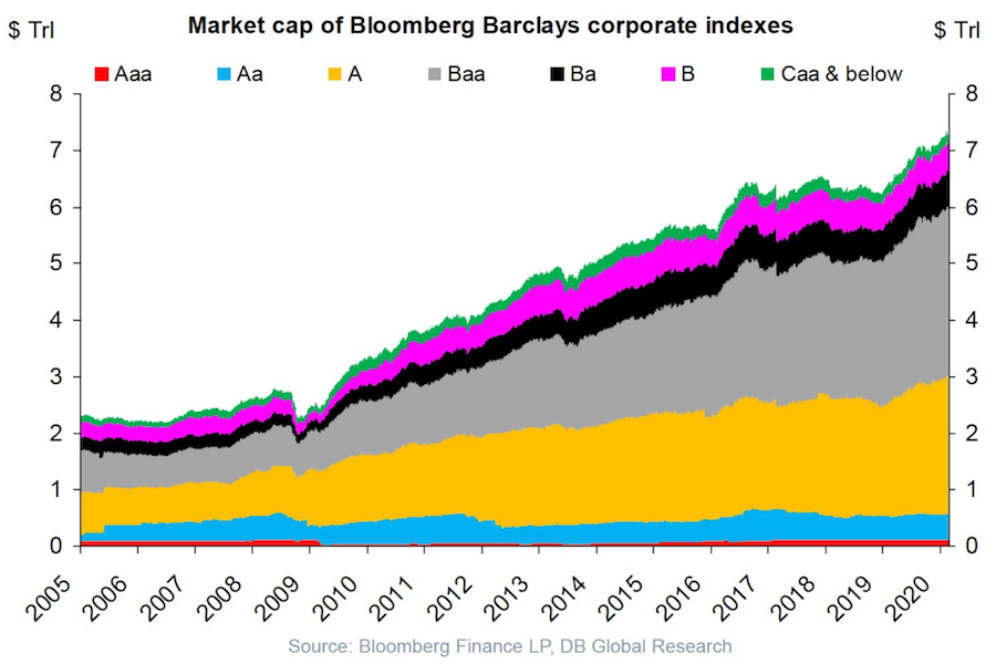
USA corporate debt has increased from a bit over $2 trillion in 2005 to over $7 trillion in 2020.
This isn’t a healthy way to build an economy. Businesses should be robust and able to sustain themselves if the economy experiences a recession and interest rates rise and the ability to borrow decreases.
Extremely low interest rates hide a huge potential cost if interest rates rise. Sure the huge debt is covered by cash flow in good times with the interest rate on your debt is 4%. What happens if interest rates rise to 6% and the economy declines? At some point investors (and banks) are going to realize that huge debt burdens on companies that are overly leveraged are not safe and deserve a premium interest rate.
I don’t think there is any risk to companies with very strong balance sheets and a business model that won’t have any trouble maintaining positive cash flow in a significant recession (Apple, Abbvie, Google, Costco, etc.). But many businesses are over-leveraged and at a significant risk of default in a bad economy.
The stock market is down quite a bit today partially due to the worry that the leveraged oil shale companies in the USA will go under if OPEC does not manage to restrict the supply of oil in order to keep oil prices high (or at least keep oil prices from collapsing).
Plenty of leveraged buyouts (where private equity firms take out cash and leave behind barely functional businesses) are barely able to survive even with extremely low interest rates. Those companies are in danger of failing when they experience even a small problems.
The Federal Reserve Bank of New York’s Center for Microeconomic Data today issued its Quarterly Report on Household Debt and Credit, which reported that total household debt increased by $193 billion (1.5%) to $13.15 trillion in the fourth quarter of 2017. This report marks the fifth consecutive year of positive annual household debt growth. There were increases in mortgage, student, auto, and credit card debt (increasing by 1.6%, 1.5%, 0.7% and 3.2% respectively) and another modest decline in home equity line of credit (HELOC) balances (decreasing by 0.9%).
Outstanding consumer debt balances by type: $8.88 trillion (mortgage), $1.38 trillion (student loans), $1.22 trillion (auto), $834 billion (credit card), $444 (HELOC).
Mortgages are the largest form of household debt and their increase of $139 billion was the most substantial increase seen in several quarters. Unlike overall debt balances, which last year surpassed their previous peak reached in the third quarter of 2008, mortgage balances remain 4.4% below it. The New York Fed issued an accompanying blog post to examine the regional differences in mortgage debt growth since the previous peak.

As of December 31, 4.7% of outstanding debt was in some stage of delinquency. As the chart shows mortgage and credit card debt delinquency rates have decreased sharply since 2010. Student loan debt delinquency rates have increased substantially during the same period (and delinquency rates for student loans are likely to understate effective delinquency rates because about half of these loans are currently in deferment, in grace periods or in forbearance and therefore temporarily not in the repayment cycle. This implies that among loans in the repayment cycle delinquency rates are roughly twice as high). You can understand why many see student debt as a huge economic problem the economy is facing in the coming years.
Of the $619 billion of debt that is delinquent, $406 billion is seriously delinquent (at least 90 days late or “severely derogatory”). The flow into 90+ days delinquency for credit card balances has been increasing notably from the last year and the flow into 90+ days delinquency for auto loan balances has been slowly increasing since 2012.
This post lists the 20 publicly traded companies with the largest market capitalization as of today. Since my May 2017 list of the 20 most valuable stocks many of the market caps have increased significantly.
In the 20 most valuable companies list there are 13 USA companies, 4 Chinese companies and 1 each for Korea, Netherlands and Switzerland. The remaining 17 companies with market caps above $200 billion are based in: USA 8, China 5, Switzerland 2, Japan 1 and Taiwan 1.
| Company | Country | Market Capitalization | |
|---|---|---|---|
| 1 | Apple | USA | $898 billion |
| 2 | Alphabet (GOOGL) | USA | $729 billion |
| 3 | Microsoft | USA | $642 billion |
| 4 | Amazon | USA | $572 billion |
| 5 | USA | $531 billion | |
| 6 | Tencent | China | $506 billion* |
| 7 | Alibaba | China | $492 billion |
| 8 | Berkshire Hathaway | USA | $451 billion |
| 9 | Johnson & Johnson | USA | $371 billion |
| 10 | Exxon Mobil | USA | $345 billion |
Tencent (China) soared $192 billion (61%) since my May 2017 post (after a 85% gain shown in the last post – behind only Samsung for largest percentage gain in that post). That gain pushed Tencent over a $500 billion market cap and moved them from 10th most valuable to 6th. Alibaba also soared $192 billion (64% for them) and moved into the top 10.
Apple gained $73 billion in market cap and is closing in on a market cap over $1 trillion since my May 2017 post. Microsoft, which continues to gain value rapidly even though it is not getting the attention of many of the internet companies, increased by $117 billion. Amazon added $106 billion to their market cap in the last 6 months. Alphabet (Google) gained $77 billion while Facebook increased by $94 billion.
The next ten most valuable companies:
| Company | Country | Market Capitalization | |
|---|---|---|---|
| 11 | JPMorgan Chase | USA | $341 billion |
| 12 | Industrial & Commercial Bank of China (ICBC) | China | $319 billion* |
| 13 | Samsung | Korea | $310 billion |
| 14 | Walmart | USA | $289 billion |
| 15 | China Unicom | China | $281 billion |
| 16 | Bank of America | USA | $277 billion |
| 17 | Wells Fargo | USA | $267 billion |
| 18 | Nestle | Switzerland | $267 billion |
| 19 | Royal Dutch Shell | Netherlands | $260 billion |
| 20 | Visa | USA | $254 billion |
Market capitalization shown are of the close of business November 26th, as shown on Google Finance.
GE continued to collapse, dropping another 62 billion add dropping well out of the top 20 (they were one of the 10 most valuable companies in 2016).
The total value of the top 20 gained $1.2 trillion since my February, 2016 post: growing from $7.2 trillion to $8.4 trillion. Remember, the companies making up the top 20 has changed (China Unicom, Visa and Royal Dutch Shell were added while GE, China Mobile and Roche dropped out).
As I noted in Stock Market Capitalization by Country from 2000 to 2016: Apple, Alphabet, Microsoft, Facebook and Amazon have a combined market capitalization greater than the entire stock market in every country but those in the USA, China and Japan.
Related: Global Stock Market Capitalization from 2000 to 2012 – Stock Market Capitalization by Country from 1990 to 2010 – Historical Stock Returns
A few other companies of interest (based on their market capitalization):
The USA is currently looking to pass a tax bill. Actually the Republican party has decided to not seek bipartisan solutions so it is the Republicans that are looking to change the tax policy. They wish to call it tax reform but they are reforming nearly nothing. They are mainly moving around tax breaks to different people. The main aim seems to be to reduce taxes without reducing spending which given the huge annual deficit the USA government currently runs that means really this is a plan to shift taxes to the grandchildren of people living right now.
And within lowering taxes for some people today while placing those payments onto their grandchildren there is a bit of shifting around who will pay what now. Mostly this amounts to lowering the taxes on the rich today – along with some lowering of many people’s taxes that are in the middle class.
When you run a huge budget deficit (and have a huge amount of debt outstanding) “cutting taxes today” is just shifting taxes to the kids, grandkids and great-grandkids of those avoiding the taxes today. Truly cutting taxes (versus shifting them to a future generation) requires cutting the outstanding debt (which represents future tax increases) in addition to cutting current taxes.

The White House, Washington DC by John Hunter. See more of my photos of Washington DC.
To find reform ideas in the proposals requires using an extremely broad definition of what reform means. There are some attempts to reduce some favors in the tax code now for special interests. But these are minor compared to the goal of shifting the tax burden to grandchildren from those alive today.
One of the other goals is to reduce the corporate tax rate. This goal doesn’t look so great politically, so they are trying to minimize any focus on this. I think likely a reduction in the corporate tax rate is wise. This is mainly due, not to some principle that 25% corporate tax rate is better than a 35% rate (with all the system-wide effects that results in). Mainly a lower rate is needed when you consider the global economic system and the tax rates of other countries with an understanding of the global economy today. What must be sacrificed to reach a 20% corporate rate seems unreasonable to me, so 25% rate seems more sensible, but at this time they are trying to stretch to a 20% rate (and leave future generations to pay for the difference).
I support the effort to lower the corporate tax rate. In order to pay for that reducing some deductions is sensible. The plans have some of that and while each tax break has special interests benefiting from them I would support adding to the decreases in deductions. I would go along with a 20% rate if that was necessary, but think 25% or 22% or something would be better.
The most ludicrous part of the plan is the favors for trust fund babies. Eliminating the most capitalist friendly tax (the estate tax) and providing trust fund babies not only free inheritance without limit but stepping up the cost basis of investments is indefensible (economically indefensible, politically the Republicans obviously feel favors for trust fund babies are wise).
See my Curious Cat Tax Proposals blog post from 2016 for more of my ideas on how tax reform should be done.
The current deficit spending is made to look much less bad than it really is due to incredibly low interest rates. Given the inevitable rise in interest rates over the next 30 years the debt we pile on future generations is going to be much greater than it appears in an extremely low interest rate environment.
There are essentially 4 areas of significant federal spending.
- interest on the debt – this can’t be changed, it is set by the market
- spending on the department of defense (including spending on veterans)
- social security
- medicare and medicaid
There is no political will to reduce the costs of social security. I would raise the age at which you can begining taking payments and reduce payments to the rich. But this won’t pass, so that won’t change.
The Republicans have greatly increased spending by the department of defense so obviously this results in a tax increase (just on our descendants because they chose not to pay for the higher level of spending they voted for)
The total stock market capitalization by country gives some insight but it is also data that is a bit muddy. The data doesn’t tell you how the economies of the countries are doing as there is quite a bit of room for misinterpreting the data.
Apple, Alphabet, Intel, 3M, Abbvie… all are included in the USA market capitalization but much of their sales, earnings and employment are overseas. And USA companies have done very well in global markets so the USA totals are not just an indication how the USA has performed but includes great gains made by profiting from global growth. Also you may be surprised to learn that 26% of USA equities are owned by investors outside the USA.
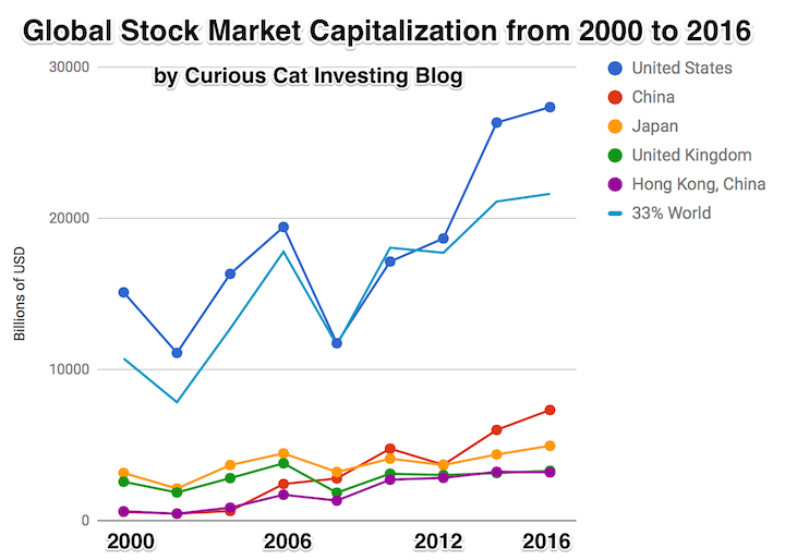
The chart shows the top countries based on stock market capitalization, with data from 2000 to 2016. The chart was created by Curious Cat Investing and Economics Blog may be used with attribution. Data from the World Bank.
It is important to keep in mind the data is shown in current USA dollars, so large swings in exchange rates can have a large impact.
China’s performance has been remarkable. China also shows some of the challenges in collecting this data. I am fairly certain Alibaba (BABA), one of the 10 most valuable companies in the world and a Chinese company has the stock issued in the USA (even this is confusing as it is a complex arrangement but the only publicly traded stock is traded in the USA). And many other Chinese companies are traded this way and therefore are not included in the Chinese total value. In addition Hong Kong is part of China but also separate. The data is reported separately by the world bank and I include them that way in the charts.
As with so much recent economic data China’s performance here is remarkable. China grew from 1.8% of world capitalization in 2000 to 6.9% in 2012 and 11.2% in 2016. Adding Hong Kong to China’s totals shows 3.7% in 2000 with growth to to 12.2% in 2012 and 16.2% in 2016. If you look at my post global stock market capitalization from 2000 to 2012 you will see significantly different historical data for Hong Kong. Collecting this data is much more complex than people realize and data determinations can change over the years resulting in changes in historical data.
The chart shows the 1/3 of the total global market capitalization in order to have the chart display look better (and it also makes it easier to compare the USA performance to the total global performance). The USA market capitalization was at 46.9% of the global market cap in 2000 and fell to 31.6% in 2000 before rising to 42% in 2016. This shows that the USA has largely held its own globally as measured by market cap. This may not seem impressive but when you consider that China has grown from 3.7% to 16.2% you can see that for the market cap outside of China the USA has actually gained quite a bit of ground. This is the result of what I mentioned before – how well USA companies have done at capture global markets (especially in high technology areas with very high profits and therefore very high market caps).
The latest massive breach of USA citizen’s private information by poorly run companies once again shows how we are voting for the wrong type of people. We need to start electing people that fix problems instead of watching things burn.
It is not impossible to improve if you elect people that care about making things better. If you elect people that are driven mainly by doing favors for those giving them cash you get the system we have now.
I believe in designing systems that use markets to create the best solutions to desired outcomes (this is the basic idea of real capitalism – instead of the crony capitalism we have been infected with). Europe has much more respect for citizen’s privacy that the USA does. Europe has much more effect laws on protecting citizen’s privacy. For decades the 2 political parties in the USA have taken large cash donations (and more, future cushy jobs…) to allow the current system to punish citizen’s as their private information is abused and they are expected to spend their time and resources to fix the problems created by the identity theft the lack of decent systems in the USA to stop identity theft. And the design by the 2 parties to put the cost of dealing with it on voters and the benefits (of selling private consumer information and using poor security practices to create problems that voters have to clean up) to those giving the parties cash.
We need to stop voting for such corrupt parties and such poor representatives of our interests (though they are very good representatives of those paying them cash).
So what is a simple starting point for taking the burden of dealing with the easy identity theft our political parties and companies that don’t care about the costs of their sloppy practices on society are?
- Force those approving false credit to pay. Anytime you have to fix credit given falsely in your name they must pay you. Say, $1,000 minimum.
- Force those providing false information about you to pay. If credit bureaus report false information about you that you must correct it is $50 if it is fixed within 7 days of a simple internet form being completed. If it takes 30 days the cost is $150. If they require you to provide additional information, additional costs accrue. They must provide your the original documentation on the loans.
- Give consumer automatic and free control over the use of their private information.
Obviously, credit freezes, and managing that status must be free. - Any organization that collects private financial information must have liability insurance. That insurance will automatically pay per security breach. For name + SSN ($150) + Date of birth ($20) + cell phone number ($20) + current address ($100) + credit card number ($50) + email address ($10) + mother’s maiden name ($25), etc. If you do not collect SSN, credit card number, cell phone number or current address this will not apply. I haven’t given it any thought, but there should be some level of private information that pushes you into the category of the organization that must have liability coverage (what that is can be worked out).
- The funds for those security breaches are paid to the Consumer Financial Protection Bureau and used to
- create better security practices for private information
- fund enforcement of those better security practices
- fund law enforcement investigations and criminal prosecution of those abusing private financial information
This idea needs to be expanded beyond my 1 hour of thinking about it, but it is sad that in 1 hour I can think of much more effective ideas than our political parties have put in place in 20 years.
The reliance on SSN as a identifier for people is something that shouldn’t have been allowed. It is one of many things that should be fixed and it should be fixed quickly.
The organization created here needs to focus on privacy of data. They need to encourage the use of encryption. They need to be given a seat at the table to counter those seeking to promote hacking (both leaving insecure software in place and creating insecurity in the software ecosystem to exploit and be exploited by criminals and other states) to benefit state sponsored spying. That debate will result in tradeoffs. Sometimes they will decide to allow our private information to be put at risk for other benefits. But they need to accept the responsibility of doing so. It would likely be sensible to charge the departments leaving open security holes and creating security holes anytime it becomes obvious that they are responsible for the harm to us. Otherwise they pretend there are not costs to the very bad security practices that our government has been encouraging (even as crazy as it sounds building backdoors into software – which is a security disaster obviously).
Other than the extremely sad state of affairs in health care in the USA (with the Republicans focusing on making it much worse) the biggest threat to our personal finances is likely the lack of security in our financial system (though to be fair there are other plausible candidates – very high debt level…).
Related: Protecting Your Privacy and Security (2015) – Making Credit Cards More Secure and Useful (2014) – Governments Shouldn’t Prevent Citizens from Having Secure Software Solutions USA Congress Further Aids Those Giving Them Cash Risks Economic Calamity Again – Security, Verification of Change – 8 Million New Potential Victims of Identity Theft (2008)
This post lists the 20 publicly traded companies with the largest market capitalization as of today. Since my February 2016 list of the 20 most valuable stocks many of the market caps have increased significantly.
| Company | Country | Market Capitalization | |
|---|---|---|---|
| 1 | Apple | USA | $825 billion |
| 2 | Alphabet (GOOGL) | USA | $652 billion |
| 3 | Microsoft | USA | $525 billion |
| 4 | Amazon | USA | $466 billion |
| 5 | USA | $437 billion | |
| 6 | Berkshire Hathaway | USA | $403 billion |
| 7 | Exxon Mobil | USA | $350 billion |
| 8 | Johnson & Johnson | USA | $334 billion |
| 9 | Samsung | Korea | $316 billion** |
| 10 | Tencent | China | $314 billion* |
Apple gained an amazing $284 billion in market cap since my February 2016 post. Only 12 companies (including Apple) are worth more than $284 billion. Amazon soared $204 billion (a 78% increase). Alphabet (Google) gained $156 billion in market cap.
Samsung soared $163 billion (a 107% gain) and Tencent soared $144 billion (a 85% gain) to move from outside the top 20 to become the 9th and 10th most valuable companies and the most valuable based outside the USA.
Facebook gained $126 billion and Microsoft gained $117 billion. GE lost $60 billion to drop out of the top ten. Wells Fargo also dropped out of the top 10.
The next ten most valuable companies:
| Company | Country | Market Capitalization | |
|---|---|---|---|
| 11 | JPMorgan Chase | USA | $308 billion |
| 12 | Alibaba | China | $298 billion |
| 13 | Wells Fargo | USA | $261 billion |
| 14 | Industrial & Commercial Bank of China | China | $258 billion* |
| 15 | Nestle | Switzerland | $253 billion |
| 16 | GE | USA | $240 billion |
| 17 | Bank of America | USA | $238 billion |
| 18 | Roche | Switzerland | $231 billion |
| 19 | Walmart | USA | $228 billion |
| 20 | China Mobile | China | $225 billion* |
Market capitalization shown are of the close of business May 12th, as shown on Google Finance.
In the 20 most valuable companies list there are 13 USA companies, 4 Chinese companies, 2 Swiss companies and 1 Korean company.
Alibaba (China) soared $131 billion (78%) and climbed to the 11th spot (from outside the top 20 last time). Bank of America soared $105 billion (up 79%).
Verizon was one of 2 companies in the top 20 to lose value in the period, Verizon declined $23 billion (over 10%) and dropped out of the top 20.
The total value of the top 20 gained $1.3 trillion since my February, 2016 post: growing from $5.9 trillion to $7.2 trillion. Remember, the companies making up the top 20 has changed.
Related: Global Stock Market Capitalization from 2000 to 2012 – Stock Market Capitalization by Country from 1990 to 2010 – Historical Stock Returns
A few other companies of interest (based on their market capitalization):
Read more
The Great Convergence by Richard Baldwin makes some interesting points about “globalization.” I actually find the long term history the most interesting aspect. It is very easy for people today to forget the recently rich “West” has not always been so dominant.
That shows how quickly things changed. The industrialization of Europe and the USA was an incredibly powerful global economic force. The rapid economic gains of Japan, Korea, Singapore, China and India in the last 50 years should be understood in the context of the last 200 years not just the last 100 years.
A central point Richard advocates for in the book is realizing that the current conditions are different from the conditions in which traditional economic theory (including comparative advantage) hold. The reasoning and argument for this claim are a bit too complex to make sensibly in this post but the book does that fairly well (not convincingly in my opinion, but enough to make the argument that we can’t assume traditional economic theory for international trade is completely valid given the current conditions).
I don’t expect this blog post to convince people. I don’t even think his book will. But he makes a case that is worth listen to. And I believe he is onto something. I have for years been seeing the strains of “comparative advantage” in our current world economy. That doesn’t mean I am not mainly a fan of freer trade. I am. I don’t think complex trade deals such as TPP are the right move. And I do think more care needs to be taken to consider current economic conditions and factor that into our trade policies.
Richard Baldwin uses 3 costs and the economic consequences of those changing over time to show globalizations history, where we are today and where we are going.
It isn’t very easy to follow but the book provides lots of explanation for the dramatic consequences of these costs changing over time.
One of his themes is that mobility of labor is still fairly costly. It isn’t easy to move people from one place to another. Though he does discuss how alternatives that are similar to this (for example telepresence and remote controlled robots to allow a highly technical person to operate remotely) without actually do moving the person are going to have huge economic consequences.
The “high spillovers” are the positive externalities that spin off of a highly knowledgable workforce.
Even though there are plenty of ways to improve the economic conditions for most people today is very good compared to similar people 50 years ago. There are a few, small population segments that there are arguments for being worse off, but these are a tiny percentage of the global population.
However, we humans often compare ourselves to whoever is better off than us and feel jealous. So instead of appreciating good roads, food, shelter, health care, etc. we see where things could be better (either our parents had it a bit better or these people I see on TV or in this other country, etc.). It is good to see how we could improve if we then take action to improve. To just be frustrated that others have it better doesn’t do any good, it doesn’t seem to me.
There are significant ways governments can help or hinder the economic well being of their citizens. I am a big believer in the power of capitalism to provide wealth to society. That isn’t the same as supporting the huge push to “crony capitalism” that many of the political parties throughout the world are promoting. The “capitalism” in that phrase exists for alliteration, the real meaning is the word crony.

street scene in Seoul, South Korea (photo by John Hunter)
These Are the World’s Most Innovative Economies
These type of rankings are far from accurate, what does most innovative really mean? But they do provide some insight and I think those at the top of the list do have practices worth examining. And I do believe those near the top of this list are doing a better job of providing for the economic future of their citizens than other countries. But the reality is much messier than a ranking illustrates.
With that in mind the ranking shows
- Korea
- Sweden
- Germany
- Switzerland
- Finland
- Singapore
- Japan
- Denmark
- USA
One thing that is obvious is the ranking is very biased toward already rich countries. When you look at the measures they use to rank it is easy to see this is a strong bias with their method.
China is 21st. Malaysia is 23rd and an interesting country doing very well compared to median income (I am just guessing without actually plotting data). Hong Kong is 35th, which is lower than I imagine most people would have predicted. Thailand is 44th. Brazil is 46th and even with their problems seems low. Brazil has a great deal of potential if they can take care of serious problems that their economy faces.
In a previous post I examined the GDP Growth Per Capita for Selected Countries from 1970 to 2010, Korea is the country that grew the most (not China, Japan, Singapore…).
Related: Leading Countries for Economic Freedom: Hong Kong, Singapore, New Zealand, Switzerland – Economic Consequences Flow from Failing to Follow Real Capitalist Model and Living Beyond Our Means – Easiest Countries in Which to Operate a Businesses (2011)