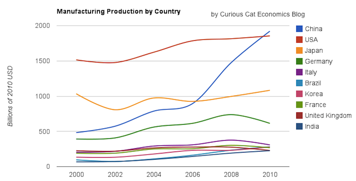
Chart of manufacturing production by the top 10 manufacturing countries (2000 to 2010). The chart was created by the Curious Cat Economics Blog. You may use the chart with attribution. All data is shown in 2010 USD (United States Dollar).
In my last post I looked at the output of the top 10 manufacturing countries with a focus on 1980 to 2010. Here I take a closer look at the last 10 years.
In 2010, China took the lead as the world’s leading manufacturing country from the USA. In 1995 the USA was actually very close to losing the lead to Japan (though you wouldn’t think it looking at the recent data). I believe China will be different, I believe China is going to build on their lead. As I discussed in the last post the data doesn’t support any decline in Chinese manufacturing (or significant moves away from China toward other South-East Asian countries). Indonesia has grown quickly (and have the most manufacturing production, of those discussed), but their total manufacturing output is less than China grew by per year for the last 5 years.
The four largest countries are pretty solidly in their positions now: the order will likely be China, USA, Japan, Germany for 10 years (or longer): though I could always be surprised. In the last decade China relentlessly moved past the other 3, to move from 4th to 1st. Other than that though, those 3 only strengthened their position against their nearest competitors. Brazil, Korea or India would need to increase production quite rapidly to catch Germany sooner. After the first 4 though the situation is very fluid.

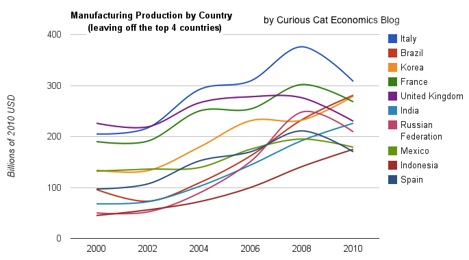
Taking a closure look at the large group of countries after top 4. Chart of manufacturing production from 2000-2010.
Chart of manufacturing production by the leading manufacturing countries (2000 to 2010). The top 4 countries are left off to look more closely at history of the next group. The chart was created by the Curious Cat Economics Blog based on UN data. You may use the chart with attribution.
Removing the top 4 to take a close look at the data on the other largest manufacturing countries we see that there are many countries bunched together. It is still hard to see, but if you look closely, you can make out that some countries are growing well, for example: Brazil, India and Indonesia. Other countries (most in Europe, as well as Mexico) did not fare well in the last decade.
The UK had a particularly bad decade, moving from first place in this group (5th in the world) to 5th in this group and likely to be passed by India in 2011. Europe has 4 countries in this list (if you exclude Russia) and they do not appear likely to do particularly well in the next decade, in my opinion. I would certainly expect Brazil, India, Korea and Indonesia to out produce Italy, France, UK and Spain in 2020. In 2010 the total was $976 billion by the European 4 to $961 billion by the non-European 4. In 2000 it was $718 billion for the European 4 to $343 billion (remember all the data is in 2010 USD).
Mexico is left of that comparison (and I would expect them to be below all the others in the comparison – but also substituting them for any of the 4 I would still believe those 4 countries would out-manufacture the European group. Also adding Russia to the Europe group and Mexico to the other group I would also expect the non-Europe group to manufacture more. I actually think Mexico has great potential but they did not have a particularly good decade and need to do a better job to realize their potential (being right next to the USA is a great advantage).
From 2000 to 2010 China grew manufacturing output by 298%. India was next at 232% and Brazil followed with 193%. The UK performed the worst, up just 2%, while Japan was up 5%. The USA was next worst up just 22% for the decade, which while still an increase. For decades there has been all sorts of talk about how the USA doesn’t manufacture anything anymore. This is just false. It is true that manufacturing jobs have been disappearing but this is a global phenomenon (even in countries growing manufacturing very quickly). It is also true the rest of the USA economy is growing faster than manufacturing output over the last few decades and so the percentage of manufacturing compared to the overall economy has shrunk (but this is due to higher growth elsewhere – manufacturing continues to increase). 2011 may actually have been quite a good year for manufacturing in the USA.
Related: Chart of Largest Petroleum Consuming Countries from 1980 to 2010 – USA, China and Japan Lead Manufacturing Output in 2008 – Manufacturing Employment Data: USA, Japan, Germany, UK… 1990-2009 – Top 15 Manufacturing Countries in 2009 –
The last few years I have had to estimate China’s manufacturing output (to separate out mining production), this year the data is provided using the same criteria for each country: manufacturing comprises units engaged in the physical or chemical transformation of materials, substances, or components into new products (see more detail). Economic data is never perfect and when you are comparing between countries it gets even more difficult (and the measurement discrepancies distort the data – compared to the state you are trying to measure). But still the data useful and interesting; understanding it includes some noise.
Comments
4 Comments so far
[…] Chart of Manufacturing Output from 2000 to 2010 by Country […]
If the U.S. doesn’t wake up we all will be speaking Chinese very soon. Manufacturing can become efficient enough to keep our jobs at home. Manufacturing Timing Eq1uipment can increase efficiency tremendously.
[…] underestimate how much manufacturing the USA does, as I have been writing about for years. In fact, until 2010, the USA manufactured more than China. China owns 7.6% of U.S. government debt outstanding. As of November, China owned $1.13 trillion of […]
[…] growth in output (if that continues, I think the USA growth will improve). I said last year, that I expected China to build on the lead it finally took, and they did so. I expect that to continue, but I also wouldn’t be surprised […]