Dylan Grice suggests the Cockroach Portfolio: 25% cash; 25% government bonds; 25% equities; and 25% gold. What we can learn from the cockroach
Government bonds protect against deflation (provided your money’s invested in solid government bonds and not trash). Equities offer capital growth and income. And gold, as we know, protects against currency depreciation, inflation, and financial collapse. It’s vitally important to maintain holdings in each, in my opinion.
The beauty of a ‘static’ allocation across these four asset classes is that it removes emotion from the investment process.
I don’t really agree with this but I think it is an interesting read. And I do agree the standard stock/bond/cash portfolio model is not good enough.
I would rather own real estate than gold. I doubt I would ever have more than 5% gold and only would suggest that if someone was really rich (so had money to put everywhere). Even then I imagine I would balance it with investments in other commodities.
One of the many problems with “stock” allocations is that doesn’t tell you enough. I think global exposure is wise (to some extent S&P 500 does this as many of those companies have huge international exposure – still I would go beyond that). Also I would be willing to take some stock in commodities type companies (oil and gas, mining, real estate, forests…) as a different bucket than “stocks” even though they are stocks.
And given the super low interest rates I see dividend paying stocks as an alternative to bonds.
The Cockroach Portfolio does suggest only government bonds (and is meant for the USA where those bonds are fairly sensible I think) but in the age of the internet many of my readers are global. It may well not make sense to have a huge portion of your portfolio in many countries bonds. And outside the USA I wouldn’t have such a large portion in USA bonds. And they don’t address the average maturity (at least in this article) – I would avoid longer maturities given the super low rates now. If rates were higher I would get some long term bonds.

View of Glacier National Park, from Bears Hump Trail in Waterton International Peace Park in Canada, by John Hunter
These adjustments mean I don’t have as simple a suggestion as the cockroach portfolio. But I think that is sensible. There is no one portfolio that makes sense. What portfolio is wise depends on many things.
Looking at stock market capitalization by country gives some insight into how countries, and stocks, are doing. Looking at the total market capitalization by country doesn’t equate to the stock holdings by individuals in a country or the value of companies doing work in a specific country. Some countries (UK and Hong Kong, for example) have more capitalization based there than would be indicated by the size of their economy.
It is important to keep in mind the data is in current USA dollars, so big swings in exchange rates can have a big impact (and can cause swings to be exacerbated when they move in tandem with stock market movements – if for example the market declines by 15% and the currency declines by 10% against the US dollar those factors combine to move the result down).

The chart shows the top four countries based on stock market capitalization, with data from 200 to 2012. The chart created by Curious Cat Investing and Economics Blog may be used with attribution. Data from the World Bank.
As with so much recent economic data China’s performance here is remarkable. China grew from 1.8% of world capitalization in 2000 to 6.9% in 2012. And Hong Kong’s data is reported separately, as it normally is with global data sets. Adding Hong Kong to China’s totals would give 3.7% in 2000 with growth to to 8.9% in 2012 (Hong Kong stayed very stable – 1.9% in 2000, 2% in 2012). China alone (without HK) is very slightly ahead of Japan.
The first chart shows the largest 4 market capitalizations (2012: USA $18.6 trillion, China and Japan at $3.7 trillion and UK at $3 trillion). Obviously the dominance of the USA in this metric is quite impressive the next 7 countries added together don’t quite reach the USA’s stock market capitalization. I also including the data showing the global stock market capitalization divided by 3 (I just divide it by three to have the chart be more usable – it lets us see the overall global fluctuations but doesn’t cram all the other data in the lower third of the chart).
Canada is the 5th country by market capitalization (shown on the next chart) with $2 trillion. From 2000 to 2012 China’s market capitalization increased by $3.1 trillion. The USA increased by $3.6 trillion from a much larger starting point. China increased by 536% while the USA was up 23.5%. The world stock market capitalization increased 65% from 2000 to 2012.
Related: Stock Market Capitalization by Country from 1990 to 2010 – Government Debt as Percent of GDP 1998-2010 – Manufacturing Output by Country 1999-2011: China, USA, Japan, Germany
A report by the Dallas Federal Reserve Bank, Assessing the Costs and Consequences of the 2007–09 Financial Crisis and Its Aftermath, puts the costs to the average household of the great recession at $50,000 to $120,000.
The worst downturn in the United States since the 1930s was distinctive. Easy credit standards and abundant financing fueled a boom-period expansion that was followed by an epic bust with enormous negative economic spillover.
…
Our bottom-line estimate of the cost of the crisis, assuming output eventually returns to its pre-crisis trend path, is an output loss of $6 trillion to $14 trillion. This amounts to $50,000 to $120,000 for every U.S. household, or the equivalent of 40 to 90 percent of one year’s economic output.
They say “misguided government incentives” much of which are due to payments to politicians by too-big-to-fail institution to get exactly the government incentives they wanted. There is a small bit of the entire problem that is likely due to the desire to have homeownership levels above that which was realistic (beyond that driven by too-big-to-fail lobbyists).
“Were safer” says a recent economist. Which I guess is true in that it isn’t quite as risky as when the too-big-to-fail-banks nearly brought down the entire globally economy and required mass government bailouts that were of a different quality than all other bailouts of failed organizations in the past (not just a different quantity). The changes have been minor. The CEOs and executives that took tens and hundreds of millions out of bank treasures into their own pockets then testified they didn’t understand the organization they paid themselves tens and hundreds of a millions to “run.”
We left those organizations intact. We bailed out their executives. We allowed them to pay our politicians in order to get the politicians to allow the continued too-big-to-fail ponzie scheme to continue. The too-big-to-fail executives take the handouts from those they pay to give them the handouts and we vote in those that continue to let the too-big-to-fail executives to take millions from their companies treasuries and continue spin financial schemes that will either work out in which case they will take tens and hundreds of millions into their person bank accounts. Or they won’t in which case they will take tens of millions into their personal bank accounts while the citizens again bail out those that pay our representatives to allow this ludicrous system to continue.
Bono (who is fairly well known 🙂 as the lead singer for U2): “Commerce — entrepreneurial capitalism — takes more people out of poverty than aid, of course, we know that.”
That is my belief and something I believe in strongly. Real capitalism will bring people out of poverty. That isn’t the same thing as any businesses will do that. Businesses that use monopolistic powers to extract benefits to themselves and suppress free markets may well do more damage than good. But we will continue to bring more people out of poverty through economic development and capitalism than through aid.
Related: Helping Capitalism Make the World Better – Kiva – Giving Entrepreneurs an Opportunity to Succeed – Dr. Deming’s personal aim was to advance commerce, prosperity and peace – Business 901 Podcast with Me: Deming’s Management Ideas Today – Monopolies and Oligopolies do not a Free Market Make
There have been quite a few complaints about companies hiring foreign nationals to work in the USA to save money (and costing citizens jobs or reducing their pay). The way the laws are now, companies are only suppose to hire people to work in the USA that can’t be met with USA workers. The whole process is filled with unclear borders however – it is a grey world, not black and white.
I think one of the things I would do is to make it cost more to hire foreigners. Just slap on a tax of something like $10,000 per year for a visa. If what I decided was actually going to adopted I would need to do a lot more study, but I think something like that would help (maybe weight it by median pay – multiple that by 2, or something, for software developers…).
It is a complex issue. In general I think reducing barriers to economic competition is good. But I do agree some make sense in the context we have. Given the way things are it may well make sense to take measures that maybe could be avoided with a completely overhauled economic and political system.
I believe there are many good things to having highly skilled workers in your country. So if the problem was in recruiting them (which isn’t a problem in the USA right now) then a tax on the each visa wouldn’t be wise, but I think it might make sense now for the USA.
I think overall the USA benefits tremendously from all the workers attracted from elsewhere. We are much better off leaving things as they are than overreacting the other way (and being too restrictive) – but I do believe it could be tweaked in ways that could help.
Outsourcing Made by India Seen Hit by Immigration Law
…
Indians received more than half the 106,445 first-time H-1Bs issued in the year ending September 2011, according to a U.S. Department of Homeland Security report. The second-biggest recipient was China with 9.5 percent.
…
While the legislation raises the annual H-1B cap to as much as 180,000 from 65,000, it increases visa costs five-fold for some companies to $10,000. It also bans larger employers with 15 percent or more of their U.S. workforce on such permits from sending H-1B staff to client’s sites.
The aim is to balance the U.S. economy’s need to fill genuine skills gaps with protection for U.S. citizens from businesses that may use the guest-worker program to bring in cheaper labor
Related: Relocating to Another Country – Working as a Software Developer – Science PhD Job Market in 2012 – Career Prospect for Engineers Continues to Look Positive
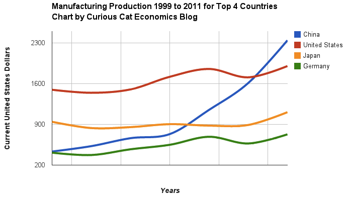
Chart of manufacturing production by China, USA, Japan and Germany from 1999 to 2011. The chart was created by the Curious Cat Economics Blog using UN data. You may use the chart with attribution. All data is shown in current USD (United States Dollar).
The story of global manufacturing production continues to be China’s growth, which is the conventional wisdom. The conventional wisdom however is not correct in the belief that the USA has failed. China shot past the USA, which dropped into 2nd place, but the USA still manufactures a great deal and has continually increased output (though very slowly in the last few years).
The story is pretty much the same as I have been writing for 8 years now. The biggest difference in that story is just that China actually finally moved into 1st place in 2010 and, maybe, the slowing of the USA growth in output (if that continues, I think the USA growth will improve). I said last year, that I expected China to build on the lead it finally took, and they did so. I expect that to continue, but I also wouldn’t be surprised to see China’s momentum slow (especially a few more years out – it may not slow for 3 or 4 more years).
As before, the four leading nations for manufacturing production remain solidly ahead of all the rest. Korea and Italy had manufacturing output of $313 billion in 2011 and Brazil moved up to $308 are in 4-6 place. Those 3 countries together could be in 4th place (ahead of just Germany). Even adding Korea and Italy together the total is short of Germany by $103 in 2011). I would expect Korea and Brazil to grow manufacturing output substantially more than Italy in the next 5 years.
A recent report by Deloitte, The Hidden Costs of U.S. Health Care: Consumer Discretionary Health Care Spending provides some interesting data.
Between 2006 and 2010 USA health care expenditures increased by 19%. Government spending accounted for 40% of costs (remember that figure is lowered due to Deloitte’s including inputed value for care of relatives). Those 65 and older account for 61% of the inputed cost care that is provided.
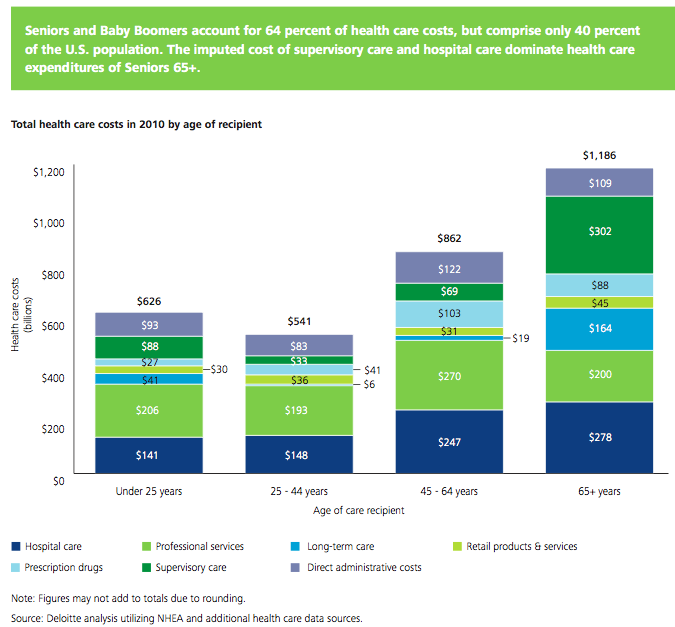
Seniors and baby boomers account for 64% of health care costs, but comprise only 40% of the USA population. The imputed cost of supervisory care and hospital care are far higher proportions of health care expenditures of seniors (65 and older).
I find this imputed value largely not worth considering. There are problems with the way we count GDP and economic activity (that affect health care and lots of other things). It is fine to be aware that they think $492 billion of extra care is given by family members but using that figure in any sensible way (other than saying hey there is a huge cost in people’s time to dealing with our health care system and sick people that isn’t counted in economic data) is questionable.
It is useful in looking at the increasingly old population we will see in the future and judging their is a large need for supervisory care that is not captured in just looking at the costs included in economic data currently. Not only will our grandkids have to pay for our living beyond our means today they will have to do so while providing unpaid care to their parents and grandparents.
The burden of long term supervisor care (that which can be provided by a non-health care professional) is one reason a resurgence in multi-generation housing options make sense to me. There are other good reasons also (child care, socialization, financial support to the young…). There are some real advantages and real disadvantages to such options. But I think economic advantages are going to encourage more of this going forward.
Related: Personal Finance Basics: Long-term Care Insurance – Health Care in the USA Cost 17.9% of GDP, $2.6 Trillion, $8,402 per person in 2010 – Resources for Improving Health Care System Performance
I am glad we have a “fiscal cliff” to finally get some reduction in the future taxes both parties have been piling on with abandon the last few decades. When you have enormous spending beyond your income, as the USA has had the last few decades, cutting current taxes is just raising taxes on your grandchildren to pay for your spending. Shifting taxes to your grand children is not cutting taxes it is shifting them to future generations.
If you want to really cut taxes you must cut taxes and not pass on paying for your cuts to your kids. It seems pretty obvious those that advocating cutting current taxes the last few decades were only interested in living beyond their means today and foisting the responsibility to pay to their grandchildren. That is despicable behavior.
The fiscal cliff is an opportunity to return to a budget that has the generation doing the spending paying the taxes (last seen in the Clinton administration). The fiscal cliff outcome is going to be far from perfect. But the result will be a much more honorable outcome than foisting ever increasing taxes on future generations to pay for our current spending.
Obviously, if you reducing how much you are adding to your credit card balance each month and start paying your bills that means you don’t get to live off your future earnings today. So you will suffer today compared to continuing to tax the future to pay for your spending.
I hope the compromise results in spending cuts and an elimination of the Bush generation shifting taxes (cutting taxes on the the current wealthy without spending cuts – so just taxing the future to pay for tax cuts today). It is unlikely the fiscal cliff results in us actually paying for our spending (the best possible result is not an elimination of adding to the taxes future generations must pay but just a reduction in the level of tax increases we are imposing on the future every year).
Lots of little things should be done to save a few billion (maybe it could add up to $50 billion a year if we are very lucky). But the serious spending cuts have to come from reductions in military spending, reducing waste in the health care system and making social security more actuarially sensible (social security is not part of the fiscal cliff discussions though). Reducing tax breaks also has to happen, unless absolutely huge spending cuts can be found which is not at all likely.
Building your saving is largely about not very sexy actions. The point where most people fail is just not saving. It isn’t really about learning some tricky secret.
You can find yourself with pile of money without saving; if you win the lottery or inherit a few million from your rich relative via some tax dodge scheme like generation skipping trusts or charitable remainder trusts.
But the rest of us just have to do a pretty simple thing: save money. Then, keep saving money and invest that money sensibly. The key is saving money. The next key is not taking foolish risks. Getting fantastic returns is exciting but is not likely and the focus should be on lowering risk until you have enough savings to take risks with a portion of the portfolio.
My favorite tips along these lines are:
- spend less than you make
- save some of every raise you get
- save 10-15% of income for retirement
- add to any retirement account with employer matching (where say they add $500 for every $1,000 you put into your 401(k)
Spending less than you make and building up your long term savings puts you in the strongest personal finance position. These things matter much more than making a huge salary or getting fantastic investing returns some year. Avoiding risky investments is wise, and sure making great returns helps a great deal, but really just saving and investing in a boring manner puts you in great shape in the long run. Many of those making huge salaries are in atrocious personal financial shape.
Another way you can boost savings is to do so when you pay off a monthly bill. So when I paid off my car loan I just kept saving the old payment. Then I was able to buy my new car with the cash I saved in advance when I was ready for a new car.
The largest manufacturing countries are China, USA, Japan and then Germany. These 4 are far in the lead, and very firmly in their positions. Only the USA and China are close, and the momentum of China is likely moving it quickly ahead – even with their current struggles.
The chart below shows manufacturing production by country as a percent of GDP of the 10 countries that manufacture the most. China has over 30% of the GDP from manufacturing, though the GDP share fell dramatically from 2005 and is solidly in the lead.
Nearly every country is decreasing the percentage of their economic output from manufacturing. Korea is the only exception, in this group. I would expect Korea to start following the general trend. Also China has reduced less than others, I expect China will also move toward the trend shown by the others (from 2005 to 2010 they certainly did).
For the 10 largest manufacturing countries in 2010, the overall manufacturing GDP percentage was 24.9% of GDP in 1980 and dropped to 17.7% in 2010. The point often missed by those looking at their country is most of these countries are growing manufacturing, they are just growing the rest of their economy more rapidly. It isn’t accurate to see this as a decline of manufacturing. It is manufacturing growing more slowly than (information technology, health care, etc.).

This chart shows manufacturing output, as percent of GDP, by country and was created by the Curious Cat Economics Blog based on UN data. You may use the chart with attribution.
The manufacturing share of the USA economy dropped from 21% in 1980 to 18% in 1990, 15% in 2000 and 13% in 2010. Still, as previous posts show, the USA manufacturing output has grown substantially: over 300% since 1980, and 175% since 1990. The proportion of manufacturing output by the USA (for the top 10 manufacturers) has declined from 33% in 1980, 32% in 1990, 35% in 2000 to 26% in 2010. If you exclude China, the USA was 36% of the manufacturing output of these 10 countries in 1980 and 36% in 2010. China’s share grew from 7.5% to 27% during that period.
The United Kingdom has seen manufacturing fall all the way to 10% of GDP, manufacturing little more than they did 15 years ago. Japan is the only other country growing manufacturing so slowly (but Japan has one of the highest proportion of GDP from manufacturing – at 20%). Japan manufactures very well actually, the costs are very high and so they have challenges but they have continued to manufacture quite a bit, even if they are not growing output much.