We have tax plans from the major USA Presidential candidates. I don’t like any of them, though I actually like Ted Cruz’s plan more than the others, but it has a huge problem. His plan doesn’t fund the government he wants, not even just as poorly as we have been doing. He would increase the debt substantially.
My plan would have 3 parts. I like a flat tax, I doubt it will ever happen, but if we could get one I would be happy. Cruz proposes that (at 10%). I am fine with his proposal to eliminate all deductions but mortgage interest and charity. I would definitely tweak that some – no more than $50,000 in mortgage interest deduction a year and the same for charity. Basically subsidizing it a bit for the non-rich is fine. Subsidizing these for the rich seems silly so I would cap the deductions in some way. I also wouldn’t mind an almost flat tax, say 12% up to $200,000 and 15% after that (or some such rates).
Cruz’s rate is far too low given the government he wants. The government budget is largely: Social Security, Medicare and Military. Then you also have debt payment which have to be paid. Those 4 things are over 80% of the spending. All the other things are just in the last 20%, you can cut some of that but realistically you can’t cut much (in percentage terms – you can cut hundreds of billions theoretically but it is unlikely and even if you did it isn’t a huge change).
We are piling on more debt than we should. Therefore we should increase revenue, not reduce it. But if we can’t increase it (for political reasons) we definitely should not reduce it until we have shown that we have cut spending below revenue for 2 full years. After that, great, then decrease rates.

The White House, Washington DC by John Hunter. See more of my photos of Washington DC.
The VAT tax on businesses replacing the corporate tax system is in Cruz’s plan and this is the best option for corporate taxes in my opinion. Another decent option is just to pass through all the earnings to the owners (I first heard this proposal from my Economics professor in College) and tax them on the earnings.
Increasing the giveaways to trust-fund baby as Cruz and Trump propose is the single worst tax policy change that can be made. I have explained previously how bad an idea this is: The estate tax is the most capitalist tax that exists. The trust-fund-baby favors should be reduced not increased. I would roll back to the Reagan Administration policy on estate tax rates.
USA health care spending increased at a faster rate than inflation in 2013, yet again; increasing 3.5%. Total health expenditures reached $2.9 trillion, 17.4% of the nation’s Gross Domestic Product (GDP) or $9,255 per person.
While this remains bad news the rate at which heath care is increasingly costing those in the USA has been slower the last 5 years than it has been in past years. Basically the system is getting worse at a slower rate than we used to be, so while that isn’t great, it beats getting worse as quickly as we used to be. For the last 5 years the rate of increase has been between 3.6% and 4.1%.
GDP has increased more than inflation. As the GDP grows the economy has more production for society to split. The split between the extremely wealthy and the rest of society has become much more weighted to the extremely wealthy (they have taken most of the gains to the overall economy in the last 20 years). Health care has a similar track record of devouring the gains made by the economy. This has resulted in health care spending soaring over the decades in an absolute basis and as a percentage of GDP.
The slow down in how badly the health care system has performed in the USA has resulted in the share of GDP taken by the health care system finally stabilizing. Health care spending has remained near 17.4% since 2009. While hardly great news, this is much better news than we have had in the last 30 years from the USA health care system. The percentage of GDP taken by the USA health care system is double what other rich countries spend with no better health results.
It is similar to if a team started as a championship team and then got worse every year and now they have finally stopped getting even worse. Granted they have become the worst team in the league but if, say, their record has now been 5-55 for 3 years in a row, they at least are not winning fewer game in each subsequent year anymore. But you can hardly think you are doing a great job when you are clearly the worst team each and every year.
Obviously there is a need for much much more improvement in the USA health care system. Still stopping the growth in spending, as a percent of GDP, is a positive step toward drastically decreasing it to reach a level more in live with all other rich countries. Even this goal is only to have the USA reach a level of mediocrity. If you actually believe the USA can to better than mediocre that would imply a combination of drastic declines in spending (close to 50%) and drastic gains in outcomes. Decreasing spending by 50% would put the USA at essentially the definition of mediocre – middling result with average spending.
Health Spending by Type of Service or Product
- Hospital Care: Hospital spending increased 4.3% to $936.9 billion in 2013 compared to 5.7% growth in 2012. The lower growth in 2013 was influenced by growth in both prices and non-price factors (which include the use and intensity of services).
- Physician and Clinical Services: Spending on physician and clinical services increased 3.8% in 2013 to $586.7 billion, from 4.5% growth in 2012. Slower price growth in 2013 was the main cause of the slowdown, as prices grew less than 0.1%, due in part to the sequester and a zero-percent payment update.
I was recently interviewed on equities.com, read the full interview – Financial Blogger Profile: John Hunter. Some quotes from the interview:
John Hunter: I look for good individual investments, but I also weigh my guesses about long term macroeconomic conditions in making investment commitments. I think there is much more risk to the drastic measures central banks have been making for the past few years than the market is factoring in. I think the poor job regulating risk in the financial system is also very risky at the macroeconomic level.
I don’t have any real idea of what the chance of massive economic failure is, but I am much more worried today than I have been. Pretty much, my worry has remained the same over the last few years. We did avoid an immediate meltdown, though we still had plenty of economic pain. Yet, in my opinion, the risk has remained very high for the last few years, but people seem to think central banks can continue this extraordinary behavior without consequences; I see a great deal of risk in the economy.
…
Three macro-economic factors make healthcare an appealing investment. First, the aging population should provide a booming market. Second, the huge increase in rich people globally that can afford very expensive medicine again provides an ever-growing market. Third, the broken healthcare system in the USA results in exceedingly high-priced medical care in a very large and rich market.
I also close out the interview with some tips I have shared on this blog over the years
John Hunter: I can’t pick one, but I can pick a few short pieces of advice:
- Save 15%, or more, of your income and invest it wisely. If you want to buy more, then earn more, or save extra until you can pay for it with the extra savings.
- Minimize costs on investments, use Vanguard or similar low fee funds. Buying individual stocks reduces even the costs of Vanguard. There are tradeoffs to diversity of your portfolio when buying individual stocks.
- Pay attention to the overall risk of the portfolio, and even beyond that, your entire financial picture. For example, in the USA we have extra healthcare expense risk that is outside our portfolio risk, but is part of our entire financial picture. Building your portfolio with extra-portfolio risks in mind is wise. Don’t get fooled into thinking about the risks of investments taken individually, even though that is what you will continually be bombarded with.
I think those that find this blog worthwhile will also enjoy the interview so I hope you read the full interview.
Related: more interviews with John Hunter – Investment Options Are Much Less Comforting Than Normal These Days – How to Protect Your Financial Health
One thing for investors consulting historical data to remember is we may have had fundamental changes in stock valuations over the decades (and I suspect they have). Just to over simplify the idea if lets say the market valued the average stock at a PE of 11 and everyone found stocks a wonderful investment. And so more and more people buy stocks and with everyone finding stocks wonderful they keep buying and after awhile the market is valuing the average stock at a PE of 14.
Within the market there is tons of variation those things of course are not nearly that simple, but the idea I think holds. Well if you look back at historical data the returns will include the adjustment of going from a PE of 11 to a PE of 14. Now maybe the new few decades would adjust from PE of 14 to PE of 17 but maybe not. At some point that fundamental re-adjustment will stop.
And therefore future returns would be expected to be lower than historically due to this one factor. Now maybe other factors will increase returns to compensate but if not the historical returns may well provide an overly optimistic view.
And if there is a short term bubble that lets say pushes the PR to 16 while the “fair” long term value is 14, then there will be a negative impact on the returns going forward bringing the PE from 16 to 14. That isn’t necessarily a drop (though it could be) in stock prices, it could just be very slow increases as earning growth slowly pushes PE back to 14.

Monument to the People’s Heroes with the Shanghai skyline in the background. See more photos by John Hunter
Another thing to consider is another long term macro-economic factor may also be giving long term historical returns an extra boost. The type of economic growth from the end of World War I to 1973 (just to pick a specific time, there was a big economic slowdown after OPEC drastically increased the price of oil). While that period includes the great depression and World War II, which massively distorts figures, from the end of WW I through the 1960s Europe and the USA went through an amazing amount of economic growth.
While people question the value of a college degree a recent study by the New York Federal Reserve shows a degree is close to as valuable today as it has ever been. The costs to get that value have risen but even with the increased cost students earn on average a 15% annual rate of return on their investment.
Of course, not every student will earn that, some will earn more and some less.
…
The time required to recoup the costs of a bachelor’s degree has fallen substantially over time, from more than twenty years in the late 1970s and early 1980s to about ten years in 2013. So despite the challenges facing today’s college graduates, the value of a college degree has remained near its all-time high, while the time required to recoup the costs of the degree has remained near its all-time low.

So a college education is a great investment for most people. This can create a problem however, when people then assume that all they need to do is go to college and they will do well no matter what. The same thing happens in other markets. Real estate has proven to be a great investment. that doesn’t mean every real estate investment is good. It doesn’t mean you can ignore the costs and risks of a particular investment. The same goes for stocks.
Business should not be allowed to store credit card numbers that can be stolen and used. The credit card providers should generate a unique credit card number for the business to store that will only work for the purchaser at that business.
Also credit card providers should let me generate credit card numbers as I wish for use online (that are unique and can be stopped at any time I wish). If I get some customer hostile business that makes canceling a huge pain I should just be able to turn off that credit card “number.”
Laws should be adjusted to allow this consumer controlled spending and require that any subscription service must take the turning off of the payments as cancellation.
For some plan where the consumer agrees up front to say 12 months of payments then special timed numbers should be created where the potentially convoluted process used now remain for the first 12 months.
Also users should be able to interact with there credit reports and do things like turn on extra barriers to granting credit (things like they have to be delayed for 14 days after a text, email [to as many addresses and the consumer wants to enter] and postal notification are sent to the user. Variations on how these work is fine (for example, setting criteria for acceptance of the new credit early at the consumers option if certain conditions are met (signing into the web site and confirming information…).
Better security on the cards themselves are also needed in the USA. The costs of improvement are not just the expenses credit card and retailers face but the huge burden to consumers from abuse of the insecure system in place for more than a decade. It is well past time the USA caught up with the rest of the world for on-card security.
The providers have done a lousy job of reducing the enormous burden of fraud on consumers. As well as failing to deal adequately with customer hostile business practices (such as making canceling very cumbersome and continuing to debit the consumer’s credit card account).
Related: Protect Yourself from Credit Card Fraud – Personal Finance Tips on the Proper use of Credit Cards – Continued Credit Card Company Customer Dis-Service – Banks Hoping they Paid Politicians Enough to Protect Billions in Excessive Fees
I like charity that provides leveraged impact. I like charity that is aimed at building long term improvement. I like entrepreneurship. I like people having work they enjoy and can be proud of. And I like people having enough money for necessities and some treats and luxuries.
I think sites like oDesk provide a potentially great way for people to lead productive and rewarding lives. They allow people far from rich countries to tap into the market demand in rich counties. They also allow people to have flexible work arrangements (if someone wants a part time job or to work from home that is fine).
These benefits are also true in the USA and other rich countries (even geography – there are many parts of the USA without great job markets, especially many rural areas). The biggest problem with rich country residents succeeding on something like oDesk is they need quite a bit more money than people from other countries to get by (especially in the USA with health care being so messed up). There are a great deal of very successful technology people on oDesk (and even just freelancing in other ways), but it is still a small group that is capable and lucky enough to pull in large paychecks (it isn’t only technology but that is the majority of high paying jobs I think on oDesk).
But in poor countries with still easily 2 billion and probably much more there is a huge supply of good workers. There is a demand for work to be done. oDesk does a decent job of matching these two but that process could use a great deal of improvement.
I think if I became mega rich one of the projects I would have would be to create an organization to help facilitate those interested in internet based jobs in poor countries to make a living. It takes hard work. Very good communication is one big key to success (I have repeatedly had problems with capable people just not really able to do what was expected in communications). I think a support structure to help with that and with project management would be very good. Also to help with building skills.
If I were in a different place financially (and I were good at marketing which I am not) I would think about creating a company to do this profitably. The hard part for someone in a rich country to do this is that either they have to take very little (basically do it as charity) or they have to take so much cash off the top that I think it makes it hard to build the business.
But building successful organizations that can grow and provide good jobs to those without many opportunities but who are willing to work is something I value. I did since I was a kid living in Nigeria (for a year). I didn’t see this solution then but the idea of economic well being and good jobs and a strong economy being the key driver to better lives has always been my vision.
This contrast to many that see giving cash and good to those in need as good charity. I realize sometimes that is what is needed – especially in emergencies. But the real powerful change comes from strong economy providing people the opportunity to have a great job.
I share Dr. Deming’s personal aim was to advance commerce, prosperity and peace.
Related: Commerce Takes More People Out of Poverty Than Aid – Investing in the Poorest of the Poor – I am a big fan of helping improve the economic lives of those in the world by harnessing appropriate technology and capitalism – A nonprofit in Queens taught people to write iPhone apps — and their incomes jumped from $15k to $72k
Looking at stock market capitalization by country gives some insight into how countries, and stocks, are doing. Looking at the total market capitalization by country doesn’t equate to the stock holdings by individuals in a country or the value of companies doing work in a specific country. Some countries (UK and Hong Kong, for example) have more capitalization based there than would be indicated by the size of their economy.
It is important to keep in mind the data is in current USA dollars, so big swings in exchange rates can have a big impact (and can cause swings to be exacerbated when they move in tandem with stock market movements – if for example the market declines by 15% and the currency declines by 10% against the US dollar those factors combine to move the result down).

The chart shows the top four countries based on stock market capitalization, with data from 200 to 2012. The chart created by Curious Cat Investing and Economics Blog may be used with attribution. Data from the World Bank.
As with so much recent economic data China’s performance here is remarkable. China grew from 1.8% of world capitalization in 2000 to 6.9% in 2012. And Hong Kong’s data is reported separately, as it normally is with global data sets. Adding Hong Kong to China’s totals would give 3.7% in 2000 with growth to to 8.9% in 2012 (Hong Kong stayed very stable – 1.9% in 2000, 2% in 2012). China alone (without HK) is very slightly ahead of Japan.
The first chart shows the largest 4 market capitalizations (2012: USA $18.6 trillion, China and Japan at $3.7 trillion and UK at $3 trillion). Obviously the dominance of the USA in this metric is quite impressive the next 7 countries added together don’t quite reach the USA’s stock market capitalization. I also including the data showing the global stock market capitalization divided by 3 (I just divide it by three to have the chart be more usable – it lets us see the overall global fluctuations but doesn’t cram all the other data in the lower third of the chart).
Canada is the 5th country by market capitalization (shown on the next chart) with $2 trillion. From 2000 to 2012 China’s market capitalization increased by $3.1 trillion. The USA increased by $3.6 trillion from a much larger starting point. China increased by 536% while the USA was up 23.5%. The world stock market capitalization increased 65% from 2000 to 2012.
Related: Stock Market Capitalization by Country from 1990 to 2010 – Government Debt as Percent of GDP 1998-2010 – Manufacturing Output by Country 1999-2011: China, USA, Japan, Germany
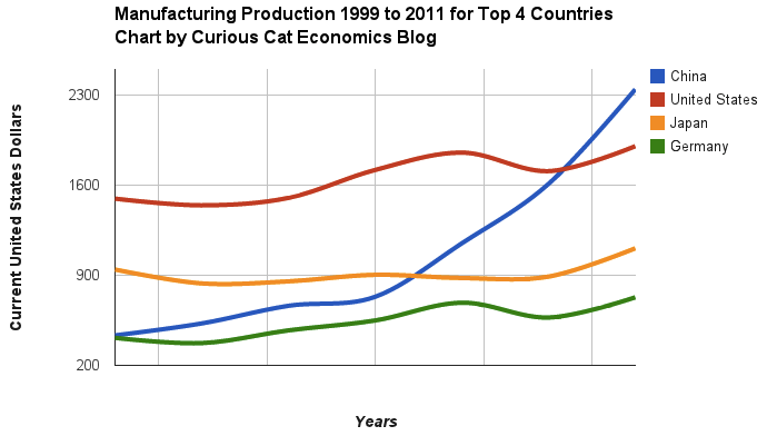
Chart of manufacturing production by China, USA, Japan and Germany from 1999 to 2011. The chart was created by the Curious Cat Economics Blog using UN data. You may use the chart with attribution. All data is shown in current USD (United States Dollar).
The story of global manufacturing production continues to be China’s growth, which is the conventional wisdom. The conventional wisdom however is not correct in the belief that the USA has failed. China shot past the USA, which dropped into 2nd place, but the USA still manufactures a great deal and has continually increased output (though very slowly in the last few years).
The story is pretty much the same as I have been writing for 8 years now. The biggest difference in that story is just that China actually finally moved into 1st place in 2010 and, maybe, the slowing of the USA growth in output (if that continues, I think the USA growth will improve). I said last year, that I expected China to build on the lead it finally took, and they did so. I expect that to continue, but I also wouldn’t be surprised to see China’s momentum slow (especially a few more years out – it may not slow for 3 or 4 more years).
As before, the four leading nations for manufacturing production remain solidly ahead of all the rest. Korea and Italy had manufacturing output of $313 billion in 2011 and Brazil moved up to $308 are in 4-6 place. Those 3 countries together could be in 4th place (ahead of just Germany). Even adding Korea and Italy together the total is short of Germany by $103 in 2011). I would expect Korea and Brazil to grow manufacturing output substantially more than Italy in the next 5 years.
Building your saving is largely about not very sexy actions. The point where most people fail is just not saving. It isn’t really about learning some tricky secret.
You can find yourself with pile of money without saving; if you win the lottery or inherit a few million from your rich relative via some tax dodge scheme like generation skipping trusts or charitable remainder trusts.
But the rest of us just have to do a pretty simple thing: save money. Then, keep saving money and invest that money sensibly. The key is saving money. The next key is not taking foolish risks. Getting fantastic returns is exciting but is not likely and the focus should be on lowering risk until you have enough savings to take risks with a portion of the portfolio.
My favorite tips along these lines are:
- spend less than you make
- save some of every raise you get
- save 10-15% of income for retirement
- add to any retirement account with employer matching (where say they add $500 for every $1,000 you put into your 401(k)
Spending less than you make and building up your long term savings puts you in the strongest personal finance position. These things matter much more than making a huge salary or getting fantastic investing returns some year. Avoiding risky investments is wise, and sure making great returns helps a great deal, but really just saving and investing in a boring manner puts you in great shape in the long run. Many of those making huge salaries are in atrocious personal financial shape.
Another way you can boost savings is to do so when you pay off a monthly bill. So when I paid off my car loan I just kept saving the old payment. Then I was able to buy my new car with the cash I saved in advance when I was ready for a new car.