There are many problems with the extremely low interest rates available in decade since the too-big-to-fail financial crisis. The interest rates seem to me to be artificially sustained by massive central bank actions for 12 years now.
Extraordinarily low rates encourage businesses to borrow money, after all how hard is it to invest in something that will return the business more than a few percent a year (that they can borrow at). Along with the continued efforts by the central banks to flood the economy with money any time there is even a slowdown in growth teaches companies to not worry about building a business that can survive bad times. Just borrow and if necessary borrow more if you are having trouble then just borrow more.
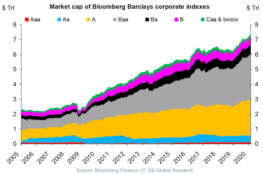
USA corporate debt has increased from a bit over $2 trillion in 2005 to over $7 trillion in 2020.
This isn’t a healthy way to build an economy. Businesses should be robust and able to sustain themselves if the economy experiences a recession and interest rates rise and the ability to borrow decreases.
Extremely low interest rates hide a huge potential cost if interest rates rise. Sure the huge debt is covered by cash flow in good times with the interest rate on your debt is 4%. What happens if interest rates rise to 6% and the economy declines? At some point investors (and banks) are going to realize that huge debt burdens on companies that are overly leveraged are not safe and deserve a premium interest rate.
I don’t think there is any risk to companies with very strong balance sheets and a business model that won’t have any trouble maintaining positive cash flow in a significant recession (Apple, Abbvie, Google, Costco, etc.). But many businesses are over-leveraged and at a significant risk of default in a bad economy.
The stock market is down quite a bit today partially due to the worry that the leveraged oil shale companies in the USA will go under if OPEC does not manage to restrict the supply of oil in order to keep oil prices high (or at least keep oil prices from collapsing).
Plenty of leveraged buyouts (where private equity firms take out cash and leave behind barely functional businesses) are barely able to survive even with extremely low interest rates. Those companies are in danger of failing when they experience even a small problems.
When 2 year US government bonds yield more than the 10 year US government bonds a recession is likely to appear soon. This chart shows why this is seen as such a reliable predictor.
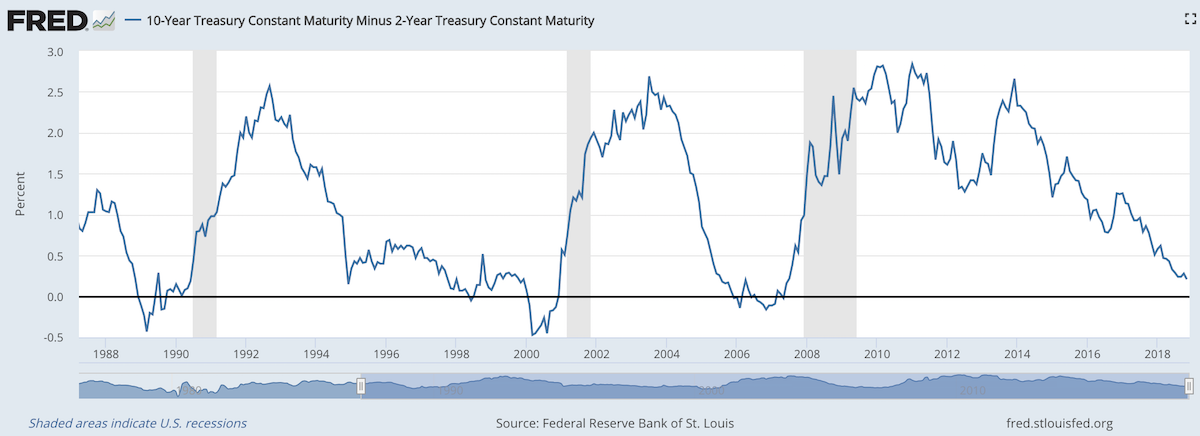
The chart shows the 10 year yield minus the 2 year yield. So when the value falls below 0 that means the 2 year yield is higher. Each time that happened, since 1988, a recession has followed (the grey shaded areas in the chart).
Do note that there were very small inversions in 1998 and 2006 that did not result in a recession in the near term. Also note that in every case the yield curve was no longer inverted by the time a recession actually started.
The reason why this phenomenon is getting so much attention recently is another thing that is apparent when looking at this chart, the 2 and 10 year yields are getting close to equal. But you can also see we are no closer than 1994 and the USA economy held off a recession for 7 more years.
Since 1970 the average length of time from the inversion of the 10 to 2 year yield curve has been 12 months (with a low of 6 months in 1973 and a high of 17 months, before the great recession of 2008).
In addition to a possibly impending yield curve inversion it has been a long time since the last recession which makes many investors and economists nervous that one may be due.
Related: 30 Year Fixed Mortgage Rates are not correlated with the Fed Funds Rate – Bond Yields Stay Very Low, Treasury Yields Drop Even More (2010) – Looking for Dividend Stocks in the Current Extremely Low Interest Rate Environment (2011) – Stock Market Capitalization by Country from 2000 to 2016
Another thing to note about yield curves at this time is that the US Federal Reserve continues to hold an enormous amount of long term government debt (trillions of dollars) which it has never done before the credit crisis of 2008. This reduces the long term yield since if they sold those assets that would add a huge amount of supply. How this impacts the predictive value of this measure will have to be seen. Also, one way for the Fed to delay the inversion would be to sell some of those bonds and drive up long term rates.
Abuse of the credit system by 3rd party collection agencies (and credit reporting agencies) in the USA has been a long term problem.
An attempt to partially address some of the abuses was a change in the required reporting practices that impacted collections accounts specifically, known as the National Consumer Assistance Plan (NCAP), which rolled into effect during the second half of 2017. The plan has many components, including: (1) a requirement for more frequent, detailed, and accurate reporting of collections accounts, including reflecting when those accounts have been paid; (2) a prohibition against reporting debts that did not arise from an agreement to pay, or from, medical collections less than 180 days old; (3) the removal of collections accounts that did not arise from a contract or agreement to pay; and (4) permission to report any account only when there is sufficient information to link the account with an individual’s credit files (requiring a name, address, and some other personally identifying information such as a Social Security number or date of birth).
All in all, the changes in credit reporting prompted by the National Consumer Assistance Plan have resulted in an $11 billion reduction in the collections accounts balances being reported on credit reports. A total of 8 million people had collections accounts completely removed from their credit report. However, collections accounts do indeed align with other negative events and the cleanup of collections accounts had the largest impact on the borrowers with the lowest scores.
These borrowers will certainly benefit in the long run from the cleanup of their credit reports, since higher scores are associated with better access to credit, to the job market, and even to the rental housing market. But the immediate impact of the removal of collections will be muted for most of those affected (other items are also impacting their current credit score).
In the longer-term there may be a rebound in collections account reporting because creditors will likely begin collecting the newly required personally identifying information as they adjust to this reporting change.
This was a small good step in protecting consumers from the bad behavior of credit reporting companies and their customers. But much more must be done to protect us from having our financial lives negatively impacted by bad practices of the credit reporting companies.
Related: Cleaning Up Collections – Avoiding the Vicious Cycle of Credit Problems – Truly Free Credit Report – USA Household Debt Jumps to Record $13.15 Trillion
Factfulness by Hans Rosling (of TED talks and Gapminder charts fame) is an exceptionally good book. It provides great insight into how to think more effectively and how to understand the reality of the world we live in (versus the large distortions so common in most people’s vision of the world). You can take a quick quiz to see how well you understand the world
The truth of the very widespread increase in wealth around the globe has influenced my investing strategy for decades. It should be influencing yours, is it?

Data is extremely valuable in helping us make decisions and evaluating the effectiveness of policy. However it is critical to be careful. It is very easy to focus on meeting targets that seem sensible – increasing the number of hospital beds – but that lead to less effective policy.
Dollar street provides photos of people at all 4 income levels from around the globe. This illustrates Hans’ point that what determines how people live and what their circumstances look like is mostly a matter of income not the country they live in. It is simple idea but one that runs counter to much of the economic discussion focused so much on national boundaries. National boundaries do matter and the laws and economic reality of the national economy has a large impact but the issues for people at each level of income are much more tied to those in their level of income anywhere in the world than they are tied to their nation.

The book relentlessly points out the great progress that has been made globally over the last 50 years and how that progress continues today and looks to be set to continue in the future. We have plenty of areas to work on improving but we should be aware of how much progress we have been making. As he points out frequently he has continually seen huge underestimation of the economic conditions in the world today. This book does a great job of presenting the real success we have achieved and the progress we can look forward to in the future.
* In 2017
Level 1 has 0.75 billion people living on less than $2 per day.
Level 2 has 3.3 billion people living on incomes between $2 to $8 per day.
Level 3 has 2.5 billion people living on $8 to $32 per day.
Level 4 has 0.9 billion people living on more than $32 per day.
Related: GDP Growth Per Capita for Selected Countries from 1970 to 2010 (Korea, China, Singapore, Brazil) – Stock Market Capitalization by Country from 2000 to 2016 – Ignorance of Capitalism Leads us Astray – Wealthiest 1% Continue Dramatic Gains Compared to Everyone Else
The Federal Reserve Bank of New York’s Center for Microeconomic Data today issued its Quarterly Report on Household Debt and Credit, which reported that total household debt increased by $193 billion (1.5%) to $13.15 trillion in the fourth quarter of 2017. This report marks the fifth consecutive year of positive annual household debt growth. There were increases in mortgage, student, auto, and credit card debt (increasing by 1.6%, 1.5%, 0.7% and 3.2% respectively) and another modest decline in home equity line of credit (HELOC) balances (decreasing by 0.9%).
Outstanding consumer debt balances by type: $8.88 trillion (mortgage), $1.38 trillion (student loans), $1.22 trillion (auto), $834 billion (credit card), $444 (HELOC).
Mortgages are the largest form of household debt and their increase of $139 billion was the most substantial increase seen in several quarters. Unlike overall debt balances, which last year surpassed their previous peak reached in the third quarter of 2008, mortgage balances remain 4.4% below it. The New York Fed issued an accompanying blog post to examine the regional differences in mortgage debt growth since the previous peak.

As of December 31, 4.7% of outstanding debt was in some stage of delinquency. As the chart shows mortgage and credit card debt delinquency rates have decreased sharply since 2010. Student loan debt delinquency rates have increased substantially during the same period (and delinquency rates for student loans are likely to understate effective delinquency rates because about half of these loans are currently in deferment, in grace periods or in forbearance and therefore temporarily not in the repayment cycle. This implies that among loans in the repayment cycle delinquency rates are roughly twice as high). You can understand why many see student debt as a huge economic problem the economy is facing in the coming years.
Of the $619 billion of debt that is delinquent, $406 billion is seriously delinquent (at least 90 days late or “severely derogatory”). The flow into 90+ days delinquency for credit card balances has been increasing notably from the last year and the flow into 90+ days delinquency for auto loan balances has been slowly increasing since 2012.
The total stock market capitalization by country gives some insight but it is also data that is a bit muddy. The data doesn’t tell you how the economies of the countries are doing as there is quite a bit of room for misinterpreting the data.
Apple, Alphabet, Intel, 3M, Abbvie… all are included in the USA market capitalization but much of their sales, earnings and employment are overseas. And USA companies have done very well in global markets so the USA totals are not just an indication how the USA has performed but includes great gains made by profiting from global growth. Also you may be surprised to learn that 26% of USA equities are owned by investors outside the USA.
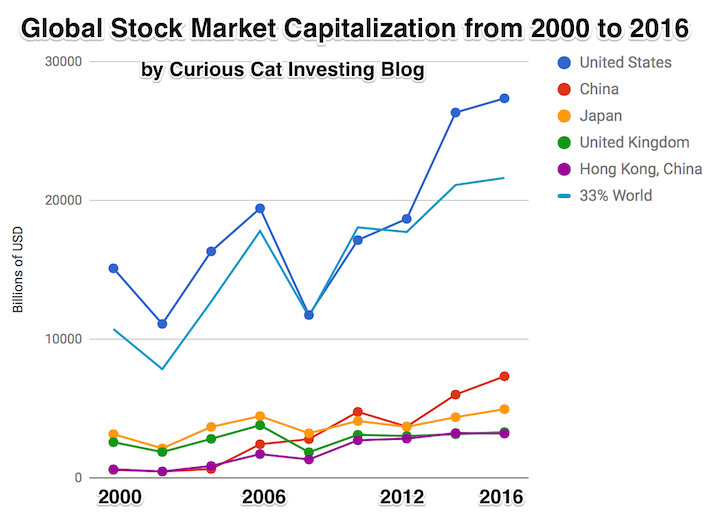
The chart shows the top countries based on stock market capitalization, with data from 2000 to 2016. The chart was created by Curious Cat Investing and Economics Blog may be used with attribution. Data from the World Bank.
It is important to keep in mind the data is shown in current USA dollars, so large swings in exchange rates can have a large impact.
China’s performance has been remarkable. China also shows some of the challenges in collecting this data. I am fairly certain Alibaba (BABA), one of the 10 most valuable companies in the world and a Chinese company has the stock issued in the USA (even this is confusing as it is a complex arrangement but the only publicly traded stock is traded in the USA). And many other Chinese companies are traded this way and therefore are not included in the Chinese total value. In addition Hong Kong is part of China but also separate. The data is reported separately by the world bank and I include them that way in the charts.
As with so much recent economic data China’s performance here is remarkable. China grew from 1.8% of world capitalization in 2000 to 6.9% in 2012 and 11.2% in 2016. Adding Hong Kong to China’s totals shows 3.7% in 2000 with growth to to 12.2% in 2012 and 16.2% in 2016. If you look at my post global stock market capitalization from 2000 to 2012 you will see significantly different historical data for Hong Kong. Collecting this data is much more complex than people realize and data determinations can change over the years resulting in changes in historical data.
The chart shows the 1/3 of the total global market capitalization in order to have the chart display look better (and it also makes it easier to compare the USA performance to the total global performance). The USA market capitalization was at 46.9% of the global market cap in 2000 and fell to 31.6% in 2000 before rising to 42% in 2016. This shows that the USA has largely held its own globally as measured by market cap. This may not seem impressive but when you consider that China has grown from 3.7% to 16.2% you can see that for the market cap outside of China the USA has actually gained quite a bit of ground. This is the result of what I mentioned before – how well USA companies have done at capture global markets (especially in high technology areas with very high profits and therefore very high market caps).
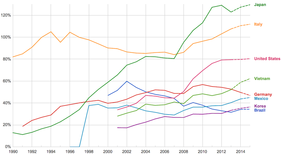
The data, from IMF, does not include China or India.
The chart shows data for net debt (gross debt reduced by certain assets: gold, currency deposits, debt securities etc.).
Viewing our post on the data in 2014 we can see that the USA improved on the expectations, managing to hold net debt to 80% instead of increasing to 88% as expected. Nearly every country managed to take on less debt than predicted (Vietnam took on more, but is very low so this is not a problem).
Taking on debt to invest in valuable resources (building roads, mass transit, internet infrastructure, education, environmental regulation and enforcement, health care, renewable energy…) that will boost long term economic performance can be very useful. The tricky part is knowing the debt levels doesn’t tell you whether the debt was taken on for investment or just to let current taxpayers send the bills for their consumption to their grandchildren.
Also government debt can become a huge burden on the economy (especially if the debt is owed outside the country). The general consensus today seems to be that 100% net debt level is the maximum safe amount and increasing beyond that gets riskier and riskier.
Delinquencies in closed-end loans fell slightly in the second quarter, driven by a drop in home equity loan delinquencies, according to results from the American Bankers Association’s Consumer Credit Delinquency Bulletin.
The composite ratio, which tracks delinquencies in eight closed-end installment loan categories, fell 3 basis points to 1.35% of all accounts – a record low. This also marked the third year that delinquency rates were below the 15-year average of 2.21%. The ABA report defines a delinquency as a late payment that is 30 days or more overdue. This is good news but the personal financial health of consumers in the USA is still in need of significantly improvements to their balance sheets. Debt levels are still too high. Savings levels are still far to low.
Home equity loan delinquencies fell 4 basis points to 2.70% of all accounts, which helped drive the composite ratio down. Other home related delinquencies increased slightly, with home equity line delinquencies rising 6 basis points to 1.21% of all accounts and property improvement loan delinquencies rising 2 basis points to 0.91% of all accounts. Home equity loan delinquencies dipped further below their 15-year average of 2.85%, while home equity line delinquencies remained just above their 15-year average of 1.15 percent.
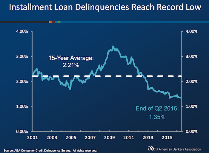
Bank card delinquencies edged up 1 basis point to 2.48% of all accounts in the second quarter. They remain significantly below their 15-year average of 3.70 percent.
The second quarter 2016 composite ratio is made up of the following eight closed-end loans. All figures are seasonally adjusted based upon the number of accounts.
Closed-end loans
Home equity loan delinquencies fell from 2.74% to 2.70%.
Mobile home delinquencies fell from 3.41% to 3.17%.
Personal loan delinquencies fell from 1.44% to 1.43%.
Direct auto loan delinquencies rose from 0.81% to 0.82%.
Indirect auto loan delinquencies rose from 1.45% to 1.56%.
Marine loan delinquencies rose from 1.03% to 1.23%.
Property improvement loan delinquencies rose from 0.89% to 0.91%.
RV loan delinquencies rose from 0.92% to 0.96%.
Open-end loans
Bank card delinquencies rose from 2.47% to 2.48%.
Home equity lines of credit delinquencies rose from 1.15% to 1.21%.
Non-card revolving loan delinquencies rose from 1.57% to 1.65%.
Related: Debt Collection Increasing Given Large Personal Debt Levels (2014) – Consumer and Real Estate Loan Delinquency Rates from 2001 to 2011 in the USA – Good News: Credit Card Delinquencies at 17 Year Low (2011) – Real Estate and Consumer Loan Delinquency Rates 1998-2009 – The USA Economy Needs to Reduce Personal and Government Debt (2009)
Even if some lobbyists and their friends in Washington DC try to distract from the long term failure of the USA health care system the data continues to pour in about how bad it is.
U.S. Health-Care System Ranks as One of the Least-Efficient
None of these rankings are perfect and neither is this one. But it is clear beyond any doubt that the USA healthcare system is extremely costly for no better health results than other rich countries (and even more expensive with again no better results than most poor countries). It is a huge drain on the economy that we continue to allow lobbyists and special interests to take advantage of the rest of us via the Democrats and Republican parties actions over the last few decades.
We have to improve. The costs imposed on everyone to support those benefiting from this decades old transfer of economic wealth to health care special interests should no longer be accepted.
The top 5 countries are: Hong Kong, Singapore, Spain, South Korea and Japan. The first four have costs about 25% of the USA. Japan costs about 40% of the USA per person cost.
Mylan’s despicable actions with Epi-pen and the direct participation of both political parties in increasing the costs foisted on the health care system by Mylan is just one in hundreds of the individual actions that continue to saddle the rest of USA economy with huge costs.
Related: Out of Pocket “Maximum”, Understanding USA Health Care Costs – Decades Later The USA Health Care System is Still a Deadly Disease for Our Economy – 2015 Health Care Price Report, Costs in the USA and Elsewhere – USA Health Care Spending 2013: $2.9 trillion $9,255 per person and 17.4% of GDP – USA Spends $7,960 Compared to Around $3,800 for Other Rich Countries on Health Care with No Better Health Results (2009 data)
The International Federation of Health Plans has published the 2015 Comparative Price Report, Variation in Medical and Hospital Prices by Country. Once again this illustrates the excessive cost of health care in the USA. See related posts for some of our previous posts on this topic.
The damage to the USA economy due to inflated health care costs is huge. A significant portion of the excessive costs are due to policies the government enacts (which only make sense if you believe the cash given to politicians by those seeking to retain the excessive costs structure in the USA the last few decades buy the votes of the political parties and the individual politicians).
In 2015, Humira (a drug from Abbvie to treat rheumatoid arthritis that is either the highest grossing drug in the world, or close to it) costs $2,669 on average in the USA; $822 in Switzerland; $1,362 in the United Kingdom. This is the cost of a 28 day supply.
All the prices shown here are for the prices reported are the average allowed costs, which include both member cost sharing and health plan payment. So it only includes costs for those covered by health plans (it doesn’t include even much larger price tags given those without insurance in the USA).
Harvoni (a drug from Gilead to treat hepatitis C is also near the top of drugs with the largest revenue worldwide). This is also a drug that has been used as a lightning rod for the whole area of overpriced drugs. One interesting thing is this is actually one that is not nearly as inflated in the USA over other countries nearly as much as most are. Again, for a 28 day supply the costs are $16,861 in Switzerland; $22,554 in the United Kingdom and $32,114 in the USA. Obviously quite a lot but “only” double the cost in the USA instead of over triple for Humira (from Switzerland to the USA).
Tecfidera is prescribed to treat relapsing multiple sclerosis. The cost for a 30 day supply vary from $663 in the United Kingdom to $5,089 in the USA ($1,855 Switzerland).
There are actually some drugs that are more expensive outside the USA (though it is rare). OxyContin is prescribed to treat severe ongoing pain and is also abused a great deal. The prices vary from $95 in Switzerland to $590 in the United Kingdom ($265 in United States).
The report also includes the cost of medical procedures. For both the drugs and the procedures they include not only average but measures to show how variable the pricing is. As you would expect (if you pay attention to the massive pricing variation in the USA system) the variation in the cost of medical procedures is wide. For an appendectomy in the USA the 25th percentile of cost was $9,322 and for the 95th was $33,250; the average USA cost was $15,930. The average cost in Switzerland was $6,040 and in the United Kingdom was $8,009.
As has been obvious for decades the USA needs to stop allowing those benefiting from the massively large excessive health care costs in the USA from buying the Democrats and Republicans support to keep prices so high. But there has been very little good movement on this front in decades.
Related: USA Heath Care System Needs Reform – USA Health Care Spending 2013: $2.9 trillion $9,255 per person and 17.4% of GDP – Decades Later The USA Health Care System is Still a Deadly Disease for Our Economy – USA Spends $7,960 per person Compared to Around $3,800 for Other Rich Countries on Health Care with No Better Health Results (2009) – Drug Prices in the USA (2005)