The most popular posts on the Curious Cat Investing and Economics blog in 2017 (based on page views).
- Default Rates on Loans by Credit Score (2015)
- Top 10 Countries for Manufacturing Production in 2010: China, USA, Japan, Germany… (posted in 2011)
- USA Health Care Spending 2013: $2.9 trillion $9,255 per person and 17.4% of GDP (2015) (
- Manufacturing Output as a Percent of GDP by Country (1980 to 2008) (2010)
- The 20 Most Valuable Companies in the World – November 2017*
- Warren Buffett’s 2016 Letter to Shareholders (2017)*
- Stock Market Capitalization by Country from 2000 to 2016 (2017)*
- Stock Market Capitalization by Country from 1990 to 2010 (2012)
- Monopolies and Oligopolies do not a Free Market Make (2008)
- Manufacturing Output by Country 1999-2011: China, USA, Japan, Germany (2013)
- Government Debt as Percentage of GDP 1990-2009: USA, Japan, Germany, China… (2010)
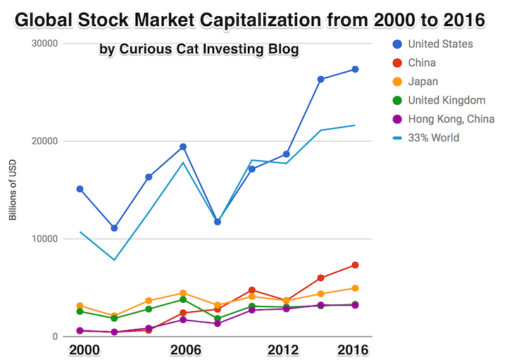
The chart shows the top countries based on stock market capitalization, with data from 2000 to 2016. The chart was created by Curious Cat Investing and Economics Blog may be used with attribution. Data from the World Bank.
The total stock market capitalization by country gives some insight but it is also data that is a bit muddy. The data doesn’t tell you how the economies of the countries are doing as there is quite a bit of room for misinterpreting the data.
Apple, Alphabet, Intel, 3M, Abbvie… all are included in the USA market capitalization but much of their sales, earnings and employment are overseas. And USA companies have done very well in global markets so the USA totals are not just an indication how the USA has performed but includes great gains made by profiting from global growth. Also you may be surprised to learn that 26% of USA equities are owned by investors outside the USA.
The chart shows the top countries based on stock market capitalization, with data from 2000 to 2016. The chart was created by Curious Cat Investing and Economics Blog may be used with attribution. Data from the World Bank.
It is important to keep in mind the data is shown in current USA dollars, so large swings in exchange rates can have a large impact.
China’s performance has been remarkable. China also shows some of the challenges in collecting this data. I am fairly certain Alibaba (BABA), one of the 10 most valuable companies in the world and a Chinese company has the stock issued in the USA (even this is confusing as it is a complex arrangement but the only publicly traded stock is traded in the USA). And many other Chinese companies are traded this way and therefore are not included in the Chinese total value. In addition Hong Kong is part of China but also separate. The data is reported separately by the world bank and I include them that way in the charts.
As with so much recent economic data China’s performance here is remarkable. China grew from 1.8% of world capitalization in 2000 to 6.9% in 2012 and 11.2% in 2016. Adding Hong Kong to China’s totals shows 3.7% in 2000 with growth to to 12.2% in 2012 and 16.2% in 2016. If you look at my post global stock market capitalization from 2000 to 2012 you will see significantly different historical data for Hong Kong. Collecting this data is much more complex than people realize and data determinations can change over the years resulting in changes in historical data.
The chart shows the 1/3 of the total global market capitalization in order to have the chart display look better (and it also makes it easier to compare the USA performance to the total global performance). The USA market capitalization was at 46.9% of the global market cap in 2000 and fell to 31.6% in 2000 before rising to 42% in 2016. This shows that the USA has largely held its own globally as measured by market cap. This may not seem impressive but when you consider that China has grown from 3.7% to 16.2% you can see that for the market cap outside of China the USA has actually gained quite a bit of ground. This is the result of what I mentioned before – how well USA companies have done at capture global markets (especially in high technology areas with very high profits and therefore very high market caps).
The most popular posts on the Curious Cat Investing and Economics blog in 2016 (by page views).
- Top 10 Countries for Manufacturing Production in 2010: China, USA, Japan, Germany… (posted in 2011)
- Manufacturing Output as a Percent of GDP by Country (1980 to 2008) (2010)
- Default Rates on Loans by Credit Score (2015)*
- Stock Market Capitalization by Country from 1990 to 2010 (2012)
- Investing in Peer to Peer Loans (2015)
- Manufacturing Output by Country 1999-2011: China, USA, Japan, Germany (2013)
- The 20 Most Valuable Companies in the World – October 2015
- Manufacturing Output as Percent of GDP from 1980 to 2010 by Country (2012)
- Monopolies and Oligopolies do not a Free Market Make (2008)
- Government Debt as Percentage of GDP 1990-2009: USA, Japan, Germany, China… (2010)
- USA Individual Earnings Levels: Top 1% $343,000, 5% $154,000, 10% $112,000, 25% $66,000 (2012)
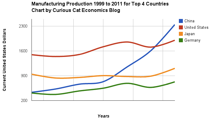
Chart of manufacturing production by China, USA, Japan and Germany from 1999 to 2011. The chart was created by the Curious Cat Economics Blog using UN data. You may use the chart with attribution. All data is shown in current USD (United States Dollar).
The most popular posts on the Curious Cat Investing and Economics blog in 2014 (by page views).
- Top 10 Countries for Manufacturing Production in 2010: China, USA, Japan, Germany… (posted in 2011)
- Manufacturing Output as a Percent of GDP by Country (1980 to 2008) (2010)
- Nuclear Power Generation by Country from 1985-2010 (2012)
- Government Debt as Percentage of GDP 1990-2009: USA, Japan, Germany, China… (2010)
- Stock Market Capitalization by Country from 1990 to 2010 (2012)
- Global Stock Market Capitalization from 2000 to 2012 (2013)
- The 20 Most Valuable Companies in the World – October 2015
- Manufacturing Output as Percent of GDP from 1980 to 2010 by Country (2012)
- USA Individual Earnings Levels: Top 1% $343,000, 5% $154,000, 10% $112,000, 25% $66,000 (2012)
- Manufacturing Output by Country 1999-2011: China, USA, Japan, Germany (2013)
- Chart of Largest Petroleum Consuming Countries from 1980 to 2010 (2011)
- The USA Doesn’t Understand that the 1950s and 1960s are Not a Reasonable Basis for Setting Expectations (2011)
- Oil Production by Country 1999-2009 (2011)
- Monopolies and Oligopolies do not a Free Market Make (2008)
- Investing in Peer to Peer Loans (2015)
- Cockroach Portfolio (2014)
- USA Health Care Spending 2013: $2.9 trillion $9,255 per person and 17.4% of GDP (2015) (
- Long Term View of Manufacturing Employment in the USA (2012)
- Solar Energy Capacity by Country (2015)
- Chart of Global Wind Energy Capacity by Country 2005 to 2013 (2014)
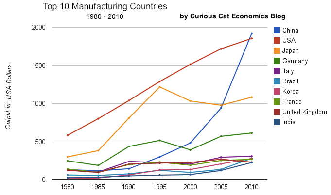
chart of output by top 10 manufacturing countries from 1980 to 2010
As with my other blogs the most popular posts show that old posts stay popular for a long time. Number of top 20 posts by year of publication:
2015: 4
2014: 2
2013: 2
2012: 5
2011: 4
2010: 2
2008: 1
Related: 20 Most Popular Posts on the Curious Cat Investing and Economics Blog in 2014 – 20 Most Popular Post on Curious Cat Science and Engineering Blog in 2014 – 10 Most Popular Posts on the Curious Cat Management Blog in 2014 – Most Popular Posts on the Curious Cat Management Comments Blog – Most Popular Posts on the Curious Cat Comments Blog
Chart of manufacturing production by China, USA, Japan and Germany from 1999 to 2011. The chart was created by the Curious Cat Economics Blog using UN data. You may use the chart with attribution. All data is shown in current USD (United States Dollar).
The story of global manufacturing production continues to be China’s growth, which is the conventional wisdom. The conventional wisdom however is not correct in the belief that the USA has failed. China shot past the USA, which dropped into 2nd place, but the USA still manufactures a great deal and has continually increased output (though very slowly in the last few years).
The story is pretty much the same as I have been writing for 8 years now. The biggest difference in that story is just that China actually finally moved into 1st place in 2010 and, maybe, the slowing of the USA growth in output (if that continues, I think the USA growth will improve). I said last year, that I expected China to build on the lead it finally took, and they did so. I expect that to continue, but I also wouldn’t be surprised to see China’s momentum slow (especially a few more years out – it may not slow for 3 or 4 more years).
As before, the four leading nations for manufacturing production remain solidly ahead of all the rest. Korea and Italy had manufacturing output of $313 billion in 2011 and Brazil moved up to $308 are in 4-6 place. Those 3 countries together could be in 4th place (ahead of just Germany). Even adding Korea and Italy together the total is short of Germany by $103 in 2011). I would expect Korea and Brazil to grow manufacturing output substantially more than Italy in the next 5 years.
The largest manufacturing countries are China, USA, Japan and then Germany. These 4 are far in the lead, and very firmly in their positions. Only the USA and China are close, and the momentum of China is likely moving it quickly ahead – even with their current struggles.
The chart below shows manufacturing production by country as a percent of GDP of the 10 countries that manufacture the most. China has over 30% of the GDP from manufacturing, though the GDP share fell dramatically from 2005 and is solidly in the lead.
Nearly every country is decreasing the percentage of their economic output from manufacturing. Korea is the only exception, in this group. I would expect Korea to start following the general trend. Also China has reduced less than others, I expect China will also move toward the trend shown by the others (from 2005 to 2010 they certainly did).
For the 10 largest manufacturing countries in 2010, the overall manufacturing GDP percentage was 24.9% of GDP in 1980 and dropped to 17.7% in 2010. The point often missed by those looking at their country is most of these countries are growing manufacturing, they are just growing the rest of their economy more rapidly. It isn’t accurate to see this as a decline of manufacturing. It is manufacturing growing more slowly than (information technology, health care, etc.).

This chart shows manufacturing output, as percent of GDP, by country and was created by the Curious Cat Economics Blog based on UN data. You may use the chart with attribution.
The manufacturing share of the USA economy dropped from 21% in 1980 to 18% in 1990, 15% in 2000 and 13% in 2010. Still, as previous posts show, the USA manufacturing output has grown substantially: over 300% since 1980, and 175% since 1990. The proportion of manufacturing output by the USA (for the top 10 manufacturers) has declined from 33% in 1980, 32% in 1990, 35% in 2000 to 26% in 2010. If you exclude China, the USA was 36% of the manufacturing output of these 10 countries in 1980 and 36% in 2010. China’s share grew from 7.5% to 27% during that period.
The United Kingdom has seen manufacturing fall all the way to 10% of GDP, manufacturing little more than they did 15 years ago. Japan is the only other country growing manufacturing so slowly (but Japan has one of the highest proportion of GDP from manufacturing – at 20%). Japan manufactures very well actually, the costs are very high and so they have challenges but they have continued to manufacture quite a bit, even if they are not growing output much.

Chart of manufacturing production by the top 10 manufacturing countries (2000 to 2010). The chart was created by the Curious Cat Economics Blog. You may use the chart with attribution. All data is shown in 2010 USD (United States Dollar).
In my last post I looked at the output of the top 10 manufacturing countries with a focus on 1980 to 2010. Here I take a closer look at the last 10 years.
In 2010, China took the lead as the world’s leading manufacturing country from the USA. In 1995 the USA was actually very close to losing the lead to Japan (though you wouldn’t think it looking at the recent data). I believe China will be different, I believe China is going to build on their lead. As I discussed in the last post the data doesn’t support any decline in Chinese manufacturing (or significant moves away from China toward other South-East Asian countries). Indonesia has grown quickly (and have the most manufacturing production, of those discussed), but their total manufacturing output is less than China grew by per year for the last 5 years.
The four largest countries are pretty solidly in their positions now: the order will likely be China, USA, Japan, Germany for 10 years (or longer): though I could always be surprised. In the last decade China relentlessly moved past the other 3, to move from 4th to 1st. Other than that though, those 3 only strengthened their position against their nearest competitors. Brazil, Korea or India would need to increase production quite rapidly to catch Germany sooner. After the first 4 though the situation is very fluid.
")
Taking a closure look at the large group of countries after top 4. Chart of manufacturing production from 2000-2010.
Chart of manufacturing production by the leading manufacturing countries (2000 to 2010). The top 4 countries are left off to look more closely at history of the next group. The chart was created by the Curious Cat Economics Blog based on UN data. You may use the chart with attribution.
Removing the top 4 to take a close look at the data on the other largest manufacturing countries we see that there are many countries bunched together. It is still hard to see, but if you look closely, you can make out that some countries are growing well, for example: Brazil, India and Indonesia. Other countries (most in Europe, as well as Mexico) did not fare well in the last decade.
The UK had a particularly bad decade, moving from first place in this group (5th in the world) to 5th in this group and likely to be passed by India in 2011. Europe has 4 countries in this list (if you exclude Russia) and they do not appear likely to do particularly well in the next decade, in my opinion. I would certainly expect Brazil, India, Korea and Indonesia to out produce Italy, France, UK and Spain in 2020. In 2010 the total was $976 billion by the European 4 to $961 billion by the non-European 4. In 2000 it was $718 billion for the European 4 to $343 billion (remember all the data is in 2010 USD).
Chart of output by top 10 manufacturing countries from 1980 to 2010. The chart was created by the Curious Cat Economics Blog based on UN data. You may use the chart with attribution.
China has finally actually taken the lead as the largest manufacturer in the world. Reading many news sources and blogs you may have thought the USA lost the lead a couple of decades ago, but you would be wrong. In 1995 it looked like Japan was poised to take the lead in manufacturing production, but they have slumped since then (still they are solidly the 3rd biggest manufacturer). China has been growing manufacturing output enormously for 20 years, and they have now taken the lead from the USA.
As I have been saying for years the biggest economic story about manufacturing is the dramatic and long term increase of productive capacity in China. The next is the continuing global decline in manufacturing employment: increased productivity has seen production rise year after year and employment fall. What is the next most interesting stories is debatable: I would say the continuing failure to appreciate the continuing strong manufacturing production increases by the USA. Another candidate is the the decline in Japan. Another is the increase in several other counties: Korea, Brazil, India, Indonesia…
Looking more closely at some of the long term data shows how much China stands out. From 1980 to 2010 China increased output 1345%. The total top 10 group increased output 302% (all data is in current USD so inflation accounts for most of the gain, 100 1980-USD equal 280 2010-USD). From 1995 to 2010 China increased output 543%. The group increased 64%. For 1980-2010, the results for the other 3 largest manufacturing countries are: USA up 218%, Japan up 261% and Germany up 148% (other countries doing very well are Korea up 1893% and India up 737%). Looking at the last half of that period, from 1995-2010 the: USA up 44%, Japan down 11% and Germany up 19%.
One thing to remember about adjusting manufacturing data for inflation is that often the products created in later years are superior and cost less. So that a computer manufactured in 1990 which added $5,000 to the manufacturing total is far inferior to one in 2010 that added just $1,000. This point is mainly to say that while the increase in manufacturing in real (not inflated dollars) is not as high as it might seem the real value of manufacturing good did likely increase a great deal. But the economic data is based on price so manufacturing increases are reduced by cost decreases. Computers are the most obvious example, but it is also true with many other manufactured goods.
You can that the other largest manufacturing countries fail to keep up with the increases of the entire group of the top 10. China’s gains are just too large for others to match. If you remove China’s results (just to compare how the non-China countries are doing) from 1980-2010 the increase was 216% (so compared to the other 9 top manufacturers over this period the USA was even and Japan better than the average and Germany was worse). And from 1995-2010 the top 9 group (top 10, less China) increased just 28%: so the USA beat while Japan and Germany did worse than the other 9 as a group.
My preference is for a lower use of bonds than the normal portfolio balancing strategies use. I just find the risks greater than the benefits. This preference increases as yields decline. Given the historically low interest rates we have been experiencing the last few years (and low yields even for close to a decade) I really believe bonds are not a good investment. Now for someone approaching or in retirement I do think some bonds are probably wise to balance the portfolio (or CDs). But I would limit maturities/duration to 2 or 3 years. And really I would pursue high yielding stocks much more than normal.
In general I like high yielding stocks for retirement portfolios. Many are very good long term investments overall and I prefer to put a portion of the portfolio others would place in bonds in high yielding stocks. Unfortunately 401(k) [and 403(b)] retirement accounts often don’t offer an option to do this. Luckily IRAs give you the options to invest as you chose and by placing your IRA in a brokerage account you can use this strategy. In a limited investing option retirement account [such as a 401(k)] look for short term bond funds, inflation protected bonds and real estate funds – but you have to evaluate if those funds are good – high expenses will destroy the reasons to invest in bond funds.
There are actually quite a few attractive high yield stocks now. I would strive for a very large amount of diversity in high yield stocks that are meant to take a portion of the bonds place in a balanced portfolio. In the portion of the portfolio aimed at capital appreciation I think too much emphasis is placed on “risk” (more concentration is fine in my opinion – if you believe you have a good risk reward potential). But truthfully most people are better off being more diversified but those that really spend the time (it takes a lot of time and experience to invest well) can take on more risk.
A huge advantage of dividends stocks is they often increase the dividend over time. And this is one of the keys to evaluate when selected these stock investments. So you can buy a stock that pays a 4% yield today and 5 years down the road you might be getting 5.5% yield (based on increased dividend payouts and your original purchase price). Look for a track record of increasing dividends historically. And the likelihood of continuing to do so (this is obviously the tricky part). One good value to look at is the dividend payout rate (dividend/earnings). A relatively low payout (for the industry – using an industry benchmark is helpful given the different requirement for investing in the business by industry) gives you protection against downturns (as does the past history of increasing payouts). It also provides the potential for outsized increases in the future.
There are a number of stocks that look good in this category to me now. ONEOK Partners LP pays a dividend of 5.5% an extremely high rate. They historically have increased the dividend. They are a limited partnership which are a strange beast not quite a corporation and you really need to read up and understand the risks with such investments. ONEOK is involved in the transportation and storage of natural gas. I would limit the exposure of the portfolio to limited partnerships (master limited partnerships). They announced today that the are forecasting a 20% increase in 2012 earnings so the stock will likely go up (and the yield go down – it is up 3.4% in after hours trading).
Another stock I like in this are is Abbott, a very diversified company in the health care field. This stock yields 3.8% and has good potential to grow. That along with a 3.8% yield (much higher than bond yields, is very attractive).
My 12 stocks for 10 year portfolio holds a couple investments in this category: Intel, Pfizer and PetroChina. Intel yields 3.9% and has good growth prospects though it also has the risk of deteriorating margins. There margins have remains extremely high for a long time. Maybe it can continue but maybe not. Pfizer yeilds 4.6% today which is a very nice yield. At this time, I think I prefer Abbott but given the desire for more diversification in this portion of the portfolio both would be good holdings. Petro China yields 4% today.
When invested in a retirement portfolio prior to retirement I would probably just set up automatic reinvesting of the dividends. Once in retirement as income is needed then you can start talking the dividends as cash, to provide income to pay living expenses. I would certainly suggest more than 10 stocks for this portion of a portfolio and an investor needs to to educate themselves evaluate the risks and value of their investments or hire someone who they trust to do so.
Related: Retirement Savings Allocation for 2010 – S&P 500 Dividend Yield Tops Bond Yield: First Time Since 1958 – 10 Stocks for Income Investors
China continues to grow manufacturing is output. In 2009, the USA, and most countries saw declines in manufacturing production. China, however, continued to grow. China is now finally approaching the level of manufacturing done in USA. The latest data again shows the USA is the largest manufacturer but China looks poised to take over the number one spot soon.

The chart showing manufacturing output by country was created by the Curious Cat Economics Blog based on UN data (in 2009 USA dollars). You may use the chart with attribution.
The large decline in Germany was 23%. This was a 18% decline in Euro terms, and when you added the decline of the Euro the total USA dollar decline was 23%. Quite extraordinary. Most European countries were down over 15%. In fact, so extraordinary it makes me question the data. World economic data is useful and interesting but it isn’t perfect. USA manufacturing declined just .5%. China increased manufacturing production by 9%.
The last 2 years, China has stopped separating out mining and utilities from manufacturing. The percentage of manufacturing (to manufacturing, mining and utilities) was 78% for 2005-2007 (I used 78% of the manufacturing, mining and utilities figure provided in the 2008 and 2009 data – but that could be wrong). The unadjusted 2009 China total was $2.05 trillion and for the USA the total manufacturing, mining and utilities was $2.33 trillion. In 2009, the manufacturing total was 76% of USA manufacturing, mining and utilities. The percentage varies significantly between countries (the Russian federation is about 55% and Japan about 91%) and various over time as a countries economy changes.
The big, long term story remains the same. China has continued to grow manufacturing output tremendously. I see very little data to support the stories about manufacturing having to leave China to go elsewhere (especially when you look at the “lower wages” counties mentioned in news stories – they are not growing at any significant rate). The USA is still manufacturing a huge amount and that production has steadily grown over time.
When you look back over the period from 1980 to today you can see
- The biggest story is the growth in Chinese manufacturing
- The USA started out the largest and has grown significantly
- Japan did very well from 1980 to 1995, and since they have struggled
- The USA, China, Japan are really far ahead of other countries in total manufacturing output, and Germany is solidly in 4th place.
- After that the countries are fairly closely grouped together. Though there are significant trends hidden by the scale of this graph, which I will explore in future posts. South Korea has growth significantly over this period, for example.
- The biggest macro trend that the data shows, but is not so visible in this chart (other than China’s growth), is the very strong performance of emerging markets (and in fact some counties have fully become manufacturing powerhouses during this period, most notably China but also, South Korea and Brazil). And I see that continuing going forward (though that is speculation).
Two more interesting pieces of data. Italy is the 5th largest manufacturing country, I don’t think many people would guess that. Since 1980 Italy surpassed the UK and France but China rocketed passed them. And Indonesia has moved into 14th place, edging out Canada in 2009.
I plan to take more time in 2011 to look at global manufacturing and other global economic data more closely and to write about it here.
Related: Data on the Largest Manufacturing Countries in 2008 – Top 12 Manufacturing Countries in 2007 – Top 10 Manufacturing Countries 2006 – Leading global manufacturers in 2004