The total stock market capitalization by country gives some insight but it is also data that is a bit muddy. The data doesn’t tell you how the economies of the countries are doing as there is quite a bit of room for misinterpreting the data.
Apple, Alphabet, Intel, 3M, Abbvie… all are included in the USA market capitalization but much of their sales, earnings and employment are overseas. And USA companies have done very well in global markets so the USA totals are not just an indication how the USA has performed but includes great gains made by profiting from global growth. Also you may be surprised to learn that 26% of USA equities are owned by investors outside the USA.
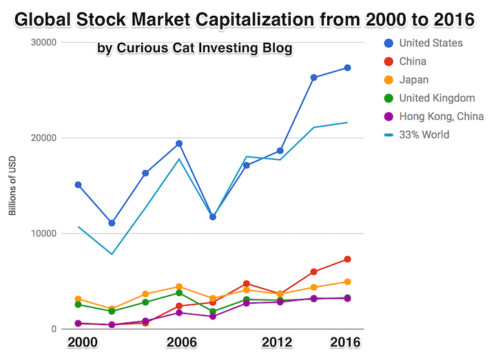
The chart shows the top countries based on stock market capitalization, with data from 2000 to 2016. The chart was created by Curious Cat Investing and Economics Blog may be used with attribution. Data from the World Bank.
It is important to keep in mind the data is shown in current USA dollars, so large swings in exchange rates can have a large impact.
China’s performance has been remarkable. China also shows some of the challenges in collecting this data. I am fairly certain Alibaba (BABA), one of the 10 most valuable companies in the world and a Chinese company has the stock issued in the USA (even this is confusing as it is a complex arrangement but the only publicly traded stock is traded in the USA). And many other Chinese companies are traded this way and therefore are not included in the Chinese total value. In addition Hong Kong is part of China but also separate. The data is reported separately by the world bank and I include them that way in the charts.
As with so much recent economic data China’s performance here is remarkable. China grew from 1.8% of world capitalization in 2000 to 6.9% in 2012 and 11.2% in 2016. Adding Hong Kong to China’s totals shows 3.7% in 2000 with growth to to 12.2% in 2012 and 16.2% in 2016. If you look at my post global stock market capitalization from 2000 to 2012 you will see significantly different historical data for Hong Kong. Collecting this data is much more complex than people realize and data determinations can change over the years resulting in changes in historical data.
The chart shows the 1/3 of the total global market capitalization in order to have the chart display look better (and it also makes it easier to compare the USA performance to the total global performance). The USA market capitalization was at 46.9% of the global market cap in 2000 and fell to 31.6% in 2000 before rising to 42% in 2016. This shows that the USA has largely held its own globally as measured by market cap. This may not seem impressive but when you consider that China has grown from 3.7% to 16.2% you can see that for the market cap outside of China the USA has actually gained quite a bit of ground. This is the result of what I mentioned before – how well USA companies have done at capture global markets (especially in high technology areas with very high profits and therefore very high market caps).
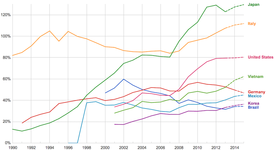
The data, from IMF, does not include China or India.
The chart shows data for net debt (gross debt reduced by certain assets: gold, currency deposits, debt securities etc.).
Viewing our post on the data in 2014 we can see that the USA improved on the expectations, managing to hold net debt to 80% instead of increasing to 88% as expected. Nearly every country managed to take on less debt than predicted (Vietnam took on more, but is very low so this is not a problem).
Taking on debt to invest in valuable resources (building roads, mass transit, internet infrastructure, education, environmental regulation and enforcement, health care, renewable energy…) that will boost long term economic performance can be very useful. The tricky part is knowing the debt levels doesn’t tell you whether the debt was taken on for investment or just to let current taxpayers send the bills for their consumption to their grandchildren.
Also government debt can become a huge burden on the economy (especially if the debt is owed outside the country). The general consensus today seems to be that 100% net debt level is the maximum safe amount and increasing beyond that gets riskier and riskier.
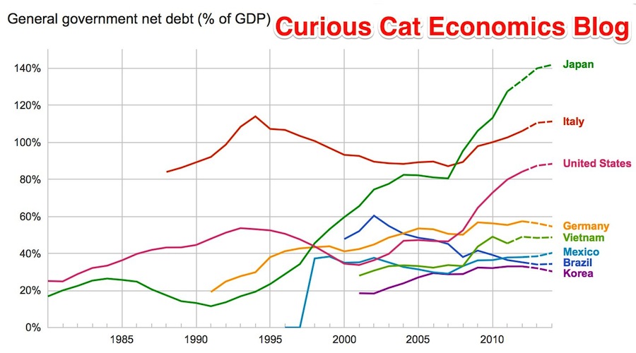
The data, from IMF, does not include China or India.
The chart shows data for net debt (gross debt reduced by certain assets: gold, currency deposits, debt securities etc.).
Bloomberg converted [broken link was removed] the data to look at debt load per person (looking at gross debt – estimated for 2014). Japan has ill-fortune to lead in this statistic with $99,725 in debt per person (242% of GDP), Ireland is in second with $60, 356 (121% of GDP). USA 3rd $58,604 (107%). Singapore 4th $56,980 (106%). Italy 6th $46,757 (133%). UK 9th $38,939 (95%). Greece 12th $38,444 (174%). Germany 14th $35,881 (78%). Malaysia 32nd $6,106 (57%). China 48th $1,489 (21%). India 53rd $946 (68%). Indonesia 54th $919 (27%).
I think the gross debt numbers can be more misleading than net debt figures. I believe Singapore has very large assets so that the “net” debt is very small (or non-existent). Japan is 242% in gross debt to GDP but 142% of net debt (which is still huge but obviously much lower). The USA in contrast has gross debt at 107% with a net debt of 88%.
Related: Government Debt as Percent of GDP 1998-2010 for OECD – Gross Government Debt as Percentage of GDP 1990-2009: USA, Japan, Germany, China – Chart of Largest Petroleum Consuming Countries from 1980 to 2010 – Top Countries For Renewable Energy Capacity
Looking at stock market capitalization by country gives some insight into how countries, and stocks, are doing. Looking at the total market capitalization by country doesn’t equate to the stock holdings by individuals in a country or the value of companies doing work in a specific country. Some countries (UK and Hong Kong, for example) have more capitalization based there than would be indicated by the size of their economy.
It is important to keep in mind the data is in current USA dollars, so big swings in exchange rates can have a big impact (and can cause swings to be exacerbated when they move in tandem with stock market movements – if for example the market declines by 15% and the currency declines by 10% against the US dollar those factors combine to move the result down).

The chart shows the top four countries based on stock market capitalization, with data from 200 to 2012. The chart created by Curious Cat Investing and Economics Blog may be used with attribution. Data from the World Bank.
As with so much recent economic data China’s performance here is remarkable. China grew from 1.8% of world capitalization in 2000 to 6.9% in 2012. And Hong Kong’s data is reported separately, as it normally is with global data sets. Adding Hong Kong to China’s totals would give 3.7% in 2000 with growth to to 8.9% in 2012 (Hong Kong stayed very stable – 1.9% in 2000, 2% in 2012). China alone (without HK) is very slightly ahead of Japan.
The first chart shows the largest 4 market capitalizations (2012: USA $18.6 trillion, China and Japan at $3.7 trillion and UK at $3 trillion). Obviously the dominance of the USA in this metric is quite impressive the next 7 countries added together don’t quite reach the USA’s stock market capitalization. I also including the data showing the global stock market capitalization divided by 3 (I just divide it by three to have the chart be more usable – it lets us see the overall global fluctuations but doesn’t cram all the other data in the lower third of the chart).
Canada is the 5th country by market capitalization (shown on the next chart) with $2 trillion. From 2000 to 2012 China’s market capitalization increased by $3.1 trillion. The USA increased by $3.6 trillion from a much larger starting point. China increased by 536% while the USA was up 23.5%. The world stock market capitalization increased 65% from 2000 to 2012.
Related: Stock Market Capitalization by Country from 1990 to 2010 – Government Debt as Percent of GDP 1998-2010 – Manufacturing Output by Country 1999-2011: China, USA, Japan, Germany
Global wind power capacity has increased 391% from 2005 to 2012. The capacity has grown to over 3% of global electricity needs.
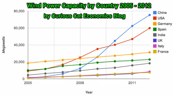
Chart by Curious Cat Economics Blog using data from the Wind Energy Association. Chart may be used with attribution as specified here.
The 8 countries shown on the chart account for 82% of total wind energy capacity globally. From 2005 to 2012 those 8 countries have accounted for between 79 and 82% of total capacity – which is amazingly consistent.
Japan and Brazil are 13th and 15th in wind energy capacity in 2012 (both with just over one third of France’s capacity). Japan has increased capacity only 97% from 2005 to 2012 and just 13% from 2010 to 2012. Globally wind energy capacity increased 41% from 2010 to 2012. The leading 8 countries increased by 43% collectively lead by China increasing by 68% and the USA up by 49%. Germany added only 15% from 2010 through 2012 and Spain just 10%.
Brazil has been adding capacity quickly – up 170% from 2010 through 2012, by far the largest increase for a county with significant wind energy capacity. Mexico, 24th in 2012, is another country I would expect to grow above the global rate in the next 10 years (I also expect Brazil, India and Japan to do so).
In 2005 China accounted for 2% of wind energy capacity globally they accounted for 30% in 2012. The USA went from 15% to 24%, Germany from 31% to 12%, Spain from 17% to 9% and India from 8% to 7%.
Related: Global Wind Energy Capacity Exceeds 2.5% of Global Electricity Needs (2011) – Nuclear Power Generation by Country from 1985-2010 – Chart of Wind Power Generation Capacity Globally 2005 to 2012 (through June)
Across the globe, saving for retirement is a challenge. Longer lives and expensive health care create challenge to our natures (saving for far away needs is not easy for most of us to do – we are like the grasshopper not the ants, we play in the summer instead of saving). This varies across the globe, in Japan and China they save far more than in the USA for example.
The United States of America ranks 19th worldwide in the retirement security of its citizens, according to a new Natixis Global Retirement Index. The findings suggest that Americans will need to pick up a bigger share of their retirement costs – especially as the number of retirees grows and the government’s ability to
support them fades. The gauges how well retired citizens live in 150 nations, based on measures of health, material well-being, finances and other factors.
Top Countries for Retirees
- 1 – Norway
- 2 – Switzerland
- 3 – Luxembourg
- 6 – Finland
- 9 – Germany
- 10 – France
- 11 – Australia
- 13 – Canada
- 15 – Japan
- 19 – USA
- 20 – United Kingdom
Western European nations – backed by robust health care and retiree social programs – dominate the top of the rankings, taking the first 10 spots, including Sweden, Austria, Netherlands and Denmark. The USA finished ahead of the United Kingdom, but trailed the Czech Republic and Slovakia.
Globally, the number of people aged 65 or older is on track to triple by 2050. By that time, the ratio of the working-age population to those over 65 in the USA is expected to drop from 5-to-1 to 2.8-to-1. The USA actually does much better demographically (not aging as quickly) as other rich countries mainly due to immigration. Slowing immigration going forward would make this problem worse (and does now for countries like Japan that have very restrictive immigration policies).
The economic downturn has taken a major toll on retirement savings. According to a recent report by the U.S. Senate Committee on Health, Education, Labor and Pensions, the country is facing a retirement savings deficit of $6.6 trillion, or nearly $57,000 per household. As a result, 53% of American workers 30 and older are on a path that will leave them unprepared for retirement, up significantly from 38% in 2011.
On another blog I recently wrote about another study looking at the Best Countries to Retirement Too: Ecuador, Panama, Malaysia. The study in the case was looking not at the overall state of retirees that worked in the country (as the study discussed in this post did) but instead where expat retirees find good options (which stretch limited retirement savings along with other benefits to retirees).
See the full press release.
Related: Top Stock Market Capitalization by Country from 1990 to 2010 – Easiest Countries in Which to Operate a Businesses: Singapore, Hong Kong, New Zealand, USA – Largest Nuclear Power Generation Countries from 1985-2010 – Leading countries for Economic Freedom: Hong Kong, Singapore, New Zealand, Switzerland – Countries with the Top Manufacturing Production
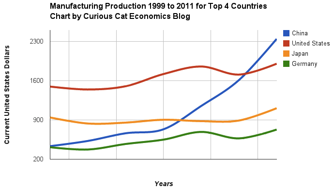
Chart of manufacturing production by China, USA, Japan and Germany from 1999 to 2011. The chart was created by the Curious Cat Economics Blog using UN data. You may use the chart with attribution. All data is shown in current USD (United States Dollar).
The story of global manufacturing production continues to be China’s growth, which is the conventional wisdom. The conventional wisdom however is not correct in the belief that the USA has failed. China shot past the USA, which dropped into 2nd place, but the USA still manufactures a great deal and has continually increased output (though very slowly in the last few years).
The story is pretty much the same as I have been writing for 8 years now. The biggest difference in that story is just that China actually finally moved into 1st place in 2010 and, maybe, the slowing of the USA growth in output (if that continues, I think the USA growth will improve). I said last year, that I expected China to build on the lead it finally took, and they did so. I expect that to continue, but I also wouldn’t be surprised to see China’s momentum slow (especially a few more years out – it may not slow for 3 or 4 more years).
As before, the four leading nations for manufacturing production remain solidly ahead of all the rest. Korea and Italy had manufacturing output of $313 billion in 2011 and Brazil moved up to $308 are in 4-6 place. Those 3 countries together could be in 4th place (ahead of just Germany). Even adding Korea and Italy together the total is short of Germany by $103 in 2011). I would expect Korea and Brazil to grow manufacturing output substantially more than Italy in the next 5 years.
The largest manufacturing countries are China, USA, Japan and then Germany. These 4 are far in the lead, and very firmly in their positions. Only the USA and China are close, and the momentum of China is likely moving it quickly ahead – even with their current struggles.
The chart below shows manufacturing production by country as a percent of GDP of the 10 countries that manufacture the most. China has over 30% of the GDP from manufacturing, though the GDP share fell dramatically from 2005 and is solidly in the lead.
Nearly every country is decreasing the percentage of their economic output from manufacturing. Korea is the only exception, in this group. I would expect Korea to start following the general trend. Also China has reduced less than others, I expect China will also move toward the trend shown by the others (from 2005 to 2010 they certainly did).
For the 10 largest manufacturing countries in 2010, the overall manufacturing GDP percentage was 24.9% of GDP in 1980 and dropped to 17.7% in 2010. The point often missed by those looking at their country is most of these countries are growing manufacturing, they are just growing the rest of their economy more rapidly. It isn’t accurate to see this as a decline of manufacturing. It is manufacturing growing more slowly than (information technology, health care, etc.).

This chart shows manufacturing output, as percent of GDP, by country and was created by the Curious Cat Economics Blog based on UN data. You may use the chart with attribution.
The manufacturing share of the USA economy dropped from 21% in 1980 to 18% in 1990, 15% in 2000 and 13% in 2010. Still, as previous posts show, the USA manufacturing output has grown substantially: over 300% since 1980, and 175% since 1990. The proportion of manufacturing output by the USA (for the top 10 manufacturers) has declined from 33% in 1980, 32% in 1990, 35% in 2000 to 26% in 2010. If you exclude China, the USA was 36% of the manufacturing output of these 10 countries in 1980 and 36% in 2010. China’s share grew from 7.5% to 27% during that period.
The United Kingdom has seen manufacturing fall all the way to 10% of GDP, manufacturing little more than they did 15 years ago. Japan is the only other country growing manufacturing so slowly (but Japan has one of the highest proportion of GDP from manufacturing – at 20%). Japan manufactures very well actually, the costs are very high and so they have challenges but they have continued to manufacture quite a bit, even if they are not growing output much.
 The chart shows the top nuclear power producing countries from 1985 to 2010. The chart created by Curious Cat Investing and Economics Blog may be used with attribution. Data from US Department of Energy.
___________________
Nuclear power provided 14% of the world’s electricity in 2010. Wind power capacity increased 233% Worldwide from 2005 2010, to a total of 2.5% of global electricity needs. Nuclear power generation declined by .72% for the same period.
Burning coal was responsible for 41% of electricity generation in 2010. Burning natural gas accounted for 21% and hydroelectric generation accounted for 15%.
Japan just announced that they have closed their last operating nuclear power plant. They have no nuclear power plant generating electricity for the first time in more than 40 years. It will be interesting to see how low their actual generation totals fall this year. They plan to re-open some of the plants but it is a political issue that is far from settled.
Globally nuclear power production increased 84% from 1985 to 2010. This is a very low percentage. Global output over that period increased much more than that, as did global electricity use. The share of electricity production provided by nuclear power peaked at about 17% for much of the 1990s.
Related: Nuclear Power Production Globally from 1985 to 2009 – Oil Production by Country 1999-2009 – Top 10 Countries for Manufacturing Production from 1980 to 2010: China, USA, Japan, Germany… – Japan to Add Personal Solar Subsidies – Nuclear Energy Institute (statistics)
Another view of data on nuclear power shows which of the leading nuclear producing countries have the largest percentages of their electrical generating capacity provided by nuclear power plants (as of 2009). France has 75% of all electricity generated from nuclear power. Ukraine had the second largest percentage at 49%, then Sweden at 37% and South Korea at 35%. Japan is at 28% compared to 20% for the USA. Russia was at 18% and China was at just 2%.
I really can’t figure out which currency is something I would want to hold if I had the option. It doesn’t really matter, since I am not going to act on it in a very direct way (maybe if I felt very strongly I would do something but it would probably be pretty limited), but I still keep thinking about this issue out of curiosity.
The USA dollar seems lousy to me. Huge debt (both government and consumer). Government debt is huge on the books and huge off the books (state and local retirement – and federal medical care [social security is really in much better shape than people think, though it also has issues 30 + years out}).
The Euro seemed a bit lame 3 years ago. Today it seems crazy to think at least one Euro country won’t default in the next 3 years – and likely more. And if they take steps to avoid that it seems like it is going to make the case for the Euro worse).
The Japanese Yen is much stronger than makes any sense to me. I think it is mainly because of how lousy all the options are. The huge government debt (worse than almost anywhere) and lousy demographics (and the refusal to deal with demographics with immigration or something) are big problems. The biggest reason for strength is that the individuals have huge savings (when your citizens own the debt it is much less horrible than when others do – especially when you are looking at currency value).
The Chinese Yuan is the best looking at the economic data. The problem is economic data is questionable for the best cases (looking at the USA, Japan…). China’s economic data is far from transparent. There is also great political and social risk. The current worries of a real estate bubble seems justified to me and China just this week took exactly the wrong action – trying to prop up the bubble (in order to decrease the economic slowdown). I can see either of these cases playing out 10 years from now: It was obvious the Yuan was the strongest currency you are an idiot for not being able to see that or It was obvious China was a bubble with unsustainable policies and likely social upheaval thinking that was anything but a sign to sell the Yuan was foolish.
Given all this I think I weakly come down on the side that the Yuan is likely to be the strongest.
The safest play I think is the US dollar (as lousy as it is on an absolute basis the options make it look almost good). It could get clobbered. But that seems less likely than the others getting clobbered.
Smaller currencies have some promise but they can be swamped by global moves. I really have no idea about the Brazilian Real. That might actually be a really good option. The Australian Dollar and Canadian Dollar may also. But those economies are really small. I don’t trust India: they have many good macro-economic factors but the climate for business leaves far too much to be desired (as does the pace of progress fixing those weaknesses). Many economist like them due to demographic factors. I understand that demographic factors will help, but without systemic reform I question how well India can do (it certainly has the potential to do amazingly well, but they seem to be significantly farther away from reaching their potential compared to many countries).
The Singapore Dollar seems good on many levels, but the economy is small. I am not really sure about emerging economies, there currencies can get swamped in a hurry. Thailand and Indonesia experienced this recently. Thailand, Indonesia and Malaysia are interesting to me in thinking about what their currencies may experience, I would like to read more on this.
This is more an intellectual and curiosity exercise than something I see directly tied to my investing strategy. But having clear answers of what I thought reasonable scenarios were for currencies going forward that would factor into my investing decisions. Right now, the confusing this causes me, leads me to favor companies that should be fine whatever happens: Apple, Google, Toyota, Intel (I don’t really like Facebook overall but in this way they fit). Lots of the stocks in my 12 stocks for 10 years portfolio, you might notice.
Related: Is the Euro Going to Survive in the Long Run? – Why the Dollar is Falling – Strong Singapore Dollar – Warren Buffett Cautions Against Buying Long Term USD Bonds