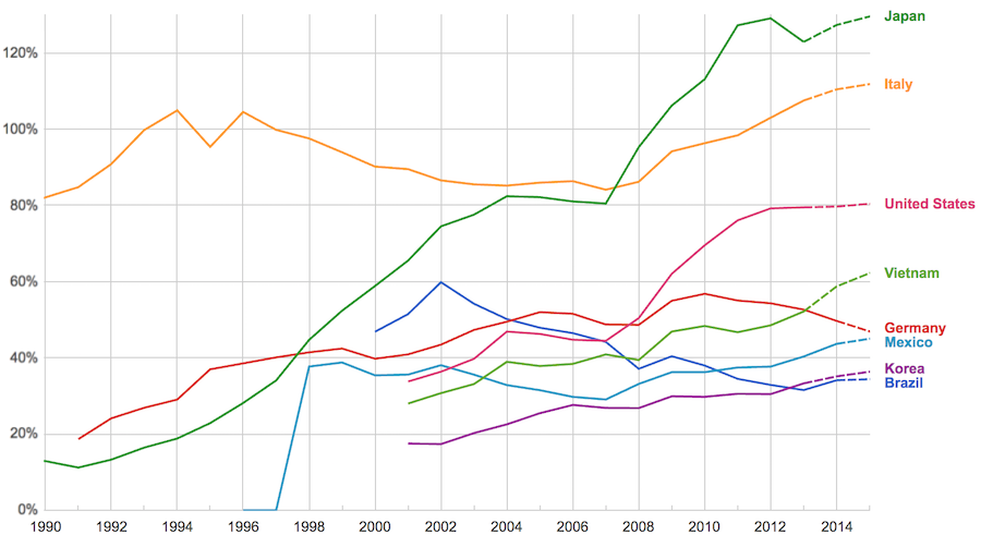
The data, from IMF, does not include China or India.
The chart shows data for net debt (gross debt reduced by certain assets: gold, currency deposits, debt securities etc.).
Viewing our post on the data in 2014 we can see that the USA improved on the expectations, managing to hold net debt to 80% instead of increasing to 88% as expected. Nearly every country managed to take on less debt than predicted (Vietnam took on more, but is very low so this is not a problem).
Taking on debt to invest in valuable resources (building roads, mass transit, internet infrastructure, education, environmental regulation and enforcement, health care, renewable energy…) that will boost long term economic performance can be very useful. The tricky part is knowing the debt levels doesn’t tell you whether the debt was taken on for investment or just to let current taxpayers send the bills for their consumption to their grandchildren.
Also government debt can become a huge burden on the economy (especially if the debt is owed outside the country). The general consensus today seems to be that 100% net debt level is the maximum safe amount and increasing beyond that gets riskier and riskier.
The most popular posts on the Curious Cat Investing and Economics blog in 2016 (by page views).
- Top 10 Countries for Manufacturing Production in 2010: China, USA, Japan, Germany… (posted in 2011)
- Manufacturing Output as a Percent of GDP by Country (1980 to 2008) (2010)
- Default Rates on Loans by Credit Score (2015)*
- Stock Market Capitalization by Country from 1990 to 2010 (2012)
- Investing in Peer to Peer Loans (2015)
- Manufacturing Output by Country 1999-2011: China, USA, Japan, Germany (2013)
- The 20 Most Valuable Companies in the World – October 2015
- Manufacturing Output as Percent of GDP from 1980 to 2010 by Country (2012)
- Monopolies and Oligopolies do not a Free Market Make (2008)
- Government Debt as Percentage of GDP 1990-2009: USA, Japan, Germany, China… (2010)
- USA Individual Earnings Levels: Top 1% $343,000, 5% $154,000, 10% $112,000, 25% $66,000 (2012)
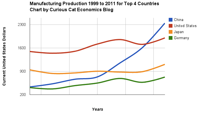
Chart of manufacturing production by China, USA, Japan and Germany from 1999 to 2011. The chart was created by the Curious Cat Economics Blog using UN data. You may use the chart with attribution. All data is shown in current USD (United States Dollar).
Solar energy capacity has been growing amazingly quickly the last few years. Part of the reason for this is the starting point was so low, making it easy to have large gains.
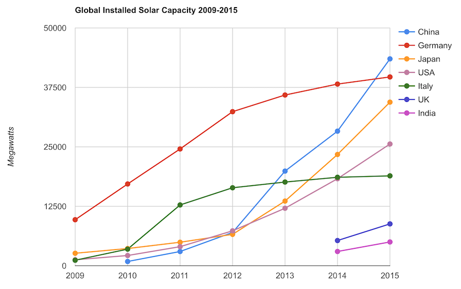
Chart by Curious Cat Economics Blog using data from the International Energy Agency (IEA) and the US Department of Energy. Chart may be used with attribution as specified here.
The 2014 and 2015 data on this chart is from IAE report for total installed photovoltaic (PV) solar capacity. See previous post on chart of Solar Energy Capacity by Country from 2009 to 2013. Different data sources for different year (and/or countries in the same year) is not ideal but for the purposes of this data in this post is sufficient.
Installed PV capacity is even more questionable that much other economic data. Economic data are always approximations of reality but with PV you have additional questions. The same plant located outside London or Rome have different capability to produce (and there are many factors that contribute not just the most obvious such as how much sun shines in a particular geography). Installed PV data is based on the capability of the equipment regardless of the solar potential of the location.
So even with the same investment it is likely Italy gets more production than Germany. The IAE report attempted to determine what was the likely ability of the solar PV capacity to produce for each country as a percentage of total electricity needs. They estimate Italy has the largest percentage of electricity needs capable of being produced by installed PV systems at 8%, with Greece at 7.4% and Germany at 7.1%. Japan is ranked 5th at just under 4%, UK is 12th at 2.5%, China is 22nd at 1%, India 24th and the USA 25th at close to .9%. They estimate the total global percentage at 1.3%.
These figures also show the huge power needs of China and the USA. Even with huge investments in Solar they us so much electricity that it is slow to make large gains in the percentage of total power generated by solar.
In the USA in 2013 solar energy capacity was under 1% USA total electrical capacity. In 2013 hydropower was 6.8%, wind was 5.3% and biomass was 1.3%. The increase in solar capacity should continue to grow rapidly and is making significant contributions to the macroeconomic energy picture (even if it doesn’t appear dramatic).
Related: Chart of Global Wind Energy Capacity by Country from 2005 to 2015 – Leasing or Purchasing a Solar Energy System For Your House – Nuclear Power Generation by Country from 1985-2010 – Manufacturing Output by Country 1999-2011: China, USA, Japan, Germany
Dual momentum investing boiled down to the simplest view involves only seeing if the S&P 500 outperformed USA t-bills for the last year. If so, invest in an low cost S&P 500 fund. If not, invest in a high quality short duration bond fund.
There are many different tweaks to this idea. Dual Momentum Investing by Gary Antonacci does a good job of exploring this idea and providing evidence on historical returns using this method. 3 big advantages of this strategy are
- Simplicity – easy to implement and it takes nearly no time each year
- Low cost – uses low cost index fund and has very limited transaction costs (direct or tax costs from sales) as it averages fewer than 1 trade a year)
- Good performance historically – the book details performance and the low risk nature of the strategy in backtesting.
There are ways to adjust the strategy that increase the complexity a bit for those looking to increase returns or reduce risks.
It is something worth reading in my opinion. The book isn’t the easiest to read but it is decent and worth reading.
Gary Antonacci also has a blog worth reading.
Related: Curious Cat Investment Books – Famous Stock Traders: Nicolas Darvas – Market Inefficiencies and Efficient Market Theory
Delinquencies in closed-end loans fell slightly in the second quarter, driven by a drop in home equity loan delinquencies, according to results from the American Bankers Association’s Consumer Credit Delinquency Bulletin.
The composite ratio, which tracks delinquencies in eight closed-end installment loan categories, fell 3 basis points to 1.35% of all accounts – a record low. This also marked the third year that delinquency rates were below the 15-year average of 2.21%. The ABA report defines a delinquency as a late payment that is 30 days or more overdue. This is good news but the personal financial health of consumers in the USA is still in need of significantly improvements to their balance sheets. Debt levels are still too high. Savings levels are still far to low.
Home equity loan delinquencies fell 4 basis points to 2.70% of all accounts, which helped drive the composite ratio down. Other home related delinquencies increased slightly, with home equity line delinquencies rising 6 basis points to 1.21% of all accounts and property improvement loan delinquencies rising 2 basis points to 0.91% of all accounts. Home equity loan delinquencies dipped further below their 15-year average of 2.85%, while home equity line delinquencies remained just above their 15-year average of 1.15 percent.
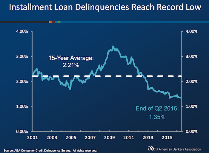
Bank card delinquencies edged up 1 basis point to 2.48% of all accounts in the second quarter. They remain significantly below their 15-year average of 3.70 percent.
The second quarter 2016 composite ratio is made up of the following eight closed-end loans. All figures are seasonally adjusted based upon the number of accounts.
Closed-end loans
Home equity loan delinquencies fell from 2.74% to 2.70%.
Mobile home delinquencies fell from 3.41% to 3.17%.
Personal loan delinquencies fell from 1.44% to 1.43%.
Direct auto loan delinquencies rose from 0.81% to 0.82%.
Indirect auto loan delinquencies rose from 1.45% to 1.56%.
Marine loan delinquencies rose from 1.03% to 1.23%.
Property improvement loan delinquencies rose from 0.89% to 0.91%.
RV loan delinquencies rose from 0.92% to 0.96%.
Open-end loans
Bank card delinquencies rose from 2.47% to 2.48%.
Home equity lines of credit delinquencies rose from 1.15% to 1.21%.
Non-card revolving loan delinquencies rose from 1.57% to 1.65%.
Related: Debt Collection Increasing Given Large Personal Debt Levels (2014) – Consumer and Real Estate Loan Delinquency Rates from 2001 to 2011 in the USA – Good News: Credit Card Delinquencies at 17 Year Low (2011) – Real Estate and Consumer Loan Delinquency Rates 1998-2009 – The USA Economy Needs to Reduce Personal and Government Debt (2009)
Even if some lobbyists and their friends in Washington DC try to distract from the long term failure of the USA health care system the data continues to pour in about how bad it is.
U.S. Health-Care System Ranks as One of the Least-Efficient
None of these rankings are perfect and neither is this one. But it is clear beyond any doubt that the USA healthcare system is extremely costly for no better health results than other rich countries (and even more expensive with again no better results than most poor countries). It is a huge drain on the economy that we continue to allow lobbyists and special interests to take advantage of the rest of us via the Democrats and Republican parties actions over the last few decades.
We have to improve. The costs imposed on everyone to support those benefiting from this decades old transfer of economic wealth to health care special interests should no longer be accepted.
The top 5 countries are: Hong Kong, Singapore, Spain, South Korea and Japan. The first four have costs about 25% of the USA. Japan costs about 40% of the USA per person cost.
Mylan’s despicable actions with Epi-pen and the direct participation of both political parties in increasing the costs foisted on the health care system by Mylan is just one in hundreds of the individual actions that continue to saddle the rest of USA economy with huge costs.
Related: Out of Pocket “Maximum”, Understanding USA Health Care Costs – Decades Later The USA Health Care System is Still a Deadly Disease for Our Economy – 2015 Health Care Price Report, Costs in the USA and Elsewhere – USA Health Care Spending 2013: $2.9 trillion $9,255 per person and 17.4% of GDP – USA Spends $7,960 Compared to Around $3,800 for Other Rich Countries on Health Care with No Better Health Results (2009 data)
To be financially successful, you need to invest. The problem most people have is deciding where their investments should be made. For a long time, real estate was seen as the best and most profitable bet. Remember the house flipping trend in the early millennium, before the housing market crashed? A successful investing strategy for a short period is no guaranty of that strategy working for the long term. Diversification provides more long term stability.
Franchising
There are two approaches to investing in a franchise. The one most people go for–especially those who are tired of being someone else’s employee–is to opt into an already existing franchise. Yes, the cost of these franchises can be pricey. For example, the average UPS franchise cost is anywhere from $100K-$440K, depending on where your franchise will be located, if you will need to build a new structure, etc. But there is financing available and if you work with an established brand (like UPS, food chains, mall shops). There are risks and you can read about problems franchisees face just by searching online, but it also has been very successful for many people.
Another approach, for people who already own their own successful businesses, is to think about turning those businesses into franchises. This way people will pay you to run your company at their locations. This is quite a huge leap in complexity but the profit potential is very large.
Business
My favorite method for business, and one my brother used for his business, Hexawise (I continue to consult for Hexawise), is bootstrapping. With this method you grown the business from the funds the business is able to generate. You don’t have to worry about pleasing investors or large debt payments. It does limit the ability to spend cash before the business generates it but this is often a benefit, in my opinion, as it forces you to avoid spending you can’t afford. It is a drawback however if the business really needs to spend a large amount of cash before it generates large amounts of income.
If you don’t want to have the responsibility of running a company yourself but still want to profit off of business investments, your best chance to do that is to invest in a promising new business. There are some people who turn enough of a profit doing this that it becomes their entire vocation.
Investing in a business has many benefits, especially if that company does well. When you invest, you typically do so in one of three ways:
- Silent partnerships: You front the money and lend your reputation in exchange for a share of the company’s ownership so that the investment will be profitable. This is good for people who want to have more control over what the company does with your investment. It can also be one of the riskiest types of investments to make.
- Angel investments: This is where you invest a large sum in a promising company but remain entirely hands-off while that company gets up and running. Most angel investors ask only for their initial investments plus a small sum on top of that original amount (usually accrued via interest charges) so that the investment is profitable for everyone.
- Traditional investments: Buying stocks or bonds in public companies. This is by far the easiest and is a very sensible way to invest. Often this is done using index funds to invest in the performance of the broad stock market.
The Usual Suspects
If you want to make real money via investing, you will want to make sure your investment portfolio includes a good mixture of stocks, bonds, mutual funds etc.. In fact, while we’re listing them last, these are the investments you will usually want to make first, as you build enough wealth and capital to make larger investments like franchises and investing in promising startups.
For many people, the first investments are savings accounts, 401(k)s or retirement accounts. If this is where you are, your next step should be something with a guaranteed return like a treasury bond (government bond) or a money-market account with a good interest rate. Let these investments mature while you are learning about stocks, mutual funds, real estate, business investing, etc. Then use the profits from those initial investments to fund your larger and riskier future projects.
You should never invest more than you can afford to lose. Sure taking risks can pay off, but if you want to build a genuinely successful portfolio, play it safe, especially when you are just getting started.
The International Federation of Health Plans has published the 2015 Comparative Price Report, Variation in Medical and Hospital Prices by Country. Once again this illustrates the excessive cost of health care in the USA. See related posts for some of our previous posts on this topic.
The damage to the USA economy due to inflated health care costs is huge. A significant portion of the excessive costs are due to policies the government enacts (which only make sense if you believe the cash given to politicians by those seeking to retain the excessive costs structure in the USA the last few decades buy the votes of the political parties and the individual politicians).
In 2015, Humira (a drug from Abbvie to treat rheumatoid arthritis that is either the highest grossing drug in the world, or close to it) costs $2,669 on average in the USA; $822 in Switzerland; $1,362 in the United Kingdom. This is the cost of a 28 day supply.
All the prices shown here are for the prices reported are the average allowed costs, which include both member cost sharing and health plan payment. So it only includes costs for those covered by health plans (it doesn’t include even much larger price tags given those without insurance in the USA).
Harvoni (a drug from Gilead to treat hepatitis C is also near the top of drugs with the largest revenue worldwide). This is also a drug that has been used as a lightning rod for the whole area of overpriced drugs. One interesting thing is this is actually one that is not nearly as inflated in the USA over other countries nearly as much as most are. Again, for a 28 day supply the costs are $16,861 in Switzerland; $22,554 in the United Kingdom and $32,114 in the USA. Obviously quite a lot but “only” double the cost in the USA instead of over triple for Humira (from Switzerland to the USA).
Tecfidera is prescribed to treat relapsing multiple sclerosis. The cost for a 30 day supply vary from $663 in the United Kingdom to $5,089 in the USA ($1,855 Switzerland).
There are actually some drugs that are more expensive outside the USA (though it is rare). OxyContin is prescribed to treat severe ongoing pain and is also abused a great deal. The prices vary from $95 in Switzerland to $590 in the United Kingdom ($265 in United States).
The report also includes the cost of medical procedures. For both the drugs and the procedures they include not only average but measures to show how variable the pricing is. As you would expect (if you pay attention to the massive pricing variation in the USA system) the variation in the cost of medical procedures is wide. For an appendectomy in the USA the 25th percentile of cost was $9,322 and for the 95th was $33,250; the average USA cost was $15,930. The average cost in Switzerland was $6,040 and in the United Kingdom was $8,009.
As has been obvious for decades the USA needs to stop allowing those benefiting from the massively large excessive health care costs in the USA from buying the Democrats and Republicans support to keep prices so high. But there has been very little good movement on this front in decades.
Related: USA Heath Care System Needs Reform – USA Health Care Spending 2013: $2.9 trillion $9,255 per person and 17.4% of GDP – Decades Later The USA Health Care System is Still a Deadly Disease for Our Economy – USA Spends $7,960 per person Compared to Around $3,800 for Other Rich Countries on Health Care with No Better Health Results (2009) – Drug Prices in the USA (2005)
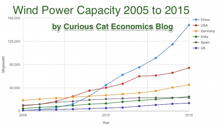
Chart by Curious Cat Economics Blog using data from the Wind Energy Association, data for 2014 and 2015. Chart may be used with attribution as specified here.
After a slowing of additional capacity added in 2013, both 2014 and 2015 saw a bit of a rebound in additions to global wind energy capacity. In 2013 capacity increased only 13% while in both 2014 and 2015 it increased 17%. Still 17% is less than any year in the last 10, except 2013.
At the end of 2013 China had 29% of global capacity (after being responsible for adding 62% of all the capacity added in 2013). In 2005 China had 2% of global wind energy capacity.
At the end of 2015 China accounted for 34% of global capacity, the only country in the top 8 increasing their share of global capacity. The USA now has 17% of capacity. Germany has 10%.
Europe moved first in adding large scale wind energy capacity but has added capacity very slowly in the last 5 years. Germany had 31% of global capacity in 2005. Spain had 17% in 2005 and now has just 5% (during that time Spain has more than doubled their wind energy capacity).
The 6 countries shown on the chart account for 76% of total wind energy capacity globally. From 2005 to 2015 those 8 countries have accounted for between 74 and 77% of total capacity – which is amazingly consistent.
Wind power now accounts for approximately 4 to 5% of total electricity used.
Related: Chart of Global Wind Energy Capacity by Country 2005 to 2013 – Solar Energy Capacity by Country (2005 to 2013) – Nuclear Power Generation by Country from 1985-2010 – Chart of Largest Petroleum Consuming Countries from 1980 to 2010
The report, The Dwindling Taxable Share Of U.S. Corporate Stock, from the Brookings Institution Tax Policy Center includes some amazing data.

In 1965 foreign ownership of USA stocks totaled about 2%, in 1990 it had risen to 10% and by 2015 to 26%. That the foreign ownership is so high surprised me. Holdings in retirement accounts (defined benefit accounts, IRAs etc.) was under 10% in 1965, rose to over 30% in 1990 and to about 40% in 2015. The holdings in retirement accounts doesn’t really surprise me.
The combination of these factors (and a few others) has decreased the holding of USA stocks that are taxable in the USA from 84% in 1965 to 24% in 2015. From the report
As with much economic data it isn’t an easy matter to determine what values to use in order to get figures such as “foreign ownership.” Still this is very interesting data, and as the report suggests further research in this area would be useful.
Related: There is No Such Thing as “True Unemployment Rate” – The 20 Most Valuable Companies in the World – February 2016 (top 10 all based in the USA) – Why China’s Economic Data is Questionable – Data provides an imperfect proxy for reality (we often forget the proxy nature of data)