The Curious Cat Investing, Economics and Personal Finance Carnival is published twice each month. We find useful recent personal finance, investing and economics blog posts and articles to share with you.
- 2 Billionaire Brothers’ Insider Buying At Colfax by Zack Miller – “[In] the Danaher Business System… management believes its found a demonstrable, repeatable recipe for success, and it drives both culture and process at the company and its acquisitions. DBS is a form of Japanese kaizen, comprising 4 components: 1) People 2) Plans 3) Processes 4) Performance” [I own Danaher and have it in my 12 stocks for 10 year portfolio – John, my management blog focuses on such management systems]
- Apple’s Impossibly Good Quarter by John Hunter – “You can’t grow quarterly sales from $26.7 billion to $46.3 billion. $26 million to $46 million, fine that is possible, billions however – not possible. Except Apple did. You can’t grow a $6 billion quarterly profit to $13 billion in 1 year. Except Apple did. You can’t generate a cash flow of $17.5 billion in a quarter. Except Apple did. You can’t have a stockpile of $100 billion in cash. Except Apple does. These figures would not have been seen as unlikely just 3 years ago. They were impossible. But Apple achieved them.”
- How to Save the Euro by George Soros – “the cuts in government expenditures that Germany wants to impose on other countries will push Europe into a deflationary debt trap. Reducing budget deficits will put both wages and profits under downward pressure, the economies will contract, and tax revenues will fall. So the debt burden, which is a ratio of the accumulated debt to the GDP, will actually rise, requiring further budget cuts, setting in motion a vicious circle.”
- Japan’s Trade Figures: Some Perspective by Eamonn Fingleton – “In a typical maneuver, goods might be shipped to China via Hong Kong. The goods are exported from Japan at heavily discounted prices and a Hong Kong subsidiary takes a huge profit in selling to China. Such profits constitute hidden export revenues that are not caught in the visible trade numbers. The maneuver makes sense because Japan’s corporate tax rate is one of the world’s highest.” [This is one, of many things, that make economic data difficult to rely on – you have to pay close attention to the details – John]
I decided to take a look at some historical economic data to see if some of my beliefs were accurate (largely about how well Singapore has done) and learn a bit more while I was at it.
| country |
|
1970** |
|
2010*** |
|
% increase |
| Korea | 1,320 | 20,200 | 1,430 | |||
| China | 325 | 4,280 | 1,217 | |||
| Singapore | 4260 | 42,650 | 901 | |||
| Indonesia | 460 | 2,960 | 543 | |||
| Brazil | 1900 | 10,500 | 453 | |||
| Thailand | 850 | 4,600 | 441 | |||
| Portugal | 3,970 | 21,000 | 429 | |||
| Japan | 9,000 | 42,300 | 370 | |||
| Malaysia | 1,900 | 7,755 | 308 | |||
| Germany | 11,550 | 40,500 | 251 | |||
| UK | 10,400 | 36,300 | 249 | |||
| France | 13,600 | 40,600 | 199 | |||
| Mexico | 4,160 | 9,200 | 121 | |||
| Panama | 3,480 | 7,700 | 121 | |||
| India | 555 | 1,180 | 113 | |||
| USA | 23,350 | 47,100 | 102 | |||
| South Africa | 3,930 | 7,100 | 81 | |||
| Venezuela | 8,280 | 9,770 | 18 |
I just picked countries that interested me and seemed worth looking at. I looked for some around the starting position of Singapore and close to Singapore geographically. And looked at Panama as the closest match to Singapore (for Singapore’s main 1970 asset, convenient for shipping lanes, and very close for GDP per capita).
Malaysia and Singapore were 1 country after independence (from 1963-1965).
I can’t imagine more than a couple countries could reasonably be argued to have had better economic performance from 1970 to 2010 than Singapore (Korea? China? Who else?). Singapore had very little going for it in 1970. They had a good location for shipping and that is about it macro-economically. No natural resources. No huge storage of wealth. No preeminence in science, technology or business.
It seems to me that Singapore actually did have 1 other thing. A government that was to preside over a fantastic economic growth success. You won’t find many textbooks talking about the way to economic success is a very well run government. And there is good reason for that, I believe. Relying on a very well run government will nearly always fail. In some ways Singapore was like Japan but with significantly more government influence on the way economic development played out.
I was surprised how poorly the USA has faired. It isn’t so surprising that we lagged. People forget how rich the USA was in 1970. The USA is still very rich but bunched together with lots of other rich countries instead of way out ahead as they were in 1970. And in 1970 the lead was already contracting, for what it had been earlier. But even knowing the relative performance of the USA had lagged, I was surprised by how much it under-performed.
I was also surprised with India. I knew they have done poorly but I didn’t realize it had been this poor. The failures to greatly improve infrastructure, education and the stifling effect of their bureaucracy have been causing them great harm. They have been doing some good things in the last 10 years especially but still have a long way to go. Their premier education is actually pretty decent. The problem is the other 90% of the education is often poor and many people (especially women) hardly have any education at all. It is very hard to get ahead when you fail to take advantage of the talents of so many of your people.
Related: Singapore and Iskandar Malaysia – Chart of Largest Petroleum Consuming Countries from 1980 to 2010 – Chart of Nuclear Power Production by Country from 1985-2009 – Top Countries For Renewable Energy Capacity
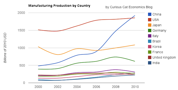
Chart of manufacturing production by the top 10 manufacturing countries (2000 to 2010). The chart was created by the Curious Cat Economics Blog. You may use the chart with attribution. All data is shown in 2010 USD (United States Dollar).
In my last post I looked at the output of the top 10 manufacturing countries with a focus on 1980 to 2010. Here I take a closer look at the last 10 years.
In 2010, China took the lead as the world’s leading manufacturing country from the USA. In 1995 the USA was actually very close to losing the lead to Japan (though you wouldn’t think it looking at the recent data). I believe China will be different, I believe China is going to build on their lead. As I discussed in the last post the data doesn’t support any decline in Chinese manufacturing (or significant moves away from China toward other South-East Asian countries). Indonesia has grown quickly (and have the most manufacturing production, of those discussed), but their total manufacturing output is less than China grew by per year for the last 5 years.
The four largest countries are pretty solidly in their positions now: the order will likely be China, USA, Japan, Germany for 10 years (or longer): though I could always be surprised. In the last decade China relentlessly moved past the other 3, to move from 4th to 1st. Other than that though, those 3 only strengthened their position against their nearest competitors. Brazil, Korea or India would need to increase production quite rapidly to catch Germany sooner. After the first 4 though the situation is very fluid.
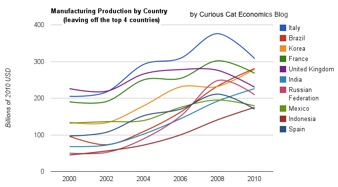
Taking a closure look at the large group of countries after top 4. Chart of manufacturing production from 2000-2010.
Chart of manufacturing production by the leading manufacturing countries (2000 to 2010). The top 4 countries are left off to look more closely at history of the next group. The chart was created by the Curious Cat Economics Blog based on UN data. You may use the chart with attribution.
Removing the top 4 to take a close look at the data on the other largest manufacturing countries we see that there are many countries bunched together. It is still hard to see, but if you look closely, you can make out that some countries are growing well, for example: Brazil, India and Indonesia. Other countries (most in Europe, as well as Mexico) did not fare well in the last decade.
The UK had a particularly bad decade, moving from first place in this group (5th in the world) to 5th in this group and likely to be passed by India in 2011. Europe has 4 countries in this list (if you exclude Russia) and they do not appear likely to do particularly well in the next decade, in my opinion. I would certainly expect Brazil, India, Korea and Indonesia to out produce Italy, France, UK and Spain in 2020. In 2010 the total was $976 billion by the European 4 to $961 billion by the non-European 4. In 2000 it was $718 billion for the European 4 to $343 billion (remember all the data is in 2010 USD).
I try to find global economic data on manufacturing and manufacturing jobs, but it isn’t easy. This is one of the areas I will be working on with the time I have freed up by moving to Malaysia (and taking a “sabbatical” [it isn’t really a sabbatical, I guess, just me studying and working on what I want to instead of what someone pays me to]).
I found some interesting data from the USA census bureau on manufacturing employment in several countries (it would be interesting to see the data for more countries but for now I am limited to this data). Sadly they just use indexed data (I would rather see raw data). This data for example lets you see the changes in countries but I don’t see any way to compare the absolute values between countries – all you can compare is the changes between countries.
The data is all indexed at 2002 = 100. Interestingly the USA has increased output per hour much more than any other country since 2002. The USA index stands at 146, the next highest is Sweden at 127 then the UK at 120. Italy is the only country tracked that fell since 2002, to 94. Japan (the 3rd largest manufacturer and 2nd largest of the countries include, China isn’t included) only increased to 113. Germany (4th and 3rd) increased to 111.
The data also lets you look back from 1990 to 2002 and again the USA has increased productivity very well (2nd most) – the value in 1990 was 58. Sweden actually had the largest gain from 1990-2002, rising from 49. In 1990 Japan stood at 71 and Germany 70.
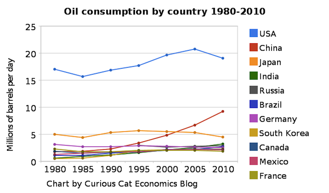
Chart of petroleum consumption by country 1980-2010 by the Curious Cat Investing and Economics Blog. The chart may be used with attribution.
The USA remains, by a huge margin, the largest consumer of petroleum products (motor gasoline, jet fuel, liquefied petroleum gases, residential fuel oil…) using 22% of the total (with about 4.5% of the population). From 1980 to 2010 the global consumption increased 38% to 87 million barrels a day.
From 1980 to 2010 USA consumption increased 12% (so less than global consumption). Meanwhile, Germany, Japan and France decreased petroleum use by 19%, 17% and 10% respectively. Many countries have very low use in 1980 and have grown their economies dramatically over this period and increased petroleum use dramatically also: India up 433%, China up 411%, South Korea up 360%.
Africa, in total, used 3.3 million barrels a day in 2010, up 120% from 1980. Africa used 73% of what Japan used in 2010 and 17% of what the USA used and 50% more than Canada. The data shows no sign of declining petroleum consumption on a global basis. The USA uses as much as China, India, Brazil and Africa combined. I believe, in 2015 those countries (by which I mean all the countries in Africa too, not that Africa is a country, which of course it is not) will use more than the USA (and likely show significant growth from 2010 levels).
Data is from the US Energy Information Agency.
Related: Oil Production by Country 1999-2009 – Top Countries For Renewable Energy Capacity – Chart of Nuclear Power Production by Country from 1985-2009 – Increasing USA Foreign Oil Dependence In The Last 40 years
This chart shows government debt as a percent of GDP based on OECD data. The chart is limited to central government debt issuance and excludes therefore state and local government debt and social security funds.
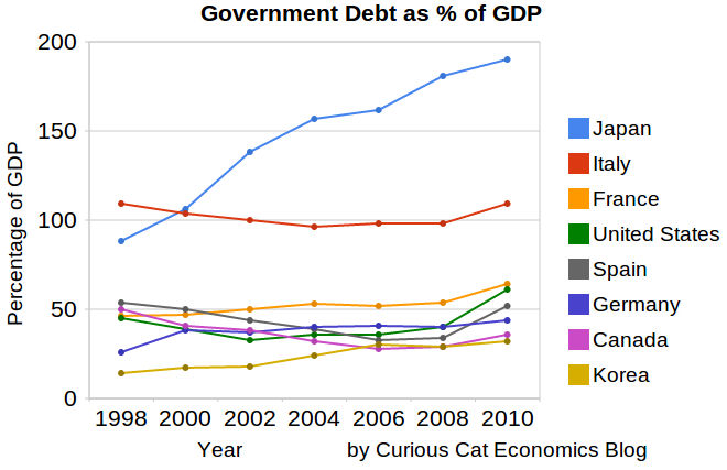
Economic data is always a bit tricky to understand. It makes some sense that excluding social security would reduce the USA debt percentage a bit. But these debt as a percentage of GDP are lower than other sources show. There are obviously many tricks that can be used to hide debt and my guess is the main thing going on with this data is OECD intentionally trying to make things look as good as possible.
Still looking at historical trends in data is useful. And I believe looking at data from various sources is wise. There has been a dramatic increase from 2008-2010. The USA is up from 41% of GDP to 61%. Spain is up from 34% to 52% (but given all the concern with Spain this doesn’t seem to indicate the real debt problems they have.
Japan and France don’t have 2010 data, so I used a rough estimate of my own based on 2009 data. Greece has been over 100% since 1998 and now stands at 148%, 2nd worst (to Japan) for any OECD country (Europe, North America, Japan and Korea), Italy is 3rd. Ireland is at 61% (up from 28% in 2008). The UK is at 86%, up from 61%.
Related: Government Debt as Percentage of GDP 1990-2009: USA, Japan, Germany, China… (based on IMF data) – Government Debt as Percentage of GDP 1990-2008 – Government Debt Compared to GDP 1990-2007 – Top 15 Manufacturing Countries in 2009
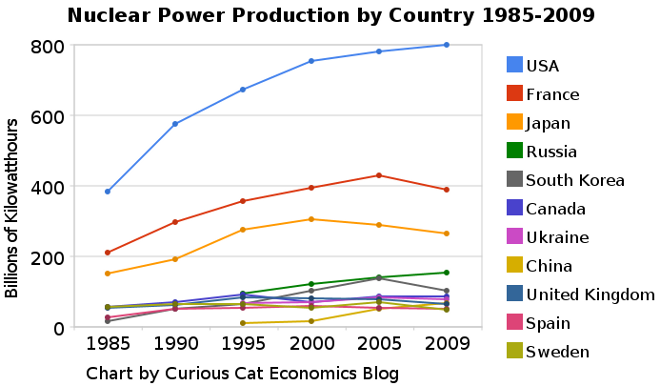 The chart shows the leading nuclear power producing countries from 1985-2009. The chart created by Curious Cat Investing and Economics Blog may be used with attribution. Data from US Department of Energy.
___________________
Nuclear power provided 14% of the world’s electricity in 2009. Wind power capacity increased 170% Worldwide from 2005-2009, to a total of 2% of electricity used (38,025 Megawatts of capacity). The USA produced nearly twice as much electricity using nuclear power than any other country, which surprised me.
Another view of data on nuclear power shows which of the leading nuclear producing countries have the largest percentages of their electrical generating capacity provided by nuclear power plants (as of 2009). France has 75% of all electricity generated from nuclear power. Ukraine had the second largest percentage at 49%, then Sweden at 37% and South Korea at 35%. Japan is at 28% compared to 20% for the USA (I am surprised these are so close _ would have thought France and Japan would be much closer). Russia is at 18% and China was at just 2%. As of January 2011, 29 countries worldwide are operating 442 nuclear reactors for electricity generation and 65 new nuclear plants are under construction in 15 countries. Source, Nuclear Energy Institute.
From 1985 to 2009, USA production increased 108%, France 84% and Japan up 77%. South Korea is up 550% (from a very low starting point). Globally nuclear power production increased 80% from 1985 to 2009. From 2000-2009 production increased 5% in the USA and decreased by 1% in France and 13% in Japan. China was up 318% (from a very low level) from 2000-2009 (they did not have nuclear power capacity prior to 1995.
The global capacity of nuclear power was scheduled to increase more rapidly in the future before the earthquake in Japan and the crisis at the Kashiwazaki-Kariwa Nuclear Power Plant. China was going to add a great deal of capacity and is likely to over the next few years (nuclear power plants take many year to bring online so those coming online in the next few years have already had hundreds of millions invested in building them). Several European countries have already announced temporary closing of some plants (especially some plants nearing the end of their originally scheduled lives – which those countries had been in the process of extending).
As a comparison global oil production increased by 10.5% from 1999-2009, while nuclear global production increased by 5% from 2000-2009. From 1999-2009 USA oil production decreased 7%. Russia increased production 62% in the decade, moving it into first place ahead of Saudi Arabia that increased production 10%.
Related: Oil Production by Country 1999-2009 – Oil Consumption by Country 1990-2009 – Japan to Add Personal Solar Subsidies – Solar Thermal in Desert, to Beat Coal by 2020
Welcome to the Curious Cat Investing and Economics Carnival: find useful recent personal finance, investing and economics blog posts and articles.
- The Myth of Japan’s ‘Lost Decades’ by Eamonn Fingleton – “Japan’s surplus is up more than five-fold since 1990. And, yes, far from falling against the dollar, the Japanese yen has actually boasted the strongest rise of any major currency in the last two decades. How can such facts be reconciled with the ‘two lost decades’ story? I don’t think they can.”
- Investment Risk Matters Most as Part of a Portfolio, Rather than in Isolation by John Hunter – “It is not less risky to have your entire retirement in treasury bills than to have a portfolio of stocks, bonds, international stocks, treasury bills, REITs… This is because their are not just risk of an investment declining in value. There are inflation risks, taxation risks…” (including structural imbalances introduced by the Feb depressing short term yields to provide billions to large banks from the pockets of savers).
- Cheating Investors As Official Government Policy by Daniel R. Amerman – “When you put your savings into a money market fund, and the policy of the US government is to force interest rates to unnaturally low levels – you are being cheated out of the yield you should be receiving. When you buy a corporate bond or corporate bond fund – you are being cheated by overt government market interventions that have the explicitly stated purpose of lowering corporate borrowing costs.”
- Force Yourself to Save by – “Save 50% of any bonus or raise… Theoretically you could save 100% of your raise and maintain the same lifestyle, but that’s no fun. What’s the point of a raise if it doesn’t include a new PS3?” (I have long favored putting a portion of each raise toward a saving plan – John)
- Who holds the most U.S. Treasuries in the world? (Hint: It’s not China.) by James Jubak – “For a while China was the biggest holder of U.S. government debt. But now with $896 billion China has slipped to No. 2. As of last week, the leader of the pack is—the envelope, please–the New York Fed, which holds the Federal Reserve’s Treasury bills, notes, bonds, and TIPs. (TIPS are Treasury Inflation Protected Securities.) As of last week the Fed’s System Open Market Account held $1,108 billion in U.S. government debt. “
- 15 Things You Need to Do, Before Reading Another Financial Blog – “Set up a system to monitor your next goal – Now that you have a goal, set up a system to monitor your progress. I have Mint email monthly progress reports on my financial goals. Another way is track your goal is by doing a monthly review.”
- How Much House Can You Afford? by Ryan Guina – “if your mortgage payment is expected to jump $500 a month, set that money aside for a few months as part of your normal budgeting. Do this for other spending categories that may increase, such as utilities, home owner’s insurance, taxes, etc.”
- MERS: Stop Foreclosing in Our Name by Barry Ritholtz – “Allow me to spell this out for you more specifically: MERS is an abomination, a legal blasphemy that should be destroyed before it unleashes the four horsemen of the apocalypse.”
Related: investing books – articles on investing – Curious Cat Investing and Economics Search
The world today has a much different economic landscape than just 20 years ago. China’s amazing economic growth is likely the biggest story. But the overwhelming success of many other countries is also a huge story. Today it is not the developing world that has governments spending taxes they promise their grandchildren will pay, but instead the richest countries on earth that choose to spend today and pay tomorrow. While “developing” countries have well balanced government budgets overall.
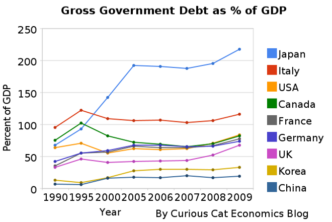 The chart shows gross government debt as percentage GDP from 1990-2009. By Curious Cat Investing and Economics Blog, Creative Commons Attribution. Data source: IMF
___________________________
There are plenty of reasons to question this data but I think it gives a decent overall picture of where things stand. It may seem like government debt should be an easy figure to know but even just agreeing what would be the most reasonable figure for one country is very difficult, comparing between countries gets even more difficult and the political pressures to reduces how bad the data looks encourages countries to try and make the figures look as good as they can.
The poster child for irresponsible spending is Japan which has gross government debt of 218% of GDP (Japan’s 2009 figure is an IMF estimate). Greece is at 115%. Gross debt is not the only important figure. Government debt held within the country is much less damaging than debt held by those outside the country. Japan holds a large portion of its own debt. If foreigners own your debt then debt payments you make each year are paid outside your country and it is in essence a tax of a portion of your economic production that must be paid. If the debt is internal it mean taxpayers have to support bond holders each year (but at least when those bondholders spend the money it stays within your economy).
Read more
In previous posts I have shown data for global manufacturing output by country. One of the things those posts have showed is that manufacturing output in China is growing tremendously, but it is also growing in the United States. The chart below shows manufacturing production by country as a percent of GDP. China dominates again, with over 30% of the GDP from manufacturing.
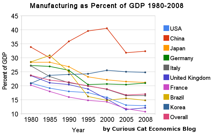
Chart showing manufacturing output, as percent of GDP, by country was created by the Curious Cat Economics Blog based on UN data* (based on current USA dollars). You may use the chart with attribution.
For the 14 biggest manufacturing countries in 2008, the overall manufacturing GDP percentage was 23.7% of GDP in 1980 and dropped to 17% in 2008. I left India (15% in 1980, 15% in 2008), Mexico (20%, 18%), Canada (17%, 13%), Spain (25%, 14%) and Russia (21% in 1990 [it was part of USSR in 1980], 15%) off the chart.
Over the last few decades Korea, and to some extent China, are the only countries that have increased the percent of GDP from manufacturing. China has not only grown manufacturing activity tremendously but also other areas of the economy (construction, mining, information technology). The countries with the largest manufacturing portions of their economies in 2008 were: China 32%, South Korea 25%, Japan and Germany at 21%. The next highest is Mexico at 18% which declined slightly over the last 15 years (with NAFTA in place). Globally, while manufacturing has grown, other areas of economic activity have been growing faster than manufacturing.
The manufacturing share of the USA economy dropped from 21% in 1980 to 18% in 1990, 16% in 2000 and 13% in 2008. Still as previous posts show the USA manufacturing output has grown substantially: over 300% since 1980, and 175% since 1990. The proportion of manufacturing output by the USA (for the top 14 manufacturers) has declined from 31% in 1980, 28% in 1990, 32% in 2000 to 24% in 2008. The proportion of USA manufacturing has declined from 33% in 1980, 29% in 1990, 36% in 2000 to 30% in 2008. While manufacturing output has grown in the USA it has done so more slowly than the economy overall.
Related: The Relative Economic Position of the USA is Likely to Decline – Manufacturing Data, Accuracy Questions – Top 12 Manufacturing Countries in 2007 – Manufacturing Employment Data: 1979 to 2007 – USA Manufacturing Output Continues to Increase (over the long term)
* I made edits to the 1980 Brazil manufacturing data and 1980, 1985 and 2008 China manufacturing data because the UN data only showed manufacturing data combined with mining and utility data. And I am using older UN data that had manufacturing separated from mining and utility figures for China in the other years.