The most popular posts on the Curious Cat Investing and Economics blog in 2017 (based on page views).
- Default Rates on Loans by Credit Score (2015)
- Top 10 Countries for Manufacturing Production in 2010: China, USA, Japan, Germany… (posted in 2011)
- USA Health Care Spending 2013: $2.9 trillion $9,255 per person and 17.4% of GDP (2015) (
- Manufacturing Output as a Percent of GDP by Country (1980 to 2008) (2010)
- The 20 Most Valuable Companies in the World – November 2017*
- Warren Buffett’s 2016 Letter to Shareholders (2017)*
- Stock Market Capitalization by Country from 2000 to 2016 (2017)*
- Stock Market Capitalization by Country from 1990 to 2010 (2012)
- Monopolies and Oligopolies do not a Free Market Make (2008)
- Manufacturing Output by Country 1999-2011: China, USA, Japan, Germany (2013)
- Government Debt as Percentage of GDP 1990-2009: USA, Japan, Germany, China… (2010)
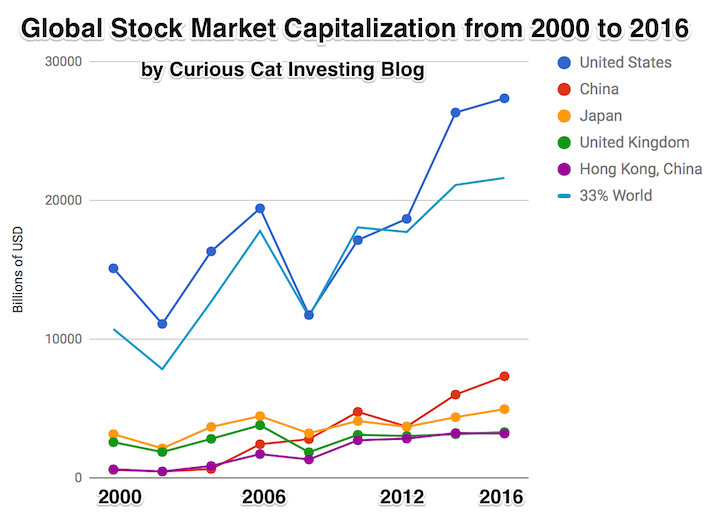
The chart shows the top countries based on stock market capitalization, with data from 2000 to 2016. The chart was created by Curious Cat Investing and Economics Blog may be used with attribution. Data from the World Bank.
The most popular posts on the Curious Cat Investing and Economics blog in 2016 (by page views).
- Top 10 Countries for Manufacturing Production in 2010: China, USA, Japan, Germany… (posted in 2011)
- Manufacturing Output as a Percent of GDP by Country (1980 to 2008) (2010)
- Default Rates on Loans by Credit Score (2015)*
- Stock Market Capitalization by Country from 1990 to 2010 (2012)
- Investing in Peer to Peer Loans (2015)
- Manufacturing Output by Country 1999-2011: China, USA, Japan, Germany (2013)
- The 20 Most Valuable Companies in the World – October 2015
- Manufacturing Output as Percent of GDP from 1980 to 2010 by Country (2012)
- Monopolies and Oligopolies do not a Free Market Make (2008)
- Government Debt as Percentage of GDP 1990-2009: USA, Japan, Germany, China… (2010)
- USA Individual Earnings Levels: Top 1% $343,000, 5% $154,000, 10% $112,000, 25% $66,000 (2012)
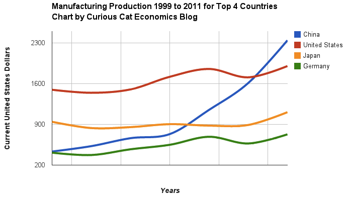
Chart of manufacturing production by China, USA, Japan and Germany from 1999 to 2011. The chart was created by the Curious Cat Economics Blog using UN data. You may use the chart with attribution. All data is shown in current USD (United States Dollar).
The most popular posts on the Curious Cat Investing and Economics blog in 2014 (by page views).
- Top 10 Countries for Manufacturing Production in 2010: China, USA, Japan, Germany… (posted in 2011)
- Manufacturing Output as a Percent of GDP by Country (1980 to 2008) (2010)
- Nuclear Power Generation by Country from 1985-2010 (2012)
- Government Debt as Percentage of GDP 1990-2009: USA, Japan, Germany, China… (2010)
- Stock Market Capitalization by Country from 1990 to 2010 (2012)
- Global Stock Market Capitalization from 2000 to 2012 (2013)
- The 20 Most Valuable Companies in the World – October 2015
- Manufacturing Output as Percent of GDP from 1980 to 2010 by Country (2012)
- USA Individual Earnings Levels: Top 1% $343,000, 5% $154,000, 10% $112,000, 25% $66,000 (2012)
- Manufacturing Output by Country 1999-2011: China, USA, Japan, Germany (2013)
- Chart of Largest Petroleum Consuming Countries from 1980 to 2010 (2011)
- The USA Doesn’t Understand that the 1950s and 1960s are Not a Reasonable Basis for Setting Expectations (2011)
- Oil Production by Country 1999-2009 (2011)
- Monopolies and Oligopolies do not a Free Market Make (2008)
- Investing in Peer to Peer Loans (2015)
- Cockroach Portfolio (2014)
- USA Health Care Spending 2013: $2.9 trillion $9,255 per person and 17.4% of GDP (2015) (
- Long Term View of Manufacturing Employment in the USA (2012)
- Solar Energy Capacity by Country (2015)
- Chart of Global Wind Energy Capacity by Country 2005 to 2013 (2014)
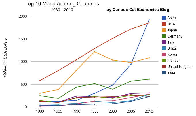
chart of output by top 10 manufacturing countries from 1980 to 2010
As with my other blogs the most popular posts show that old posts stay popular for a long time. Number of top 20 posts by year of publication:
2015: 4
2014: 2
2013: 2
2012: 5
2011: 4
2010: 2
2008: 1
Related: 20 Most Popular Posts on the Curious Cat Investing and Economics Blog in 2014 – 20 Most Popular Post on Curious Cat Science and Engineering Blog in 2014 – 10 Most Popular Posts on the Curious Cat Management Blog in 2014 – Most Popular Posts on the Curious Cat Management Comments Blog – Most Popular Posts on the Curious Cat Comments Blog
The largest manufacturing countries are China, USA, Japan and then Germany. These 4 are far in the lead, and very firmly in their positions. Only the USA and China are close, and the momentum of China is likely moving it quickly ahead – even with their current struggles.
The chart below shows manufacturing production by country as a percent of GDP of the 10 countries that manufacture the most. China has over 30% of the GDP from manufacturing, though the GDP share fell dramatically from 2005 and is solidly in the lead.
Nearly every country is decreasing the percentage of their economic output from manufacturing. Korea is the only exception, in this group. I would expect Korea to start following the general trend. Also China has reduced less than others, I expect China will also move toward the trend shown by the others (from 2005 to 2010 they certainly did).
For the 10 largest manufacturing countries in 2010, the overall manufacturing GDP percentage was 24.9% of GDP in 1980 and dropped to 17.7% in 2010. The point often missed by those looking at their country is most of these countries are growing manufacturing, they are just growing the rest of their economy more rapidly. It isn’t accurate to see this as a decline of manufacturing. It is manufacturing growing more slowly than (information technology, health care, etc.).

This chart shows manufacturing output, as percent of GDP, by country and was created by the Curious Cat Economics Blog based on UN data. You may use the chart with attribution.
The manufacturing share of the USA economy dropped from 21% in 1980 to 18% in 1990, 15% in 2000 and 13% in 2010. Still, as previous posts show, the USA manufacturing output has grown substantially: over 300% since 1980, and 175% since 1990. The proportion of manufacturing output by the USA (for the top 10 manufacturers) has declined from 33% in 1980, 32% in 1990, 35% in 2000 to 26% in 2010. If you exclude China, the USA was 36% of the manufacturing output of these 10 countries in 1980 and 36% in 2010. China’s share grew from 7.5% to 27% during that period.
The United Kingdom has seen manufacturing fall all the way to 10% of GDP, manufacturing little more than they did 15 years ago. Japan is the only other country growing manufacturing so slowly (but Japan has one of the highest proportion of GDP from manufacturing – at 20%). Japan manufactures very well actually, the costs are very high and so they have challenges but they have continued to manufacture quite a bit, even if they are not growing output much.

Chart of manufacturing production by the top 10 manufacturing countries (2000 to 2010). The chart was created by the Curious Cat Economics Blog. You may use the chart with attribution. All data is shown in 2010 USD (United States Dollar).
In my last post I looked at the output of the top 10 manufacturing countries with a focus on 1980 to 2010. Here I take a closer look at the last 10 years.
In 2010, China took the lead as the world’s leading manufacturing country from the USA. In 1995 the USA was actually very close to losing the lead to Japan (though you wouldn’t think it looking at the recent data). I believe China will be different, I believe China is going to build on their lead. As I discussed in the last post the data doesn’t support any decline in Chinese manufacturing (or significant moves away from China toward other South-East Asian countries). Indonesia has grown quickly (and have the most manufacturing production, of those discussed), but their total manufacturing output is less than China grew by per year for the last 5 years.
The four largest countries are pretty solidly in their positions now: the order will likely be China, USA, Japan, Germany for 10 years (or longer): though I could always be surprised. In the last decade China relentlessly moved past the other 3, to move from 4th to 1st. Other than that though, those 3 only strengthened their position against their nearest competitors. Brazil, Korea or India would need to increase production quite rapidly to catch Germany sooner. After the first 4 though the situation is very fluid.
")
Taking a closure look at the large group of countries after top 4. Chart of manufacturing production from 2000-2010.
Chart of manufacturing production by the leading manufacturing countries (2000 to 2010). The top 4 countries are left off to look more closely at history of the next group. The chart was created by the Curious Cat Economics Blog based on UN data. You may use the chart with attribution.
Removing the top 4 to take a close look at the data on the other largest manufacturing countries we see that there are many countries bunched together. It is still hard to see, but if you look closely, you can make out that some countries are growing well, for example: Brazil, India and Indonesia. Other countries (most in Europe, as well as Mexico) did not fare well in the last decade.
The UK had a particularly bad decade, moving from first place in this group (5th in the world) to 5th in this group and likely to be passed by India in 2011. Europe has 4 countries in this list (if you exclude Russia) and they do not appear likely to do particularly well in the next decade, in my opinion. I would certainly expect Brazil, India, Korea and Indonesia to out produce Italy, France, UK and Spain in 2020. In 2010 the total was $976 billion by the European 4 to $961 billion by the non-European 4. In 2000 it was $718 billion for the European 4 to $343 billion (remember all the data is in 2010 USD).
Chart of output by top 10 manufacturing countries from 1980 to 2010. The chart was created by the Curious Cat Economics Blog based on UN data. You may use the chart with attribution.
China has finally actually taken the lead as the largest manufacturer in the world. Reading many news sources and blogs you may have thought the USA lost the lead a couple of decades ago, but you would be wrong. In 1995 it looked like Japan was poised to take the lead in manufacturing production, but they have slumped since then (still they are solidly the 3rd biggest manufacturer). China has been growing manufacturing output enormously for 20 years, and they have now taken the lead from the USA.
As I have been saying for years the biggest economic story about manufacturing is the dramatic and long term increase of productive capacity in China. The next is the continuing global decline in manufacturing employment: increased productivity has seen production rise year after year and employment fall. What is the next most interesting stories is debatable: I would say the continuing failure to appreciate the continuing strong manufacturing production increases by the USA. Another candidate is the the decline in Japan. Another is the increase in several other counties: Korea, Brazil, India, Indonesia…
Looking more closely at some of the long term data shows how much China stands out. From 1980 to 2010 China increased output 1345%. The total top 10 group increased output 302% (all data is in current USD so inflation accounts for most of the gain, 100 1980-USD equal 280 2010-USD). From 1995 to 2010 China increased output 543%. The group increased 64%. For 1980-2010, the results for the other 3 largest manufacturing countries are: USA up 218%, Japan up 261% and Germany up 148% (other countries doing very well are Korea up 1893% and India up 737%). Looking at the last half of that period, from 1995-2010 the: USA up 44%, Japan down 11% and Germany up 19%.
One thing to remember about adjusting manufacturing data for inflation is that often the products created in later years are superior and cost less. So that a computer manufactured in 1990 which added $5,000 to the manufacturing total is far inferior to one in 2010 that added just $1,000. This point is mainly to say that while the increase in manufacturing in real (not inflated dollars) is not as high as it might seem the real value of manufacturing good did likely increase a great deal. But the economic data is based on price so manufacturing increases are reduced by cost decreases. Computers are the most obvious example, but it is also true with many other manufactured goods.
You can that the other largest manufacturing countries fail to keep up with the increases of the entire group of the top 10. China’s gains are just too large for others to match. If you remove China’s results (just to compare how the non-China countries are doing) from 1980-2010 the increase was 216% (so compared to the other 9 top manufacturers over this period the USA was even and Japan better than the average and Germany was worse). And from 1995-2010 the top 9 group (top 10, less China) increased just 28%: so the USA beat while Japan and Germany did worse than the other 9 as a group.
The world today has a much different economic landscape than just 20 years ago. China’s amazing economic growth is likely the biggest story. But the overwhelming success of many other countries is also a huge story. Today it is not the developing world that has governments spending taxes they promise their grandchildren will pay, but instead the richest countries on earth that choose to spend today and pay tomorrow. While “developing” countries have well balanced government budgets overall.
 The chart shows gross government debt as percentage GDP from 1990-2009. By Curious Cat Investing and Economics Blog, Creative Commons Attribution. Data source: IMF
___________________________
There are plenty of reasons to question this data but I think it gives a decent overall picture of where things stand. It may seem like government debt should be an easy figure to know but even just agreeing what would be the most reasonable figure for one country is very difficult, comparing between countries gets even more difficult and the political pressures to reduces how bad the data looks encourages countries to try and make the figures look as good as they can.
The poster child for irresponsible spending is Japan which has gross government debt of 218% of GDP (Japan’s 2009 figure is an IMF estimate). Greece is at 115%. Gross debt is not the only important figure. Government debt held within the country is much less damaging than debt held by those outside the country. Japan holds a large portion of its own debt. If foreigners own your debt then debt payments you make each year are paid outside your country and it is in essence a tax of a portion of your economic production that must be paid. If the debt is internal it mean taxpayers have to support bond holders each year (but at least when those bondholders spend the money it stays within your economy).
Read more

Many aspects of personal finance can get a bit confusing or require some study to understand. But really much of it isn’t very complicated. Debt is often toxic to personal financial success. The simple step you can take to avoid the problems many face is to just not buy things until you save up for them. If you want some new shoes or new Droid Incredible or to go see a football game (American or World Cup style) that is fine. Just save up the money and then spend it.
If you limit your borrowing you will get ahead financially. I think borrowing for a home is fine (I suggest saving up a 20% down-payment – or at least 10%, and many banks are again requiring this sensible step). And don’t overextend yourself – borrow what you can comfortably afford – even if you run into financial difficulty. It might be likely you earn more 5 years from now, but it is certainly possible you will earn less. Remember that.
Borrowing for school is fine but be careful. Huge education debts are a large burden. Don’t ignore this factor when selecting a school. And don’t fall prey to the for-profit education scams that have become very prevalent. I would be very very skeptical of any for profit educational institution and would much prefer long term public or private institutions with long term success (colleges, universities and community colleges). Technical training can be very good but you have to be very careful to not be taken advantage of.
Borrowing for a car is ok, but I would avoid it if possible. And other than that I would avoid debt, if at all possible. If you want a big expensive wedding, fine, save up the money. If you want a vacation to East Africa, great, save up the money. If you want the latest, new tech gadget, great save up the money first.
And saving up for your emergency fund (if it isn’t fully funded already) and for retirement should be right after food, shelter, health and disability insurance and any debt you already have to be paying back. After you have committed money to your emergency fund and retirement then choose what to do with your remaining discretionary income. It is critical to have built up an emergency fund so if you have any emergency you can tap that without going into debt and digging yourself a personal financial hole you have to dig out of.
Personal financial success is not some get rich quick scheme or magic. Success is Achieved by doing some really simple things well. It is not complicated but that isn’t the same thing as easy. Showing restraint is not what we are urged to do by the marketers. So while not buying what you can’t afford is not exactly an amazing insight, hundreds of millions of people (in the USA and Europe I know, and probably everywhere that consumer debt is easy to get) fail financially just because they refuse to follow this advice.
Related: Avoid credit card debt – How to Protect Your Financial Health – Curious Cat personal finance basics – Can I Afford That?
The chart shows the total percent of delinquent loans by commercial banks in the USA.

That last half of 2009 saw real estate delinquencies continue to increase. Residential real estate delinquencies increased 143 basis points to 10.14% and commercial real estate delinquencies in 98 basis points to 8.81%. Agricultural loan delinquencies also increased (112 basis points) though to just 3.24%. Consumer loan delinquencies decreased with credit card delinquencies down 18 basis points to 6.4% and other consumer loan delinquencies down 19 basis points to 3.49%.
Related: Loan Delinquency Rates Increased Dramatically in the 2nd Quarter – Bond Rates Remain Low, Little Change in Late 2009 – Government Debt as Percentage of GDP 1990-2008 – USA, Japan, Germany… – posts with charts showing economic data
Read more
Once again the USA was the leading country in manufacturing in 2008. And once again China grew their manufacturing output amazingly. In a change with recent trends Japan grew output significantly. Of course, the 2009 data is going to show the impact of a very severe worldwide recession.
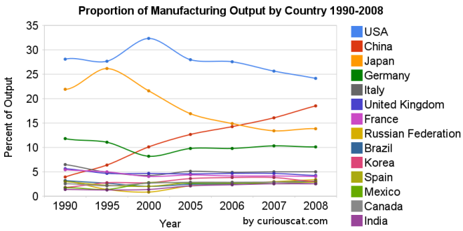 Chart showing the percentage output of top manufacturing countries from 1990-2008 by Curious Cat Management Blog, Creative Commons Attribution.
The first chart shows the USA’s share of the manufacturing output, of the countries that manufactured over $185 billion in 2008, at 28.1% in 1990, 27.7% in 1995, 32% in 2000, 28% in 2005, 28% in 2006, 26% in 2007 and 24% in 2008. China’s share has grown from 4% in 1990, 6% in 1995, 10% in 2000, 13% in 2005, 14% in 2006, 16% in 2007 to 18% in 2008. Japan’s share has fallen from 22% in 1990 to 14% in 2008. The USA has about 4.5% of the world population, China about 20%. See Curious Cat Investment blog post” Data on the Largest Manufacturing Countries in 2008.
Even with just this data, it is obvious the belief in a decades long steep decline in USA manufacturing is not in evidence. And, in fact the USA’s output has grown substantially over this period. It has just grown more slowly than that of China (as has every other country), and so while output in the USA has grown the percentage with China has shrunk. The percentage of manufacturing output by the USA (excluding output from China) was 29.3% in 1990 and 29.6% in 2008. The second chart shows manufacturing output over time.
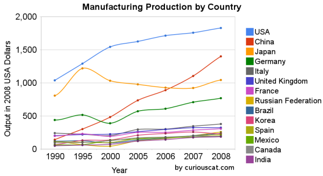 Chart showing the output of the top manufacturing countries from 1990-2008 by Curious Cat Management Blog, Creative Commons Attribution.
The 2008 China data is not provided for manufacturing alone (the latest UN Data, for global manufacturing, in billions of current USA dollars). The percentage of manufacturing (to manufacturing, mining and utilities) was 78% for 2005-2007 (I used 78% of the manufacturing, mining and utilities figure provided in the 2008 data). There is a good chance this overstates China manufacturing output in 2008 (due to very high commodity prices in 2008).
Hopefully these charts provide some evidence of what is really going on with global manufacturing and counteracts the hype, to some extent. Global economic data is not perfect. These figures are an attempt to capture the economic reality in the world but they are not a perfect proxy. This data is shown in 2008 USA dollars which is good in the sense that it shows all countries in the same light and we can compare the 1995 USA figure to 2005 without worrying about inflation. However foreign exchange fluctuations over time can show a country, for example, having a decline in manufacturing output in some year when in fact the output increased (just the decline against the USA dollar that year results in the data showing a decrease – which is accurate when measured in terms of USA dollars).
If the dollar declines substantially between when the 2008 data was calculated and the 2009 data is calculated that will give result in the data showing a substantial increase in those countries that had a currency strengthen against the USA dollar. At this time the Chinese Renminbi has not strengthened while most other currencies have – the Chinese government is retaining a peg to a specific exchange rate.
Korea (1.8% in 1990, 3% in 2008), Mexico (1.7% to 2.6%) and India (1.4% to 2.5%) were the only countries to increase their percentage of manufacturing output (other than China, of course, which grew from 3.9% to 18.5%).
Related: posts on manufacturing – Global Manufacturing Data by Country (2007) – Global Manufacturing Employment Data – 1979 to 2007 – Top 10 Manufacturing Countries 2006 – Top 10 Manufacturing Countries 2005