When 2 year US government bonds yield more than the 10 year US government bonds a recession is likely to appear soon. This chart shows why this is seen as such a reliable predictor.
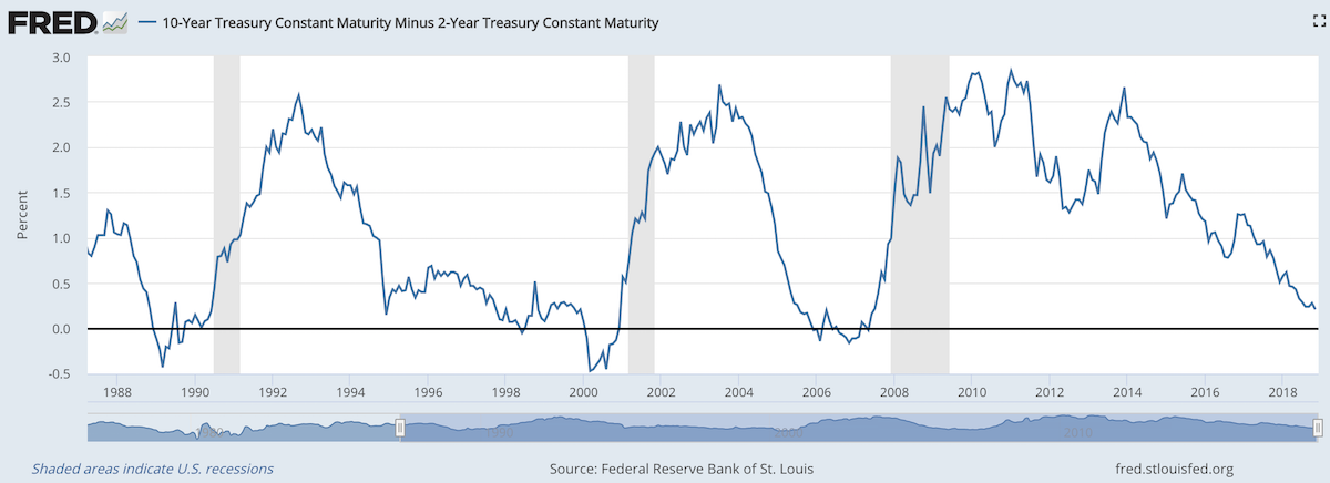
The chart shows the 10 year yield minus the 2 year yield. So when the value falls below 0 that means the 2 year yield is higher. Each time that happened, since 1988, a recession has followed (the grey shaded areas in the chart).
Do note that there were very small inversions in 1998 and 2006 that did not result in a recession in the near term. Also note that in every case the yield curve was no longer inverted by the time a recession actually started.
The reason why this phenomenon is getting so much attention recently is another thing that is apparent when looking at this chart, the 2 and 10 year yields are getting close to equal. But you can also see we are no closer than 1994 and the USA economy held off a recession for 7 more years.
Since 1970 the average length of time from the inversion of the 10 to 2 year yield curve has been 12 months (with a low of 6 months in 1973 and a high of 17 months, before the great recession of 2008).
In addition to a possibly impending yield curve inversion it has been a long time since the last recession which makes many investors and economists nervous that one may be due.
Related: 30 Year Fixed Mortgage Rates are not correlated with the Fed Funds Rate – Bond Yields Stay Very Low, Treasury Yields Drop Even More (2010) – Looking for Dividend Stocks in the Current Extremely Low Interest Rate Environment (2011) – Stock Market Capitalization by Country from 2000 to 2016
Another thing to note about yield curves at this time is that the US Federal Reserve continues to hold an enormous amount of long term government debt (trillions of dollars) which it has never done before the credit crisis of 2008. This reduces the long term yield since if they sold those assets that would add a huge amount of supply. How this impacts the predictive value of this measure will have to be seen. Also, one way for the Fed to delay the inversion would be to sell some of those bonds and drive up long term rates.
Factfulness by Hans Rosling (of TED talks and Gapminder charts fame) is an exceptionally good book. It provides great insight into how to think more effectively and how to understand the reality of the world we live in (versus the large distortions so common in most people’s vision of the world). You can take a quick quiz to see how well you understand the world
The truth of the very widespread increase in wealth around the globe has influenced my investing strategy for decades. It should be influencing yours, is it?
Data is extremely valuable in helping us make decisions and evaluating the effectiveness of policy. However it is critical to be careful. It is very easy to focus on meeting targets that seem sensible – increasing the number of hospital beds – but that lead to less effective policy.
Dollar street provides photos of people at all 4 income levels from around the globe. This illustrates Hans’ point that what determines how people live and what their circumstances look like is mostly a matter of income not the country they live in. It is simple idea but one that runs counter to much of the economic discussion focused so much on national boundaries. National boundaries do matter and the laws and economic reality of the national economy has a large impact but the issues for people at each level of income are much more tied to those in their level of income anywhere in the world than they are tied to their nation.

The book relentlessly points out the great progress that has been made globally over the last 50 years and how that progress continues today and looks to be set to continue in the future. We have plenty of areas to work on improving but we should be aware of how much progress we have been making. As he points out frequently he has continually seen huge underestimation of the economic conditions in the world today. This book does a great job of presenting the real success we have achieved and the progress we can look forward to in the future.
* In 2017
Level 1 has 0.75 billion people living on less than $2 per day.
Level 2 has 3.3 billion people living on incomes between $2 to $8 per day.
Level 3 has 2.5 billion people living on $8 to $32 per day.
Level 4 has 0.9 billion people living on more than $32 per day.
Related: GDP Growth Per Capita for Selected Countries from 1970 to 2010 (Korea, China, Singapore, Brazil) – Stock Market Capitalization by Country from 2000 to 2016 – Ignorance of Capitalism Leads us Astray – Wealthiest 1% Continue Dramatic Gains Compared to Everyone Else
Apple analysts are of no value to investors
If the stock moved more than 2% on any uptick in volume, I had to write a story explaining why. After dealing with that every day for about three years, I realized the overwhelming majority of analysts had no better clue than I did about what was moving Cisco’s stock.
Most investors know this, but if you don’t remember this lesson. The “explanations” you hear from media often are just as useless as horoscopes. A bunch of meaningless words presented in the hopes you don’t realize they are empty words.
The talking heads (and writers) need to say something. It would be much more useful if they took the time to do some research and put in some thought but they seem to be driven by the need to fill space instead of the need to inform.
It is also a huge waste of time, explaining random variation.
Related: Fooled by Randomness – Seeing Patterns Where None Exists – Illusions, Optical and Other – Understanding Data
As usual the 2016 Letter to Berkshire Hathaway shareholders by Warren Buffet provides great thoughts for investors.
American business – and consequently a basket of stocks – is virtually certain to be worth far more in the years ahead. Innovation, productivity gains, entrepreneurial spirit and an abundance of capital will see to that. Ever-present naysayers may prosper by marketing their gloomy forecasts. But heaven help them if they act on the nonsense they peddle.
Warren is not a fan of market timing, for good reason. I do think he may be a bit overly-optimistic. It is not something innate about the geography of the USA that means whoever is within that area will prosper over the long term. Our actions as a society materially impact our long term success. Yes, we have done very well economically and we have many factors continuing to make that likely to continue. But it is not certain.
Those willing to challenge rosy projections serve a useful purpose. But investors must be careful not to lose out on gains. Timing the market is rarely successful. Even in the cases where people do reasonable well getting out of a highly priced market they often fail to get back into the market until after they lose money on the effort (they may save a bit on the downside but then don’t get back in until they missed more upside than they saved on the downside).
- understand all exposures that might cause a policy to incur losses;
- conservatively assess the likelihood of any exposure actually causing a loss and the probable cost if it does;
- set a premium that, on average, will deliver a profit after both prospective loss costs and operating expenses are covered; and
- (4) be willing to walk away if the appropriate premium can’t be obtained.
Many insurers pass the first three tests and flunk the fourth. They simply can’t turn their back on business that is being eagerly written by their competitors. That old line, “The other guy is doing it, so we must as well,” spells trouble in any business, but in none more so than insurance.
Must of Berkshire Hathaway’s success is due to what seem like fairly easy things to do. For example, what Warren discusses here. This reinforces a point that is often overlooked which is the management philosophy that has helped Berkshire Hathaway achieve their success. Every year Warren Buffett praises the senior managers at various Berkshire Hathaway companies for good reason.
The fairly simple idea of hiring trustworthy, capable and ethical people and giving them freedom to manage for the long term seems too easy to provide an advantage. But it does. Warren Buffett is very careful to pick people that are more concerned with providing value to customers over the long term than promoting themselves and seeking massive short term rewards for themselves. This simple act of hiring people that are willing to put customers and shareholders before themselves allows your organizations to function in its long term best interest.
In so many other companies short term incentives destroy value (Warren’s point 4 above). This failure can extend to companies Warren is significantly invested in: such as the long term and deep seeded mismanagement at Wells Fargo due to very poor leadership at that company for years. But in general, Berkshire Hathaway is much better at avoiding these toxic behaviors driven by very poor executive leadership when compared to other companies.
The importance of Berkshire Hathaway focusing on the long term and not getting distracted by short term financial measures is vastly under-appreciated.
By focusing managers and CEOs on actually running the business Berkshire Hathaway again does well compared to their competitors. Far too many companies spend the time of executives on playing financial games to divert huge payments to themselves that they then try to claim are not really costs. This is enormously costly to investors and our economy.
Diversification and keeping down fees are the investing strategies that will help more investors than anything else.
Related: Warren Buffett’s 2011 Letter to Shareholders – Warren Buffett’s 2010 Letter to Shareholders – Warren Buffett’s 2005 Shareholder Letter
The report, The Dwindling Taxable Share Of U.S. Corporate Stock, from the Brookings Institution Tax Policy Center includes some amazing data.

In 1965 foreign ownership of USA stocks totaled about 2%, in 1990 it had risen to 10% and by 2015 to 26%. That the foreign ownership is so high surprised me. Holdings in retirement accounts (defined benefit accounts, IRAs etc.) was under 10% in 1965, rose to over 30% in 1990 and to about 40% in 2015. The holdings in retirement accounts doesn’t really surprise me.
The combination of these factors (and a few others) has decreased the holding of USA stocks that are taxable in the USA from 84% in 1965 to 24% in 2015. From the report
As with much economic data it isn’t an easy matter to determine what values to use in order to get figures such as “foreign ownership.” Still this is very interesting data, and as the report suggests further research in this area would be useful.
Related: There is No Such Thing as “True Unemployment Rate” – The 20 Most Valuable Companies in the World – February 2016 (top 10 all based in the USA) – Why China’s Economic Data is Questionable – Data provides an imperfect proxy for reality (we often forget the proxy nature of data)
Alphabet (Google) writes how they purchased 3.2 million shares this quarter in their earnings release:
In Q1 2016, we repurchased 3.2 million shares of Alphabet Class C capital stock for an aggregate amount of $2.3 billion, of which $2.1 billion was paid during the quarter. The total remaining authorization for future repurchases is approximately $1.4 billion. The authorization has no expiration date.
And they tout non-GAAP earnings, while of course reporting the GAAP earnings as required. One of the things executives like about non-GAAP earnings is they pretend the stock they give away to themselves doesn’t have a cost to shareholders. When you call attention to spending over $2 billion in the quarter to buy back 3.2 million shares it seems silly to then claim that the stock you gave away shouldn’t be considered as an expense.
How can you pay over $2 billion just to get back the stock you gave away and also pretend that money is not really a cost? And on top of that you promote the buyback as evidence that the stock is really worth more than you paid (after all why would you pay more than it is worth). But when you give the stock away to yourself that shouldn’t be seen as a cost? It is amazing they can do this and think they are not doing anything wrong.
And where does Google stand compared to last year for outstanding shares? 689,498,000 last year compared to 699,311,000 now. So nearly 10,000,000 more shares outstanding, even after they bought back 3.2 million this quarter. In the previous quarter there where 697,025,000 shares outstanding. All these figures are weighted-average diluted share balances for the entire quarter.
Google CEO, Sundar Pichai, got a $100 million stock award in 2015 (before being promoted to CEO). After the promotion he will be taking an additional “$209 million in stock granted every other year (he has to stay at Google for four years after each grant to cash them out).” He was granted $335 million in stock in 2014 and $78 million in 2013. You can see how quickly the executives paying themselves this well (this is 1 executive, a highly ranked one but still just 1) can dilute stockholders positions even with multi billion dollar buybacks in a quarter.
You don’t hear companies promoting how much dilution they are imposing on shareholders in order to provide windfalls for executives. I wonder why? No I don’t. I do wonder why reporters promote the buybacks and ignore the fact that the dilution is so extreme that it even overwhelms billions of dollars in buybacks.
Alphabet reported $6.02 a share in earnings and $7.50 a share in non-GAAP “earnings” for the latest quarter.
As I have said before I believe Google’s ability to extract enormous profit from their search dominance (as well as YouTube and adwords) makes it a very compelling long term investment. It would be better if the executives were not allowed to take such huge slices from the cash flow Google generates. But it is able to sustain those raids on stockholder equity and still be a good investment and appears likely to be able to continue to do so. Though I think they would be better off reducing the amount executives take going forward.
Related: Google Diluted Shareholder Equity by 1% a year (2009-2013) – Executives Again Treating Corporate Treasuries as Their Money (2011) – Another Year of CEO’s Taking Hugely Excessive Pay (2009) –
When I lived in Malaysia I learned that the residential electricity rates were very low for the low levels of use and climbed fairly rapidly as you used a lot of electricity (say running your air conditioner a lot). I think this is a very good idea (especially for the not yet rich countries). In rich countries even most of the “poor” have high use of electricity and it isn’t a huge economic hardship to pay the costs.
Effectively the rich end up subsidizing the low rates for the poor, which is a very sensible setup it seems to me. The market functions fairly well even though it is distorted a bit to let the poor (or anyone that uses very little electricity) to pay low rates.
In a country like Malaysia as people become rich they may well decide to use a great deal of electricity for air conditioning (it is in the tropics). But their ancestors didn’t have that luxury and having that be costly seems sensible to me. Allowing the poor to have access to cheap electricity is a very good thing with many positive externalities. And subsidizing the rate seems to be a good idea to me.
Often you get bad distortions in how markets work when you try to use things like subsidies (this post is expanded from a comment I made on Reddit discussing massive bad investments created by free electricity from the power company to city governments – including free electricity to their profit making enterprises, such as ice rinks in Puerto Rico).

View of downtown Johor Bahru from my condo (a small view of Singapore visible is in the background)
With the model of low residential rates for low usage you encourage people to use less electricity but you allow everyone to have access at a low cost (which is important in poor or medium income countries). And as people use more they have to pay higher rates (per kwh) and those rates allow the power company to make a profit and fund expansion. Often in developing countries the power company will be semi-private so the government is involved in providing capital and sharing in profits (as well as stockholders).
The USA mainly uses central air conditioning everywhere. In Malaysia, and most of the world actually, normally they just have AC units in some of the rooms. In poor houses they may well have none. In middle class houses they may have a one or a couple rooms with AC units.
Even in luxury condos (and houses) they will have some rooms without AC at all. I never saw a condo or house with AC for the kitchen or bathrooms. The design was definitely setup to use AC in fairly minimal ways. The hallways, stairways etc. for the “interior” of the high rise condos were also not air conditioned (they were open to the outside to get good air flow). Of course as more people become rich there is more and more use of AC.
Related: Traveling for Health Care – Expectations – Looking at the Malaysian Economy (2013) – Pursuing a Growing Economy While Avoiding the Pitfalls That Befall to Many Middle Income Countries – Singapore and Iskandar Malaysia – Looking at GDP Growth Per Capita for Selected Countries from 1970 to 2010 – Malaysian Economy Continues to Expand, Budget Deficits Remain High (2012) – Iskandar Malaysia Housing Real Estate Investment Considerations (2011)
Credit scores are far from a great measure of whether a person is a great credit risk for a specific loan, in my opinion. However, they are very widely used and therefor, very important. They also are somewhat useful. And lenders don’t base judgement solely on credit scores, they consider many other factors, if they have any sense at all.
Credit scores range from 300 to 850. They are calculated by various credit reporting organizations, including FICO. They factor in payment history, percent of outstanding credit available that is used, credit report checks, length of outstanding credit accounts, etc..
Metlife report on consumers and credit scores provides some interesting data.
| Credit score range | Default rate* |
|---|---|
| 740-850 | .4% |
| 680-739 | 2.8% |
| 620-679 | 7.5% |
| 550-619 | 17% |
| 300-459 | 33.8% |
* Default rate in this case means, 90 days past due. MetLife got this data from the Consumer Financial Health Study dataset**.
Peer to peer lending platform, Lending Club, limits loans to those with a minimum credit score of 660 (remember there are multiple organizations that provide credit scores, this minimum is based on Lending Club’s score). In general I see scores above 700 in A and B loans, scores from 650-700 in C and D loans. Remember the credit score is not the only factor setting the rate (you will see scores above 700 in the C loans sometimes, etc.). Credit scores provide some insight but are just 1 factor in approving loans or setting rates (an important one but not a completely dominant one).
About 38% of people have credit scores from 750-850. Another 37% from 600-749 and about 25% from 350-599.
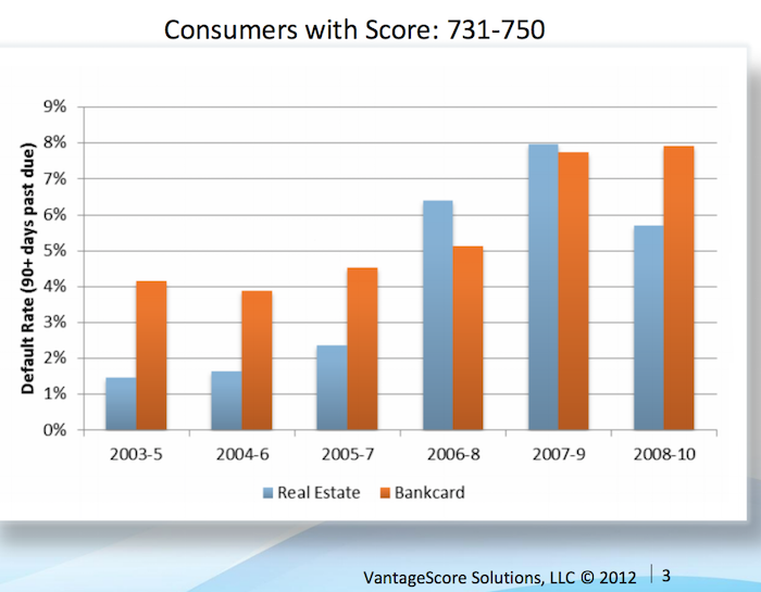
Vantage Score decided to make their score range go up to 1000, not the standard 850. Maybe a 750 score for them is comparable to 680? They say super-prime is 900+ (750-850 on more common scale), prime is 701-900 (680-739), near-prime 641-700 (620-679), subprime 501-640 (550-619). Anyway that chart shows the changing default rates from 2003 to 2010 by type of loan.
This Federal Reserve report on meeting between Federal Reserve Board staff and Fair Isaac Corporation (FICO) 20 June 2013 has some interesting material.
For guidance, the following table generally matches a borrower’s odds-of-default with the corresponding FICO 8 score (calculated on performance from Oct 2008 – Oct 2010). Of course, the range of scores and odds-of-default [the data is related to mortgages] will vary with each model as creditors develop and validate their own credit scoring models.
Odds-of Default FICO 8 Score percent of population** 5:1 610 9% 10:1 645 9% 20:1 685 6% 30:1 705 6% 40:1 720 6% 50:1 735 9% 100:1 770 30%
As you can see at a 610 level, 20 loans out of 100 defaulted. At 685 just 5 in 100 defaulted and at 770 just 1 in 100 did.
** I had to adjust this, because the report didn’t report it in this form, so it a very approximate measure (I made estimates for something like scores from 735 to 769 etc.). Again this is data from the Oct 2008 – Oct 2010 period. The rest of the population (about 25%) would have scores below 610.
Related: The Impact of Credit Scores and Jumbo Size on Mortgage Rates (2009) – Your FICO credit score explained – $2,540,000,000,000 in USA Consumer Debt
This page references a Fed report (that I can’t find) that found the following default rates on new loans for the two years after origination, 2000-2002:
| Credit score range | Default rate* |
|---|---|
| under 520 | 41% |
| 520-559 | 28% |
| 560-599 | 23% |
| 600-639 | 16% |
| 640-679 | 9% |
| 680-719 | 4.4% |
| over 720 | <1% |
The Consumer Financial Health Study respondents were asked to self-assess their credit quality and for permission to pull their actual credit scores.8 Forty-five percent of survey participants granted permission, yielding an “opt-in” sample size of 3,215. We appended two objective measures of creditworthiness to the dataset: Experian provided VantageScore 3.0 credit scores, and LexisNexis Risk Solutions provided RiskView scores. VantageScore is a generic credit scoring model that was created by the three major credit bureaus (Equifax, Experian and TransUnion) and, in addition to tradeline data, includes rent, utility and cell phone payment data when it is available in consumer credit files.
Health insurance options are confusing for those of us in the USA (those outside the USA are free of the frustrations of USA health care system). One of the features of a health insurance plan in the USA is the out-of-pocket “maximum.”
Now if you think you understand english you might think this is the maximum you have to pay out of your pocket. If you understand how horrible the USA health care system is and how nothing is easy, you probably suspect it isn’t a maximum at all. I find myself thinking that I don’t really understand what this seemingly simple value actually means, so I decided to research it and write this blog post.
First of all you have to pay the monthly premiums (assuming your employer doesn’t pay them for you), probably a few hundred or more dollars every month. Then the coverage likely has a deductible maximum for the year.
For this example, for 1 person the insurance costs $300/month with a yearly deductible maximum of $5,000. And the insurance plan says there is an out-of-pocket “maximum” of $6,500. Well 12 *$300 + $5,000 = $8,600. So, as you can probably guess, out-of-pocket “maximum” doesn’t actually mean the maximum out of your pocket. In fact the $8,600 is excluded from the out-of-pocket maximum calculation altogether.
So, you then might think ok, my actual out-of-pocket maximum (the most I will have to pay all year for health care) is $8,600 + $6,500 = $15,100. But that isn’t right either.
First, this is only for covered medical expenses, uncovered medical expenses are not included. This makes some sense, certainly, but in your planning, you can’t think your health care costs are capped at $15,100. Especially since in the USA lots of health care will be uncovered (dental care is often excluded, mental health care may well be limited, certain types of treatment may not be covered, prescription glasses, non-prescription drugs, addiction treatment…).
Remember, USA health care coverage isn’t even just limited by the type of care. For example, even if fixing your injured leg is covered, if you don’t do it using exactly the right places (where your health plan covers the cost), it may be considered to be uncovered care. In general, emergency care is more flexible for what is covered, but the horror stories of dealing with health insurers refusal to pay for provided health care adds risk to any health care someone gets in the USA.
Here is a good explanation of out-of-pocket cost questions (in this quote looking at out of network costs): “Out of Pocket Maximum” and health insurance plan terminology and calculation?
This chart shows that the percentage of millionaire families by highest education level is dramatically different by education level. The data is looking at USA family income for household headed by a person over 40. For high school dropouts, fewer than 1% are millionaires; all families it is about 5%; high school graduates about 6%; 4 year college degree about 22% and graduate or professional degree about 38%.

Interesting chart based on Federal Reserve data (via the Wall Street Journal)
While the costs of higher education in the USA have become crazy the evidence still suggests education is highly correlated to income. Numerous studies still show that the investment in education pays a high return. Of course, simple correlation isn’t sufficient to make that judgement but in other studies they have attempted to use more accurate measures of the value of education to life long earnings.
Related: The Time to Payback the Investment in a College Education in the USA Today is Nearly as Low as Ever, Surprisingly – Looking at the Value of Different College Degrees – Engineering Graduates Earned a Return on Their Investment In Education of 21%
The blog post with the chart, Why Wealth Inequality Is Way More Complicated Than Just Rich and Poor has other very interesting data. Go read the full post.
Average isn’t a very good measure for economic wealth data, is is skewed horribly by the extremely wealthy, median isn’t a perfect measure but it is much better. The post includes a chart of average wealth by age which is interesting though I think the $ amounts are largely worthless (due to average being so pointless). The interesting point is there is a pretty straight line climb to a maximum at 62 and then a decline that is about as rapid as the climb in wealth.
That decline is slow for a bit, dropping, but slowly until about 70 when it drops fairly quickly. It isn’t an amazing result but still interesting. It would be nice to see this with median levels and then averaged over a 20 year period. The chart they show tells the results for some point in time (it isn’t indicated) but doesn’t give you an idea if this is a consistent result over time or something special about the measurement at the time.
They also do have a chart showing absolute wealth data as median and average to show how distorted an average is. For example, median wealth for whites 55-64 and above 65 is about $280,000 and the average for both is about $1,000,000.
Related: Highest Paying Fields at Mid Career in USA: Engineering, Science and Math – Wealthiest 1% Continue Dramatic Gains Compared to Everyone Else – Correlation is Not Causation: “Fat is Catching” Theory Exposed