The chart shows the oil production over the last decade by the top oil producing countries. Production totals include crude oil, shale oil, oil sands and NGLs (the liquid content of natural gas where this is recovered separately). Excludes liquid fuels from other sources such as biomass and coal derivatives.
 The chart shows the leading oil producing countries from 1999-2009. The chart created by Curious Cat Investing and Economics Blog may be used with attribution.
___________________
The chart show 3 clear leaders in production Russia, Saudi Arabia and the USA (with the USA firmly in 3rd place). Those 3 were responsible for approximately a third of the total oil production in 2009. Russia greatly increased production. During the last decade world production increased from 72 million barrels a day to 80 million barrels a day. Russia accounted for 51% of the increase, close to 4 million barrels a day.
The next 11 countries are pretty closely grouped, with slightly increasing production over the period as a group. Brazil, the last country with over 2 million barrels of production a day in 2009, has the largest percentage increase in the period, producing 79% more in 2009 than they did in 1999. Russia increase production 62% over the period. The other countries ranged from a 23% increase (Canada) to a 25% decrease (Norway). The USA increased production 7% and China increased production 18%. World production increased 11%.
Last year I posted a chart showing oil consumption by the top oil consuming countries over the last 2 decades; showing all countries using over 2 million barrels of oil a day. The USA consumed 18.7 million barrels a day in 2009. Only China was also over 5 million barrels, using 8.2 million in 2009. Japan was next at 4.4 million.
Read more
China continues to grow manufacturing is output. In 2009, the USA, and most countries saw declines in manufacturing production. China, however, continued to grow. China is now finally approaching the level of manufacturing done in USA. The latest data again shows the USA is the largest manufacturer but China looks poised to take over the number one spot soon.

The chart showing manufacturing output by country was created by the Curious Cat Economics Blog based on UN data (in 2009 USA dollars). You may use the chart with attribution.
The large decline in Germany was 23%. This was a 18% decline in Euro terms, and when you added the decline of the Euro the total USA dollar decline was 23%. Quite extraordinary. Most European countries were down over 15%. In fact, so extraordinary it makes me question the data. World economic data is useful and interesting but it isn’t perfect. USA manufacturing declined just .5%. China increased manufacturing production by 9%.
The last 2 years, China has stopped separating out mining and utilities from manufacturing. The percentage of manufacturing (to manufacturing, mining and utilities) was 78% for 2005-2007 (I used 78% of the manufacturing, mining and utilities figure provided in the 2008 and 2009 data – but that could be wrong). The unadjusted 2009 China total was $2.05 trillion and for the USA the total manufacturing, mining and utilities was $2.33 trillion. In 2009, the manufacturing total was 76% of USA manufacturing, mining and utilities. The percentage varies significantly between countries (the Russian federation is about 55% and Japan about 91%) and various over time as a countries economy changes.
The big, long term story remains the same. China has continued to grow manufacturing output tremendously. I see very little data to support the stories about manufacturing having to leave China to go elsewhere (especially when you look at the “lower wages” counties mentioned in news stories – they are not growing at any significant rate). The USA is still manufacturing a huge amount and that production has steadily grown over time.
When you look back over the period from 1980 to today you can see
- The biggest story is the growth in Chinese manufacturing
- The USA started out the largest and has grown significantly
- Japan did very well from 1980 to 1995, and since they have struggled
- The USA, China, Japan are really far ahead of other countries in total manufacturing output, and Germany is solidly in 4th place.
- After that the countries are fairly closely grouped together. Though there are significant trends hidden by the scale of this graph, which I will explore in future posts. South Korea has growth significantly over this period, for example.
- The biggest macro trend that the data shows, but is not so visible in this chart (other than China’s growth), is the very strong performance of emerging markets (and in fact some counties have fully become manufacturing powerhouses during this period, most notably China but also, South Korea and Brazil). And I see that continuing going forward (though that is speculation).
Two more interesting pieces of data. Italy is the 5th largest manufacturing country, I don’t think many people would guess that. Since 1980 Italy surpassed the UK and France but China rocketed passed them. And Indonesia has moved into 14th place, edging out Canada in 2009.
I plan to take more time in 2011 to look at global manufacturing and other global economic data more closely and to write about it here.
Related: Data on the Largest Manufacturing Countries in 2008 – Top 12 Manufacturing Countries in 2007 – Top 10 Manufacturing Countries 2006 – Leading global manufacturers in 2004
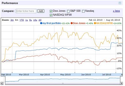
Google finance has a nice new feature to let you chart your entire portfolio. You can then compare it to the S&P 500 or other stocks. This is a very nice feature. Yahoo Finance is about the only part of Yahoo I still use. I do use Google Finance some but they still fall short and I use Yahoo Finance much more. This feature will at least encourage me to put my portfolio in Google and start tracking it.
It would be great if this could give you portfolio annual rates of return (including factoring in cash additions and withdraws and keeping track of sales over time to show a true view of the portfolio). It does look like it will factor in stock purchases and sales which is very nice. You can import csv files with transaction history – another nice feature.
It also strikes me as a very smart move (as a Google stockholder that is nice to see) as advertising rates around investing are high. The more time Google can provide financial advertisers the more income they can make.
Related: Lazy Portfolios Seven-year Winning Streak – Google Posts Good Earning But Not Good Enough for Many (April 2010) – Dollar Cost Averaging – Curious Cat Investing Books
The world today has a much different economic landscape than just 20 years ago. China’s amazing economic growth is likely the biggest story. But the overwhelming success of many other countries is also a huge story. Today it is not the developing world that has governments spending taxes they promise their grandchildren will pay, but instead the richest countries on earth that choose to spend today and pay tomorrow. While “developing” countries have well balanced government budgets overall.
 The chart shows gross government debt as percentage GDP from 1990-2009. By Curious Cat Investing and Economics Blog, Creative Commons Attribution. Data source: IMF
___________________________
There are plenty of reasons to question this data but I think it gives a decent overall picture of where things stand. It may seem like government debt should be an easy figure to know but even just agreeing what would be the most reasonable figure for one country is very difficult, comparing between countries gets even more difficult and the political pressures to reduces how bad the data looks encourages countries to try and make the figures look as good as they can.
The poster child for irresponsible spending is Japan which has gross government debt of 218% of GDP (Japan’s 2009 figure is an IMF estimate). Greece is at 115%. Gross debt is not the only important figure. Government debt held within the country is much less damaging than debt held by those outside the country. Japan holds a large portion of its own debt. If foreigners own your debt then debt payments you make each year are paid outside your country and it is in essence a tax of a portion of your economic production that must be paid. If the debt is internal it mean taxpayers have to support bond holders each year (but at least when those bondholders spend the money it stays within your economy).
Read more
The chart shows the total percent of delinquent loans by commercial banks in the USA.

The first half of 2010 saw residential real estate delinquencies continue to increase and other consumer loan delinquencies decreasing (both trends continue those of the last half of 2009). Residential real estate delinquencies increased 118 basis points to 11.4%. Commercial real estate delinquencies increased just 7 basis points to 8.79%. Agricultural loan delinquencies also increased (25 basis points) though to just 3.35%. Consumer loan delinquencies decreased, with credit card delinquencies down 131 basis points to 5.01% and other consumer loan delinquencies down 15 basis points to 3.34%.
Related: Real Estate and Consumer Loan Delinquency Rates 1998-2009 – Bond Rates Remain Low, Little Change in Late 2009 – Government Debt as Percentage of GDP 1990-2008 – USA, Japan, Germany… –posts with charts showing economic data
Read more
30 year fixed mortgage rates have declined sharply recently to close to 4.5%.

If you are considering refinancing a mortgage now may well be a very good time. If you are not, you maybe should consider it. If so look to shorten the length. If you originally took out a 30 year mortgage and now have, for example, 24 years let, don’t add 6 years to your repayment term by getting a new 30 year mortgage. Instead, look to shorten your pay back period with a 20 year mortgage. The 20 year mortgage will have an even lower rate than the 30 year mortgage.
If you plan on staying in the house, a fixed rate mortgage is definitely the better option, in my opinion. If you are going to move (and sell your hose) in a few years, an adjustable rate mortgage may make sense, but I would learn toward a fixed rate mortgage unless you are absolutely sure (because situations can change and you may decide you want to stay).
The poor economy, unemployment rate still at 9.5%, has the Fed continuing massive intervention into the economy. The Fed is keeping the fed funds rate at close to 0%.
If you are looking at a new real estate purchase, financing a 30 year mortgage sure is attractive at rates under to 4.5%.
Related: historical comparison of 30 year fixed mortgage rates and the federal funds rate – 30 Year Fixed Mortgage Rates Remain Low (Dec 2009) – Lowest 30 Year Fixed Mortgage Rates in 37 Years – What are mortgage definitions
For more data, see graphs of the federal funds rate versus mortgage rates for 1980-1999. Source data: federal funds rates – 30 year mortgage rates
The United States uses far more oil than any other country. The chart shows this very well. The chart shows all countries using over 2 million barrels of oil a day. The USA consumed 18.7 million barrels a day in 2009. Only China was also over 5 million barrels, they reached 8.2 million in 2009. Japan is next at 4.4 million.

The data is from the US Department of Energy for total consumption of petroleum products.
Mexico, Canada, South Korea, Germany, Brazil, Russia and India all use between 2 and 3 million barrels a day. All of Africa is at 3.2 million.
Related: Oil Consumption by Country in 2007 – Manufacturing output by Country 1990-2008 – Increasing USA Foreign Oil Dependence In The Last 40 years – Wind Power Capacity Up 170% Worldwide from 2005-2009
In previous posts I have shown data for global manufacturing output by country. One of the things those posts have showed is that manufacturing output in China is growing tremendously, but it is also growing in the United States. The chart below shows manufacturing production by country as a percent of GDP. China dominates again, with over 30% of the GDP from manufacturing.

Chart showing manufacturing output, as percent of GDP, by country was created by the Curious Cat Economics Blog based on UN data* (based on current USA dollars). You may use the chart with attribution.
For the 14 biggest manufacturing countries in 2008, the overall manufacturing GDP percentage was 23.7% of GDP in 1980 and dropped to 17% in 2008. I left India (15% in 1980, 15% in 2008), Mexico (20%, 18%), Canada (17%, 13%), Spain (25%, 14%) and Russia (21% in 1990 [it was part of USSR in 1980], 15%) off the chart.
Over the last few decades Korea, and to some extent China, are the only countries that have increased the percent of GDP from manufacturing. China has not only grown manufacturing activity tremendously but also other areas of the economy (construction, mining, information technology). The countries with the largest manufacturing portions of their economies in 2008 were: China 32%, South Korea 25%, Japan and Germany at 21%. The next highest is Mexico at 18% which declined slightly over the last 15 years (with NAFTA in place). Globally, while manufacturing has grown, other areas of economic activity have been growing faster than manufacturing.
The manufacturing share of the USA economy dropped from 21% in 1980 to 18% in 1990, 16% in 2000 and 13% in 2008. Still as previous posts show the USA manufacturing output has grown substantially: over 300% since 1980, and 175% since 1990. The proportion of manufacturing output by the USA (for the top 14 manufacturers) has declined from 31% in 1980, 28% in 1990, 32% in 2000 to 24% in 2008. The proportion of USA manufacturing has declined from 33% in 1980, 29% in 1990, 36% in 2000 to 30% in 2008. While manufacturing output has grown in the USA it has done so more slowly than the economy overall.
Related: The Relative Economic Position of the USA is Likely to Decline – Manufacturing Data, Accuracy Questions – Top 12 Manufacturing Countries in 2007 – Manufacturing Employment Data: 1979 to 2007 – USA Manufacturing Output Continues to Increase (over the long term)
* I made edits to the 1980 Brazil manufacturing data and 1980, 1985 and 2008 China manufacturing data because the UN data only showed manufacturing data combined with mining and utility data. And I am using older UN data that had manufacturing separated from mining and utility figures for China in the other years.
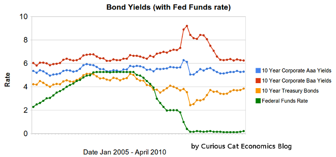 Chart showing corporate and government bond yields from 2005-2010 by Curious Cat Investing Economics Blog, Creative Commons Attribution, data from the Federal Reserve.
Bond yields have remained low, with little change over the last 6 months. 10 year Aaa corporate bonds yields have increase 10 basis points to 5.29%. 10 year Baa yields have decreased 7 basis points to 6.25%. 10 year USA treasury bonds have increased 45 basis points (largely the effective of money scared into the safety of US treasuries leaving as the credit crisis eased. The federal funds rate remains under .25%.
The United States economy appears to be gaining strength and if job growth can continue the Fed will likely reduce the amount giveaways to the banks by increasing the fed funds rate (though when this will happen is still very hard to judge). The Fed will also likely sell mortgages back to the market which will increase long term rates. The Fed will likely start by changing the wording that the economic conditions “are likely to warrant exceptionally low levels of the federal funds rate for an extended period.” When this language changes rates may well go up 25 to 50 basis points quickly.
Related: Bond Yields Change Little Over Previous Months (December 2009) – Chart Shows Wild Swings in Bond Yields in Late 2008 – Real Estate and Consumer Loan Delinquency Rates 1998-2009 – Government Debt as Percentage of GDP 1990-2008 in OECD: USA, Japan, Germany…
The chart shows the total percent of delinquent loans by commercial banks in the USA.

That last half of 2009 saw real estate delinquencies continue to increase. Residential real estate delinquencies increased 143 basis points to 10.14% and commercial real estate delinquencies in 98 basis points to 8.81%. Agricultural loan delinquencies also increased (112 basis points) though to just 3.24%. Consumer loan delinquencies decreased with credit card delinquencies down 18 basis points to 6.4% and other consumer loan delinquencies down 19 basis points to 3.49%.
Related: Loan Delinquency Rates Increased Dramatically in the 2nd Quarter – Bond Rates Remain Low, Little Change in Late 2009 – Government Debt as Percentage of GDP 1990-2008 – USA, Japan, Germany… – posts with charts showing economic data
Read more